Stage 4 of my competition entry

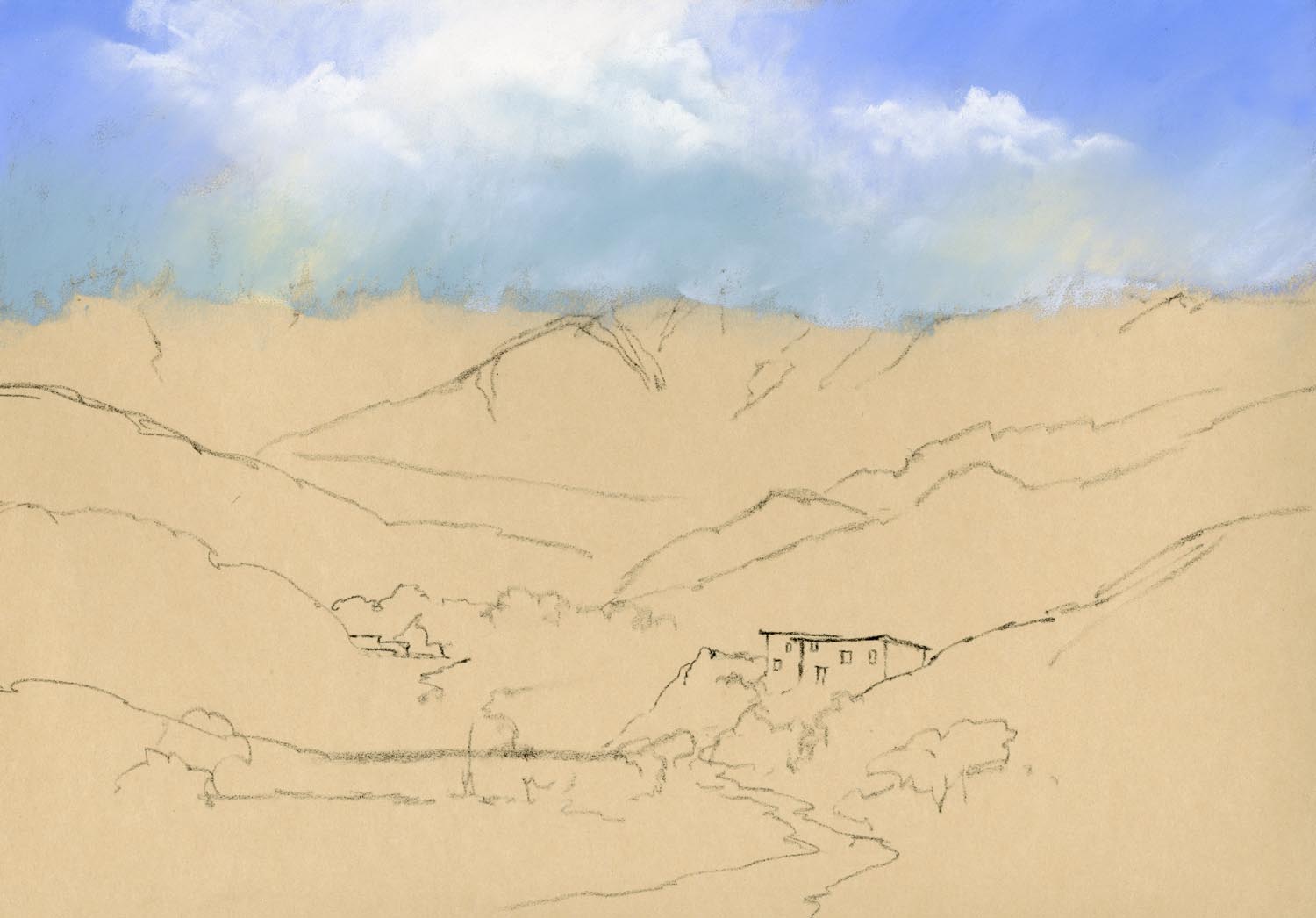
I have made further progress on my painting for the Cox & Kings Morocco competition: The middle distance in a landscape painting is often a tricky area to tackle. It’s important to keep in mind the relative size of features compared to the foreground such as trees and bushes;   the colour temperature must be carefully controlled;  and we must resist the temptation to render too much detail to features that are distant.

morocco stage4

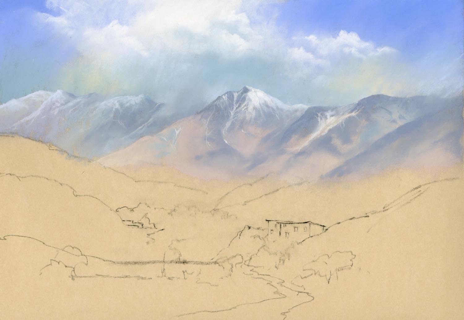
Stage 4 – middle distance

In the photograph there were very strong, sharply defined cloud shadows on the hills on the right and initially I painted these in as they were in the photograph but I quickly realised that they were drawing the eye too much and would compete with my focal point so I softened them considerably. The hills on the left were lighter in tone with less tonal contrast so there was no need to soften them too much.

The next stage will be the focal point, the building, and the foreground. See you in a few days.


Stage 2 & 3 of my competition entry

Yesterday I made more progress on my painting for the Cox & Kings Morocco competition: Stage 2 – Sky: When painting landscapes, I generally work from the top of a painting downwards. This serves two purposes. Firstly it helps prevent the heel of your hand smudging the work where it rests on the support and secondly it helps create a sense of recession. If you think of the landscape in terms of distance, the objects farthest away are usually lighter in tone, cooler in colour and less distinct. Translating this into the painting process means that you use paler, cooler colours in the distance and less detail. By working down the support you can remember that meme in your choice of colour and tone.

morocco stage2

Stage 2 – Sky

Stage 3 – The mountains: The sky was painted down over the drawn lines that defined the mountain tops. This is to ensure that there are no gaps between the sky and mountains and also to give the impression that the sky is, in effect, behind the mountains. Sticking to cooler colours and pale tones, the mountains are painted with sharp edges in places and softer edges in others so that there is not a hard line all the way across the painting. Soft edged cloud shadows helps define the ridges.

morocco stage3csm (1)

Stage 3 – the mountains

The next step will be coming soon.

A bump in the road

Every now and again our plans are thrown off course and we have to adapt to the new circumstances. In April I suffered one such ‘bump in the road’,  a slipped disc and I ended up in hospital. At the same time I was given the news that I need a major operation for an unrelated issue this summer so I have had to cancel all my demonstrations and events for the foreseeable future. I am sorry if any of these cancellations have affected you. I may not be accompanying David at his events either and will miss seeing old and new friends. but I hope to be back on course again by the autumn.

The pastel painting below was the last demonstration I did this year, for Llantarnam Grange Art Group in Cwmbran in March. The theme was ‘creating atmosphere’ and pastel is the ideal medium for this purpose. Softening the edges of the distant features in order to create a sense of atmosphere is relatively simple with pastel. To create this effect of clouds over the hilltops, just gently stroke some of the sky colour down over the distant hills. This pushes them into the distance.

Crickadarn

Crickadarn, Mid Wales, Pastel by Jenny Keal

The same method was used lower down in the distant hills, softening the green colour of the lower slopes into the blue/grey. This softness is emphasized by making the edges of the focal point sharper and the tones darker. All these techniques help to create the illusion of recession in a painting.

You can see this technique and many others, demonstrated in live action on my DVD, Painting with Pastels, available in our online shop.

I hope you find time to get out in the countryside this summer to paint and sketch and store up subjects for the coming winter months. Nature has a way of invigorating and at the same time restoring tranquility in our busy lives.

The Secret of Speckles

I’ve been asked many times how I get the fine speckles of colour in my paintings so I am going to let you into the secret. I lay the painting flat on a table and using the edge of a palette knife I scrape flakes of pastel on the surface where I want to create the effect of small leaves, seed heads in a field or sea spray on rocks etc. I than press the flakes into the painting with the flat of the palette knife. If there are some stray flakes which you do not want, you simply don’t press them in and they will either fall off when you place the painting in a vertical position or you can blow them away.

Scraping

Step 2. Press the flakes into the surface of the painting with the flat of the palette knife where you want them to stick. Blow away any unwanted flecks.

Pressing in Speckles

Step 1. Lay the painting horizontal on a table and using the edge of a palette knife, scrape flakes of pastel from a pastel stick on to the surface of the painting where you want to create fine specks of colour.

__________________________
This technique is most effective if you use contrasting tones and colour.

It is almost impossible to achieve these fine marks with a dotting technique and the random effect is particularly pleasing.  However, I will issue one word of warning. This technique is addictive and it is easy to get carried away using it all over the place and then the effect is spoiled.This technique is described in my book Painting with Pastels and demonstrated on my DVD of the same name. Or you can buy both at a Special Offer Price of £20.

Painting Rocks in Pastel

One of the most common problems people encounter when painting landscapes is how to portray a realistic looking rock. It is mainly a matter of light and shade but colour is also an important element. Rocks are rarely one uniform colour and although sometimes the colour range is limited, subtle changes from one tint to another are very effective.

In the above image, which is an enlarged part of a painting that I am currently working on for an exhibition in Tenby this spring, the strong light increases the contrast between different planes making it easy to make the rocks look three dimensional. The light faces are defined with a soft transistion of lighter tones and some darker fracture lines, rendered with a sharp charcoal pencil.

It is also important to study the random shapes of rocks. If you make all your rocks the same size and shape and uniformly spaced they will look man-made rather than natural. Of course the best way to improve your rocks is to go out sketching and make some careful studies. Or, if rocks are conspicuous by their absence where you live, gather a pile of randomly shaped stones and make a detailed pencil study in your studio. Even this should help you to understand the play of light and shade and the random nature of their shapes.

If you want to join me on my painting course in Lynmouth, North Devon in May I will be sketching and painting rocks, cottages, trees and water. North Devon has some beautiful scenery and we shall be well looked after by Cheddar Painting Holidays