David Bellamy – Determining Colour in Landscape Painting

  A few weeks ago I received an interesting query about how one determines what colours to use in response to a landscape. I could write a book on this fascinating subject, but I’ll try to answer that as best I can in this limited space and perhaps follow it up with an article on the subject later.

    In some of the practical art books I read during my early days we were warned against relying too much on the colours in photographs taken of landscapes as the colour reproduction was often unrealistic, and it was best to work from the landscape first-hand to achieve the precise colours in the scene. This approach, however, adopts the premise that we simply want to copy exactly what is in front of us, and to blazes with any of our own artictic creativity. In our paintings we are not trying to emulate photography.

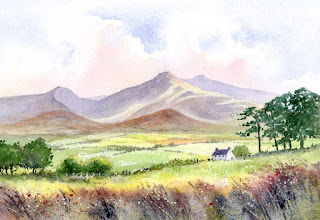
     In this painting the topographical features and buildings are fairly faithful to the scene, but the colours could not be much more different to what was actually present on this occasion. I have grossly romanticised the colours with mauves, orange, alizarin and other colours for both sky and land, and created a glimmer on the water. JMW Turner likewise used colour on many occasions for its emotional power, rather than sticking to what was before him, much to his contemporaries’ astonishment. Colour is closely bound to mood and emotion, so much thought should be given to your proposed palette before you begin painting.

    You may wish to take a less romanticised approach, but even so it is perfectly legitimate to alter the colours from the original scene. Colours are affected by the weather, light, seasons and a host of other factors. For example, one day a field can be a pale green perhaps, and the next when the farmer has cut the hay it can be a distinct Naples yellow. Fields get ploughed up and lighten in tone and colour when the dry out, and I have seen a cottage roof change in brilliant sunshine from black to the most brilliant gleaming whiteness after a shower of rain followed by more sunshine. I often change a field by the centre of interest from a dull green to a shimmering yellow to draw the eye in, and perhaps do the opposite to the landscape at the edges of the composition so that it doesn’t draw the eye away from the centre of interest.

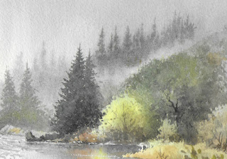
    Landscapes are commonly overwhelmed with greens, but if you try to copy every green you can see you will be ovewhelmed, and the result can look chaotic. What may look right in reality or a photograph simply may not work in a painting. We need to interpret colour as much as we need to do so with other aspects of a scene. Choose a maximum of three or four greens. Variegate them by dropping in other colours while they are still wet, but also consider changing them for a totally different colour. I’ve even seen red grasses out there, so you have quite a range to choose from!

    OK, but what if you see a colour out there that you really like, and want to replicate? Study it carefully and experiment with as many colour mixes as you can in an effort to achieve a decent result, but you need to do this on separate paper, not on the composition you are working with. If it’s still not working touch in a third colour into the mix. Another way is to take out colour swatches of various greens (or whatever colour you wish to relicate) and try to match one as close as possible to what excites you, noting whether it is darker, lighter, warmer, cooler, more or less intense, and so on. Back at home you can then experiment further and study other artists’ work to see if they have created a similar colour, and by which mixtures have they achieved the result.

    I hope this helps. I’ve recently returned from Cornwall where I ran a course organised by Alpha Painting Holidays. Matthew not only organised a great location, but also organised some truly wild weather which brought us some amazingly dramatic seascapes with huge breaking waves. It was great fun. 

    I have a zoom demonstration on Saturday 24th September at 12.30 pm in conjunction with Patchings Art Centre, so do please join us if you can. It’s free and will last one hour. I shall be demonstrating coastal scenery, and the link is as follows: 

https://us02web.zoom.us/webinar/register/5316631053963/WN_N66AL9z_R7aRVuQVf_Ca2w

David Bellamy – Losing bits of the subject

As landscape artists we often see far too much in a scene for the good of our painting, and slavishly copy as much of the detail as we can. It really does pay to think about your need to include even what may seem to be an important part of the subject, and ask yourself if it does help to include the whole feature, or can you make subtle changes before that brush touches your paper?

 In this view of Penyghent in Yorkshire, although I could see the entire mountain clearly, I felt that the profile was too stark: there was no mystery. So I introduced some lower cloud on the right to lose that strong curving edge of  the peak by bringing down the shadow part of the cloud with French ultramarine and cadmium red over the yellow ochre of the mountainside. Then, by emphasising the shadowy shape of the lower part of the fell as it came out of the cloud, the overall shape of Penyghent was retained. The work was done on Saunders Waterford 140lb NOT paper.

I will be demonstrating at Patchings Art Festival  on 14th, 15th and 16th July. The demonstrations will take place in the St Cuthberts Mill Marquee each morning. It will be great to return to Patchings after the two-year absence because of Covid. We will also have a small stand at the event, so do come along and see us.

Unfortunately my webinar with Painters On-line had to be cancelled because of my throat and chest infection which made it impossible for me to speak properly, but we are back on track now and the event is rescheduled for 11am on 4th August when I will be painting a Nile scene. I’m sorry for any inconvenience to anyone who booked. See details at Painters Online

David Bellamy – Bringing atmosphere, drama and the sublime to a village painting

Many landscape painters love working on tranquil village scenes where time seems to stand still and locals engage in conversation. Here I am deviating from the traditional village composition to add a strong ingredient of atmosphere, drama and the sublime, for this village stands high on the very edge of a vast canyon in the mountains of Oman.

In this watercolour the morning mist cloaks the background mountains and subdues detail in the further parts of the village, in places aided by strong light bleaching out features so that they are only half-seen. Two figures stand near the centre, drawing the eye – you don’t need to make your figures large in order to emphasise the human aspect, but note how there is no detail behind them. This really makes them stand out. They stand at the edge of a sheer drop, thus dramatically creating a sensation of the sublime, a feeling of possible danger. While this latter sensation is rarely found in a British village you can still enhance such paintings with carefully considered atmosphere and even a little drama with the right lighting.

This painting is featured in my new book, Arabian Light, published this month by Search Press, and packed with paintings and sketches of my travels in the Middle East.  Details of the book are on my website. The book will be launched at my exhibition in the Osborne Studio Gallery, at 2 Motcomb Street, London SW1X  8JU  Telephone  +44(0)20 7235 9667   The exhibition runs from 18th to 27th May and I will be in the gallery for much of 18th if you would like to pop in for a chat

David Bellamy – Painting massed trees in a landscape

Featured

 Most of the time I find there is too much action happening and not enough talking – it’s great fun, but leaves little time for communicating, and there is not enough room in this blog to cover everything. I’ll have to leave my sketching adventures in Snowdonia of last week for the next blog.    

On Sunday in Aberedw we had an event to raise money for the Ukrainian refugees. We are only a tiny village but we raised over £1,000 and will be trying to get another event organised soon in which I hope to be able to sell paintings in support of these unfortunate people. It’s hardly believable that this is happening in Europe in the 21st century, and sadly we have a pretty poor political representative locally, so I’ve been active in ruffling some political feathers as well.

As with Covid, it is amazing how art, like nature, can help us in wartime, whether to take our mind off the dangers of war, or  perhaps cooling our anger at the appalling and brutal actions of dictators like Putin. With spring about to burst upon us it’s a good time to get out into the landscape. One of the things that causes many students problems is when trees are massed together. Trying to make sense of it all can seem unsurmountable at times.

 In this section of a painting you will see the varying tones on the four blocks of conifers, the strength of tones suggesting a sense of depth in the scene, aided by a feeling of a misty day. It’s usually a good idea to include a bright colour amongst duller ones as you can see in the bottom centre. The light is coming from the left so the edges on the right-hand side of the trees have been kept soft, while those to the left are harder-edged where they are caught in the sunshine. The bright yellow foliage does not appear in the centre of the full painting as that would not be compositionally helpful.

 My watercolour course in Builth Wells from 3rd to 8th April still has a few vacancies, and anyone who would like to join us on a non-residential basis will be welcome. The Caer Beris Manor Hotel will charge a modest fee for refreshments and hotel facilities, plus a tuition fee of £215. You can check the course information on my website and book the course with the hotel on 01982 552601  We shall be using the hotel ballroom as a studio this time, so there is plenty of room for us all to work and keep apart.

David Bellamy – Warming up your Landscapes

   When you begin a painting do you stop to consider your colour management or simply copy the colours in the original scene or photograph? Whether you are a serious artist intent on improving your work, or perhaps painting simply for enjoyment, it is so much more rewarding to create a composition where you can inject some of your own ideas to add interest.

     In this watercolour of the Brecon Beacons I decided to create a much warmer feeling than was present in the scene on that particular day, and enhance the summery mood. Apart from the cobalt blue in the sky most of the scene embodies warmer colours, and after establishing the clouds with the blue I laid on permanent alizarin crimson over the lower sky. The blues on the mountains are French ultramarine with a touch of cadmium red added, resulting in a lovely warm purpley-blue. The greens on the fields have also been warmed up with touches of gamboge, and there are also some gamboge and cadmium orange fields to liven things up. In the foreground I dropped in some Indian red wet-in-wet to produce soft edges and when this was dry spattered Indian red and white gouache before finally scratching out reeds with a scalpel.

    At the end of this week I am starting once more to do live workshops, this one at the excellent Sandpipers studio on the Wirral, while on 3rd April I start my first post-Covid course at the superb Caer Beris Manor hotel in Builth Wells. There are still places available on this course, so if you feel like getting out into beautiful landscapes again you will be very welcome. We will be sketching outside (hopefully painting as well if the weather is fine), and also working indoors in the ballroom which has plenty of room for us to keep apart from each other. Details are on my website  Emphasis will be on injecting atmosphere into your landscapes and putting something of yourself into the subject.

    Sadly we haven’t had much snow this winter, but with spring about to burst upon us let’s hope that this will herald better times for getting out and about with our paintboxes.