David Bellamy – Creating a Splash

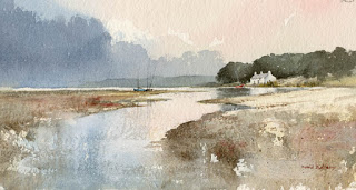
One aspect of life I am really missing in lockdown is being by the sea, and especially my native Pembrokeshire with it’s incomparable combination of sandy beaches and stunning cliff scenery. I’m desperately in need of being splashed in the face by some wild breaker crashing on the rocks, so I thought you might like to see how I tackle these fascinating actions of the sea.

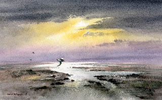
This is the sort of sea that all self-respecting sailors should be indoors, but the kind I love to catch in a sketch. Just being there and observing what happens when the sea crashes onto the rocky anvils helps you understand what is going on, and happily it is repeating itself all the time. I often stand mesmerised by these moving images, then snap out of my reverie and consider how I would render the effect in watercolour. By watching every part of that moving scene in succession you will learn a lot about moving water and a sketchbook plus a watersoluble pencil will help you record the moment without any need to be completely accurate.

To capture the white splashes in this painting I brought down the cliff colour – light red with spots of cadmium red here and there at the top, then halfway down introducing purple – a mixture of cadmium red and French ultramarine – for the lower cliff. I laid it down as a very wet wash, but as I came closer to the rocky anvils I wiped the brush on a towel to lose the excess liquid and then rolled the number ten round sable on its belly around the top of the rocks. This created an intermittent and ragged edge of purple around the white of the paper above the rocks. Where it went wrong and left an ugly mark as sometime happens I quickly pulled out the offending splodge with a damp brush, although if I can’t manage that at the time I simply let it dry and then scrub it out with a damp old brush (not your brand new number ten sable!). This was painted on the beautiful Saunders Waterford rough surface which helps enormously to create the ragged edges round the splashes as well as rock textures. A NOT surface will work well but the rough version will help you even more in this instance. There are many examples of these various techniques for rendering waves and sea action in my book Seas & Shorelines in Watercolour which can be obtained from my website http://www.davidbellamy.co.uk

There are other ways of capturing these splashes – sometimes I wet the area above the rocks and then lower the purple wash (or whatever colour I am using) into the wet area, working it round the splash. This has a lovely clean effect but you often will need to adjust the shape of the splash by pulling out colour with a damp brush. Try these lovely effects out on scrap watercolour paper first and have fun! Right, without the sea and on a very hot day here I think it’s time to go and jump in the river…………..    take care!

David Bellamy – Liberate your painting with scraps of paper

I often find that when I’m testing a wash or new colour on a scrap of watercolour paper that I produce some marvellous results, yet when I try to repeat the exercise in a proper painting it often falls far short of what I hope will happen. So why not try to capitalise on this perversity by now and then painting on a piece of scrap paper that you might otherwise throw away?    This little watercolour was painted on a discarded piece of 300lb Saunders Waterford rough paper 9 inches by 4.5 inches, and I loved every moment painting it. With such a small, insignificant size you tend to lose any inhibitions, and it’s certainly a liberating feeling, as you feel you have nothing to lose even if you make themost astounding mess!

    One of the main features I love is the soft wet-in-wet reflections in the water below the cottage. These were achieved by wetting the area of the water below the building and out as far as the central boats, leaving it for a few minutes to start drying, and then applying the dark green-grey reflections of the massed trees into the wet area, leaving the part directly below the cottage as white paper. At this stage it’s vital to watch how the dark reflections creep outwards as though they deliberately want to annoy you. With a damp – a really ‘thirsty’ brush (a number 6 round brush is usually fine for this) – pull out any of the dark colour that edges its way beyond where the reflections should appear. You may need to do this more than once.

    This painting appears in my Seas & Shorelines in Watercolour book, recently published by Search Press, which not only covers a really wide variety of coastal scenery and features, but is also crammed with sky treatments of all kinds that you should find useful for adopting in your own work. Signed copies are available via my website  ….and don’t forget to make full use of those bits of scrap paper lying around!

David Bellamy – Greys in watercolour landscapes

For the landscape painter grey is an extremely useful colour, often to set the mood, or equally importantly to provide a passage of quiet dullness that can be vital to make those exciting vibrant and perhaps bright colours stand out. In this scene of a stream in the New Forest, painted on Waterford NOT 140lb paper, I have used the superb Daniel Smith Lunar Blue to create the background, an exciting blue-grey colour that has interesting characteristics that may not at first sight be apparent. At it’s full strength as you can see on either side of the main tree-trunk where it defines the tops of the grasses, it reveals a powerful granulation, yet on the right-hand side where I have simply laid a weak wash of the same colour, there is no granulation. The stronger tone used, the more prominent become the granulations.

Daniel Smith have introduced a number of useful new greys into their collection recently and I’ve been trying out some of them. Alvaro’s Caliente grey is a lovely, warm grey which is quite dark at full strength, and is excellent for creating moody landscape backgrounds. The cooler Alvaro’s Fresco grey can inject a feeling of drama into a composition, for example if you may like to portray a cold sea or stormy sky, or simply cool shadows. The third grey I tried was Joseph Z’s neutral grey, a versatile colour that will be a welcome addition to the landscapist’s palette, again for creating moody scenes. All these greys can of course be modified by mixing, but one great advantage of these Daniel Smith greys is that the artist will already have a selection of interesting and varied greys without having to do any prior mixing, and in each case above the colours can produce a wide variety of  tonal values.

 I shall be demonstrating next Thursday, Friday and Saturday at the marvellous Patchings Art Festival, in the St Cuthberts Mill marquee, using the superb Saunders Waterford and Bockingford papers. Our stand will be beside the marquee so do come and chat and learn more about these excellent products and see other examples after the demonstrations. I will also be signing copies of my new book, David Bellamy’s Seas & Shorelines in Watercolour, just published by Search Press and is the No.1 Landscape painting best-seller on Amazon. You can obtain signed copies from my website  I hope to see you at Patchings

David Bellamy – Painting the haunting calm of an estuary

I love exploring quiet estuaries, well away from the hubub of modern life, where all you may hear is the haunting cry of the occasional curlew, and to sit sketching the scene as twilight begins can be a memorable experience. Often at such times the colours are reduced and it is easier to get a moody effect, though having to work quickly before darkness descends can induce mistakes. I generally begin with a few quick photographs of the scene at a variety of exposure settings, and then launch into the sketch. Photographs are helpful to back up your sketches and having several at different exposures where there is a strong lighting contrast will give you a better chance of producing a result that is closer to what you actually see with the eye.

In this watercolour I have added birds, with the closer one acting as the centre of interest. A hint of sparkle on the water was achieved by drybrushing a light grey wash across the central areas. The large white parts are simply white paper, but where I went too far with the paint I have scratched out highlights with a scalpel, mainly to the right of the white water. The paper is Saunders Waterford High White, Rough 300lb

This painting, with several others is now on show at Beaulieu Fine Arts, in Beaulieu High Street on the edge of the New Forest, postcode SO42 7YA.  See www.beauliefinearts.co.uk  or telephone 01590 612089

The painting is also featured in my new book, Seas & Shorelines in Watercolour, which is doing extremely well, and even those who have no intention of painting the sea will benefit, as it includes a wide variety of skies, buildings, rocks, cliffs, figures and birds, as well as some exquisite daubs of mud! For more information see my website. Now that summer is here I hope you are all getting out with your paints – make the most of it.

David Bellamy – Painting around the New Forest

  I now have a number of paintings on display at Beaulieu Fine Arts, an excellent gallery with several rooms full of exciting and varied art. It’s a delightful spot to visit as you can also spend time exploring the New Forest, which is especially glorious in spring-time. The watercolour shown here is of a tranquil view of the river near Bucklers’ Hard, one of several local scenes I’ve painted. I have not neglected my wilder compositions, though, so you will find a mixture. In summer the massed greens can appear a little overwhelming, so I have introduced more grey into the further tree-clad ridges.

The gallery is at Manor House in High Street, Beaulieu, Hampshire, SO42 7YA and the telephone number is 01590 612089   Check out the website at   www.beaulieufinearts.co.uk

I’ve just returned from an exciting trip to the Lebanon, returning with bagfuls of sketches. I encountered much dramatic mountain scenery, incredibly deep snow, amazing Roman ruins and not least so many kind and friendly people. And of course, the food was outstanding, and sometimes overwhelming, as when I went into an Iraqi restaurant for a lunchtime sandwich and ended up with seven courses – all at once!