David Bellamy – Creating an illustrated journal

One of my great enjoyments is keeping an illustrated journal, although because of a lack of time it tends to be rather intermittent – it’s just so stress-free to paint or sketch for yourself and add notes about your experiences, and this is especially rewarding on a holiday or journey. I am therefore pleased to announce that I have teamed up with Leisure Painter Magazine over the next six months to offer a monthly competition to encourage folk to get out and try their hand at producing a journal. Jakar International have kindly agreed to supply the monthly prizes, so do please have a look at the current (April) issue of Leisure Painter.
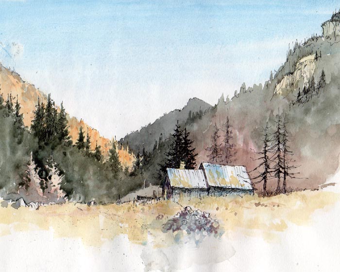
     The illustration shown right is taken from my sketchbook-journal done on a visit to Holland, and shows the typical notes I often add beside the picture. I don’t really class this as a sketch, as I feel it is more of a diagram drawn solely to illustrate the fascinating architectural styles in Old Amsterdam. I had no intention of creating a finished painting from this: it was done for my enjoyment, although many other sketches in the A4 book were intended as sources for future paintings. Working this way, with no pressure to produce a brilliant piece of artwork can be liberating as well as helping your work to improve.

The houses varied from colourful to a more drab colour, so it’s a good idea to pick out those colours that appeal most to you, rather than paint every house exactly as you see it before you. Note that I have run most of the house colours into one another, rather than paint each one with individual exactitude. I have left out a great many windows, but feel I should have omitted even more, or at least reduced the strength of detail is some.

I shall look forward to seeing how you all fare in these competitions, and I must point out that this is not limited to those who travel far and wide – you are very welcome to join in even if you are house-bound, and there are many ideas for you in my current article in Leisure Painter. Make sure you don’t miss out on the fun!

David Bellamy – Happy Christmas

                      A HAPPY CHRISTMAS & ALL BEST WISHES FOR THE NEW YEAR

Whether you are spending 
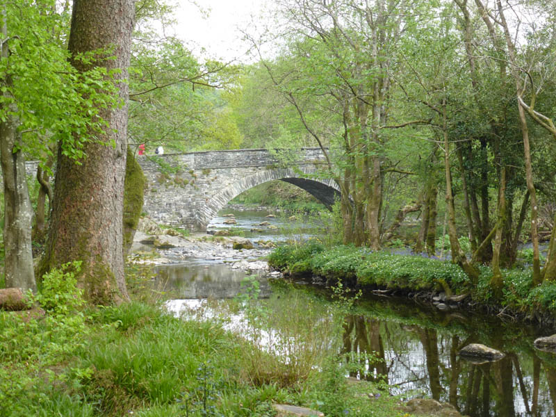
Christmas stomping round some mountain-top in search of picturesque holes in the ice to paint, or relaxing with your family, have a great time. For my part I can’t stay cooped up for long over the holiday, and have to get out – taking the old sketchbook is, of course de rigueur, but these days I more often encounter mudscapes rather than pristine snow!

2017 has been a good year for me with so many things happening, and I hope it’s been kind to you. I know some of you will be alone this Christmas, and maybe you will gain comfort from indulging yourselves in your painting. Art is a wonderful and much underrated pastime, hobby, way of life, however you see it, and it has a powerful way of transporting us away from the ills of reality and into new worlds.

Enjoy the season, take care and I will be back in the new year

David Bellamy – Painting the moving composition

Have you ever painted outside when the landscape seems to be moving, jumping about or constantly changing in some way? These can be exciting, opportunistic times for the alfresco artist, but often fraught with problems. Most of the movement, apart from animals, figures or vehicles, is usually down to strong winds, which can make painting or sketching outdoors even more difficult than in light rain.

The scene is a watercolour sketch of Trevone Bay in Cornwall, carried out on a hard-back book of cartridge paper, over a two-page spread. Strong winds were blowing the clouds along at a truly fast rate, so the sky was constantly changing and the cloud shadows over sea and headlands moved astonishingly quickly. Additionally waves crashed in with such force that it threw up great white splashes all the time.

To render the sky I simply wet the whole area and waited for the excess water to run off before applying cobalt blue, working round the clouds and the wet paper automatically resulting in soft edges. In the wind and sun this did not take long to dry, so then I laid in the lighter colours over the headland, including some red on the central promontory. I had already decided this would be my focal point, and I would keep it light with the further headland dark. I could easily have decided to do it the other way round. Whatever you do, don’t try to keep changing these main tonal areas as the scene itself changes, otherwise it will lead to a mess!

Once that had dried I painted in the green top of the closer headland and used cobalt and pthalo blues in the sea, leaving the white surf and splashes as white paper. I could have positioned the main splash a little closer to the central headland to further support the focal point, but when I’m desperate for a cappuccino I sometimes blob these features in where convenient and leave the refinements for the finished painting. Most importantly, don’t feel that because a feature appears in a certain position, that you have to put it exactly there. Finally the dark headland and foreground rocks were painted.

This was done as a sketching demonstration for a course last week. My new book, David Bellamy’s Arctic Light will be published shortly by Search Press, and it’s quite different from any of my previous books – more on that shortly.

Before I go I’d like to highlight a very useful report on watercolour paints that has just been published by www.wonderstreet.co.uk  It covers a great many ranges of watercolours, including some I had never heard of, and I recommend you take a look at it on  http://wonderstreet.com/blog/which-brand-of-watercolour-should-you-choose   While I can’t comment on those paints I have not used, it does seem pretty accurate on those I do know. Enjoy your painting!

David Bellamy – Observing the Landscape

Learning to draw and observe properly are essential skills for the landscape artist in watercolour, and although most artists can see objects clearly, so many have appalling problems when trying to observe and record a scene. This is one of the fundamental skills I try to teach students on my painting courses, but it does take quite some application and determination to continue practising the skills once the course has ended.

This is a photograph of Skelwith Bridge, taken during my recent painting course in the Lake District. Whilst the lighting is a little flat, it is still pretty clear that the distant features viewed under the arch are a little darker in tone than the left-hand side of the bridge, though they are lighter than the underside of the arch to the right. Comparison of tones in this way is a vital method of working out these tonal relationships. Always think not just about the shapes before you, but the main tonal relationships as well. This will bring forward your art in leaps and bounds, and I would urge you to practice this with deliberate emphasis for at least the next month or so.

My rough sketch of the bridge on the right was done in about 12 to 15 minutes and this is the sort of drawing that will help you with your tones. Breaking away from a pure linear response to a subject is absolutely essential in your development as an artist.

I shall be demonstrating at the Patchings Art Festival  on Thursday 9th, Friday 10th and Saturday 11th June, in the St Cuthberts Mill Marquee, painting on the fabulous Saunders Waterford and Bockingford papers. Do come and chat. It’s always a great show with superb demonstrators, marvellous crafts, paintings and art materials. I will be painting with Daniel Smith watercolours and will have available the dot-card palette of the colours I mostly use in their range, so come along and pick one up.

David Bellamy – Sketching with pen and watercolour

One of the most effective ways of sketching is by using pen and wash. I carry around hardback bound sketchbooks of cartridge paper amongst the many odd items in my rucsack, and these accept pen drawings well. While the dip-pen and bottle of ink are the ideal way, it is less practicable to carry around bottle of ink, so I normally resort to a technical pen, although this has a uniform line.

This sketch was done in evening light in the Maritime Alps, on cartridge paper. I began with the ink drawing using a .02 nib. Where you have considerable depth in a scene, and especially with distant mountains, or wish to draw clouds, it is imperative not to be too heavy-handed with the pen on these distant elements. I prefer more intermittent line work rather than continuous lines as seen on the building, as this will suggest distance. In places I have totally omitted the line work and relied solely on the watercolour wash outline to describe the shape of far ridges and trees. The ink line is also an excellent way of rescuing a painting or watercolour sketch that is too weak in tones.

My recent trip to the Alps was aimed at capturing snow scenes, but there was no snow until the final day when I had to leave. Somehow the snow appears to have been deliberately eluding me this winter!

There are still one or two spaces left on my Croatian painting holiday in September. This is an easy, relaxed painting holiday in congenial surrounding amidst lovely scenery, and will not involve any wild mountain work! For details check out my website at http://www.davidbellamy.co.uk/painting-holiday-to-croatia-2016/