David Bellamy – In Praise of the Tea-Pot

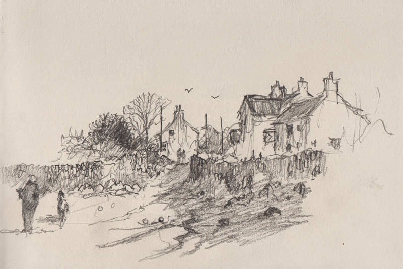
Maintaining morale when out sketching on location is vital, and while some might find a whisky flask useful, I generally rely on tea. Sadly last week in Pembrokeshire the cottage where I stayed lacked that vital ingredient, the teapot. Naturally, this was pretty disastrous, so when out and about I made the most of any such facilities. In the sketch below the right-hand building is a superb tea-shop selling the most delicious cakes, and this is why you might detect a certain hastiness in the rendering of the pencil-work.

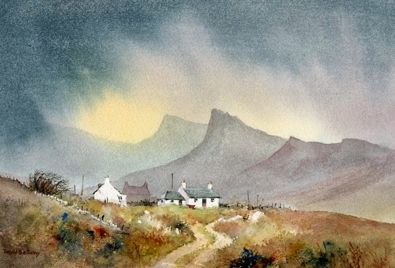
However hasty we may be in sketching, it pays to consider the composition carefully when creating a painting from the sketch or photograph. Unless the subject is quite a simple affair I normally carry out an intermediate studio sketch to work out where I wish to place the important elements and the main emphasis, together with the sort of atmosphere I wish to convey. In this instance I would move the composition to the right a little so that the left-hand house did not appear in the centre of the composition, as this would be my centre of interest. I would need more detail to be included above the left-hand wall and figures (detail missed because of the urgency of the tea situation), so I would have to resort to memory, a photograph, or the good old imagination. The main figures would be placed further to the right, a little closer to the centre of interest, and I would make full use of the dark runnels of water descending from the centre right – I have already bent them slightly to come towards the viewer as a lead-in. These are the kind of thought processes that go through my mind before I begin the painting.

Don’t underestimate the value of tea for the artist. I’ve even used it on a painting outdoors on occasion. Last autumn while I was running a landscape painting course a lovely German lady was painting a cottage, which filled her paper. When I asked her what was her focal point she replied, “The tea-pot.” Sure enough, there was a teapot in the window. Such observations may not only bring a smile to your viewers, but might also result in a sale.

David Bellamy – Foreground techniques in watercolour

Foregrounds can often be a pain in the neck, and are often not considered properly until the rest of the painting has been completed. This is not good practice, of course, as it’s by far a lot better to give the foreground some thought before you start painting. Anything but the simplest of landscapes will benefit from one or two studio thumbnail sketches to help you decide on the main features and relationships of the composition.

Foregrounds vary considerably, and sometimes completely different types of foreground may well suit a scene. Having a lead-in to the focal point can be very effective, and in this watercolour of cottages on Skye the track undulates and wriggles, losing itself in places until it disappears completely round the right-hand side of the buildings. A lead-in doesn’t have to be continuous, and there are times when it helps to be less conspicuous. The warm colours in the foreground here counter the cool ones in the distance, accentuating the sense of space, although I have mashed some strong blues into the foreground vegetation with a spatula in places to create interest. I used the edge of a piece of card to apply the paint here and there – this introduces a change of style from the brushwork, tending towards the abstract. Drystone walls, posts and boulders can be useful for breaking up masses of vegetation. Experiment with all sorts of objects with which to apply the paint if you’d like to try something new.

On a hike recently I wanted to find a spot where the river created a really good lead-in to a mountain, but there was no path. The dense vegetation simply got worse as I battled upstream (without a machete – they don’t like you carrying them around these days, and my Swiss Army knife wasn’t quite up to the job). If, rather than fight it, you wish to paint such dense vegetation, then the semi-abstract system as in the bottom left of this painting, can be the best option. Enjoy your painting/hacking!

David Bellamy – Sketching & Painting Wonky Old Cottages

Jenny and I have just returned from running a course on Exmoor where we had the luxury of sketching and painting inland scenes as well as the coast. The delightful village of Winsford provided us with a great many stunning subjects, while the heavy rain showers kept things lively. For many the local pub was a life-saver! The following days improved and we had a hot, sunny day at Lynmouth, with a harbour crammed with colourful boats and cottages climbing high up the wooded hillsides.

One of several scenes I tackled was a cottage high up above the harbour, using a graphite water-soluble pencil, and washing over it with a brush afterwards. Behind the cottage rose the wooded hillside. This highlighted the cottage really well, and I rendered it as a mass rather than outline each tree individually. You can discern a slightly darker shape rising above and between the chimneys – this was my sole indication of any sense of shape within the mass. As the cottage was perched above  many cottages I decided to vignette the foreground by extending pencil lines downwards, some linked to a hint of vegetation, plus some spatter from the brush after I’d picked up some of the watersoluble graphite on it. This technique is an excellent way to isolate your favourite part of the scene and leave out the bits you don’t want. The only worrying aspect to the sketch for me is the absolutely straight line of the roof – in such a wonky building it would be almost de rigueur to provide the finished painting with a supremely wonky roof ridge line.

Our course was organised by Alpha Painting Holidays run by Matthew and Gill Clark, with whom it is a great pleasure to work. They looked after our every need throughout the course, and we thoroughly recommend them. We still have vacancies on my course in Pembrokeshire from 28th September to 3rd October at the splendid Warpool Court Hotel in St Davids, where we have a wide choice of coastal and inland subjects for all tastes. You can get further details from Warpool Court on 01437 720300 or email info@warpoolcourthotel.com  You can also see my website

Rescuing a watercolour that’s gone adrift

I’m afraid things have been quiet on the blogging front lately as I’ve been in the Canadian Rockies for the past few weeks, painting some truly stunning scenery, and this will be the subject of a forthcoming blog.

This post covers the tricky subject of how you rescue watercolours that have gone slightly awry, or perhaps have somehow spectacularly misfired. It happens to us all. Many folk think you have to tear up the wayward masterpiece, but many watercolours can be effectively rescued even when they appear to be something of a disaster. I’ve just produced a DVD on the subject, and this covers a whole variety of techniques you can use to put things right, or simply alter a composition where you feel the need for change.

Mountain Bothy

On the left you see one of my old watercolours that I discarded years ago as I didn’t like the finished treatment: the peaks were too repetitive, the edges too hard, and the atmosphere didn’t really convince me. I felt I’d made a mess of it. When I was persuaded to do a rescues DVD I thought this would be a good lesson for illustrating methods of changing a scene.

Unlike a recent painting, over time it becomes more difficult to sponge out details and passages, but I have the advantage that most of my watercolours are carried out on Saunders Waterford paper, one of the most robust watercolour papers on the market, so I could really work hard into the paper. I also rarely use the manufacturers’ greens, preferring to mix my own, which are less staining and therefore easier to remove. Because of the hard-edged striking shapes of the peaks in this painting I realised that I would have to completely change the format to a landscape one and not include those strident peaks.

Mountain Bothy 2

My first task was to reduce the background by heavy sponging with plenty of clean water, then subduing it further with a transparent glaze of French ultramarine and a little cadmium red. This had the effect of creating a misty distance, cooler in temperature. By placing some shadow across the foreground it emphasised a lighter patch in front of the bothy, and while this was still wet I dropped in some Indian red to warm up the immediate foreground. Thus, the cool background and warm foreground suggested greater space and distance, and the buildings stand out more.

Copies of the Rescue Watercolours DVD, available for the first time this month, are available from my website  If you have any old watercolours lying around that haven’t quite worked, or have encountered a mistake you’d like to rectify, then there are many techniques on the DVD which will help improve your work. Some of the techniques are also useful to employ as a deliberate method to create special effects. There is nothing worse than finishing a watercolour only to find there is a niggling little problem to which your eye is drawn time and time again, when in fact there are almost certainly ways of solving the issue.