David Bellamy – Creating the effect of old stone walls

Writing blogs on a steam-driven laptop is an extremely slow process, and with extremely poor internet connections it can take me hours, which is the reason I’ve slowed down the number of blogs I do. Technology in Wales seems to be in some sort of reverse decline, and once the black-outs start hitting us it will be even worse. Progress is a funny thing!

Jenny and I enjoyed Patchings Art Festival, where I did two demonstrations in the St Cuthberts marquee to large, enthusiastic audiences. It’s always a joy to work with St Cuthberts Mill, and the Saunders Waterford High-White paper is superb for getting the best out of your watercolours.

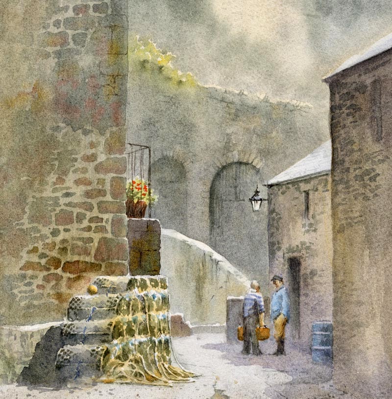
I’ve just taken some new watercolours to Art Matters in White Lion Street in Tenby (Tel. 01834 843375) and this is one, showing a quiet corner of Tenby harbour. The lovely old stone walls provide an interesting backdrop, and these were done by laying an initial wash of Naples yellow over the entire area, and once this was dry painting in the stonework with cobalt blue plus cadmium red, to which I added a few drops of yellow ochre while the stones were still wet. I left some of the Naples yellow showing as light-coloured mortar between the stones. Once again I waited until the whole area had dried and then glazed it all with a weaker wash of cobalt blue and cadmium red. This both imparted a greater sense of unity and slightly softened off the edges of the stonework.

The background has been considerably simplified so that the emphasis is thrown onto the figures in conversation, and the surface was Waterford 140lb NOT, which is excellent for taking repeated washes if necessary.

Simplifying Foregrounds with the Vignette Technique by David Bellamy

One of my favourite techniques for dealing with those troublesome foregrounds is the vignette method, which can be equally effective when used on watercolour sketches. This is especially true when you don’t want to include every bit of detail in front of you. The method can be carried out with a softening effect as though the viewing frame becomes more and more misty as it gets further away from the centre of the composition, or it can be accomplished by abruptly stopping detail while adding a few stray examples – perhaps stones, pebbles, grasses, plants or whatever is present, in the foreground.

Cascade (detail)

In this example of a cascade plunging between rocks I’ve simply splashed in a few hints of falling water with weak French ultramarine, and to the left-hand side have spattered some flecks of paint. The rocks have been faded out, although the method works equally well by rendering a few strong, hard-edged features at this point. If you find the latter method is too strident you can softly sponge away the hardness with a natural sponge and clean water until you achieve the effect you are seeking. It’s also a useful technique when you are out sketching and see those heavy rain-clouds approaching and need to finish it off at speed! Try it out – you have nothing to lose, as if you feel it doesn’t work you can always superimpose a more normal foreground over it.

Using counterchange to good effect

With the current heatwave hitting the British Isles I reckon it’s rather nice to remind ourselves of those lovely cooling days of English drizzle. I’ve been working on sunny landscapes recently and will feature some in future blogs, but for the moment I’d like to discuss counterchange, an interesting feature that someone brought up recently.

Hackney

Counterchange in a landscape scene is a very effective way of adding interest to a passage or solving a tonal problem. At its simplest it could be a change in tone across a ridge, hill, forest, mountain, or any background mass to create a tonal range running from light on one side to dark on the other, while at the same time adjusting the sky in a similar way so that the dark part of the sky stands against the light part of the hill, and vice versa. In this watercolour of a cobbled street in Hackney you can see I’ve used the method vertically on the right-hand wall just to the right of the lampost.

In this instance I’ve included it for interest rather than to solve a problem. Where the method is extremely useful in solving a tonal problem can be, for example, where you have a house with a light-coloured wall set against a dark background: if the roof is dark it will get lost in the dark background, and if it is light it will lose itself against the light wall. By laying a graduated wash over the roof, darker at the bottom and graduating to a lighter top where the roof abuts the darker background, you can thus make both top and bottom of the roof stand out, thus causing a counterchange effect using the graduated wash. One of the most simple examples of counterchange can often be found on telegraph poles or winter tree-trunks where they show up light against dark vegetation at the bottom, and dark against the bright sky at the top, depending on the light of course.

This particular painting is featured in my Skies, Light & Atmosphere book available on my website with a special offer package of book and DVD, available only from the site or my demonstrations. Don’t forget to watch out for these effects in the natural landscape when you are out and about. You can learn a lot even without your painting or sketching gear!

Adding another colour to a monochrome painting

Grassholm Island

Grassholm Island

I’ve not been at home much lately, which makes it difficult to maintain a regular blog, and this week we’re running a painting course in Mid Wales. The beautiful sunshine on the last two days made excellent light for sketching outdoors, although it has been a little on the cold side. The weather forecast told us that it was going to be quite different from this, which makes us rather sceptical about their forecasts of doom for our planet.

Now and then I rather like to put a little ‘doom’ into a painting, often a sense of impending horribleness as in this watercolour of Grassholm Island off the Pembrokeshire coast. Its northern cliffs are mainly black and dire, with the great contrast of white gannets and gannet guano in spring, so to achieve a dramatic effect I have painted it mainly as a monchrome using indigo, but injecting some colour in the form of cadmium orange in the sky. Because I’ve painted this on a biscuit-coloured tinted paper I had to add the highlights with white gouache. There are many gannets in the sky and on the crags.

As I’ve mentioned before, carrying out a monochrome is an excellent way of learning to apply watercolour without the problem of colour mixing, but when you add a further colour like this it will take you one stage further and possibly increase the drama. Dark, moody paintings like this can convey a striking sense of mystery, so don’t be afraid to apply some really strong darks in your watercolours.

Our exhibition at Art Matters in Tenby is now running and continues until the 28th April see details here

Injecting Dramatic Lighting into your Paintings

In a painting in any medium, treatment of light is a vital consideration. While the landscape photographer has to work with available light, artists can manipulate it to their advantage, changing it, intensifying it, rendering a much softer, atmospheric light or create a dramatic sense of light and dark, and so much more. It pays to study how the top artists have treated the light in their compositions when you visit an important exhibition or collection.

Brancaster Staithe

Brancaster Staithe

This scene on the Norfolk coast shows part of the composition bathed in late afternoon sunlight, as it throws the emphasis on the central building, the two figures and the boats. I achieved hard edges on the buildings set against a dark sky by using masking fluid, rubbing it off once the background washes had dried, and then painting in the details on the buildings and the rest of the scene, completing everything apart from the shadows in the foreground. At that point I often trundle off for a coffee, or if it’s late I’ll finish for the day. This allows the washes to dry completely – in fact I’ll often get on with another painting at that point.

With the whole painting completely dry I wash clean water right across the foreground, taking it up into the lower sky area. Make sure that you take the water some distance beyond where you intend to create the soft edge, as water has a habit of creeping further than you might think. I then apply a mixture of French ultramarine and cadmium red over the shadow area, including the darkened left-hand buildings and the far right-hand hedgerow. This wash blends nicely into the wet paper, creating soft-edged shadows, with the area I wished to highlight being left untouched. If you are a little wary of this technique try it out firstly on old paintings that have not worked well, so that if things really do go wrong it won’t matter.