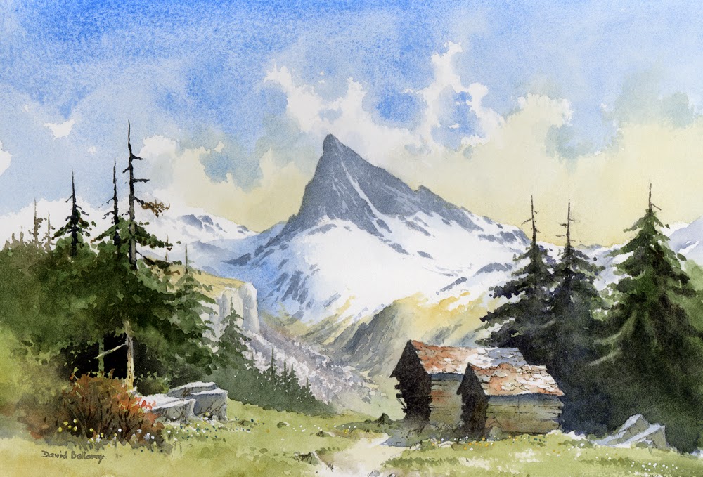
Foregrounds can often be a pain in the neck, and are often not considered properly until the rest of the painting has been completed. This is not good practice, of course, as it’s by far a lot better to give the foreground some thought before you start painting. Anything but the simplest of landscapes will benefit from one or two studio thumbnail sketches to help you decide on the main features and relationships of the composition.
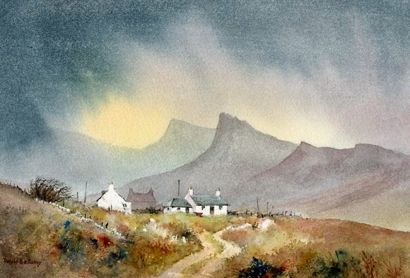
Foregrounds vary considerably, and sometimes completely different types of foreground may well suit a scene. Having a lead-in to the focal point can be very effective, and in this watercolour of cottages on Skye the track undulates and wriggles, losing itself in places until it disappears completely round the right-hand side of the buildings. A lead-in doesn’t have to be continuous, and there are times when it helps to be less conspicuous. The warm colours in the foreground here counter the cool ones in the distance, accentuating the sense of space, although I have mashed some strong blues into the foreground vegetation with a spatula in places to create interest. I used the edge of a piece of card to apply the paint here and there – this introduces a change of style from the brushwork, tending towards the abstract. Drystone walls, posts and boulders can be useful for breaking up masses of vegetation. Experiment with all sorts of objects with which to apply the paint if you’d like to try something new.
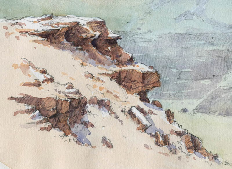
On a hike recently I wanted to find a spot where the river created a really good lead-in to a mountain, but there was no path. The dense vegetation simply got worse as I battled upstream (without a machete – they don’t like you carrying them around these days, and my Swiss Army knife wasn’t quite up to the job). If, rather than fight it, you wish to paint such dense vegetation, then the semi-abstract system as in the bottom left of this painting, can be the best option. Enjoy your painting/hacking!

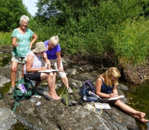 The sun beat down every day on our recent landscape course at Builth Wells, although happily we did have some welcome fluffy white clouds at times for variation. The ideal spot was down by the river running through the hotel grounds, where several students took the opportunity to dangle their feet in the water while they sketched. In the photo Jenny is giving advice as they paint a mixture of delightful cascades and still water punctuated with stunning colour reflections. Make the most of this lovely sketching weather.