Many of us are so eager to start painting that we tend to gloss over the need to get the drawing right before our brush touches the paper, and then we wonder why the composition doesn’t work too well. I love drawing, and drawing and doodling are a wonderful therapeutic activity, ideal for calming one after the stresses of modern living. I take my sketching in the field very seriously, even when I may have no need for any more sketches to add to the thousands already done.
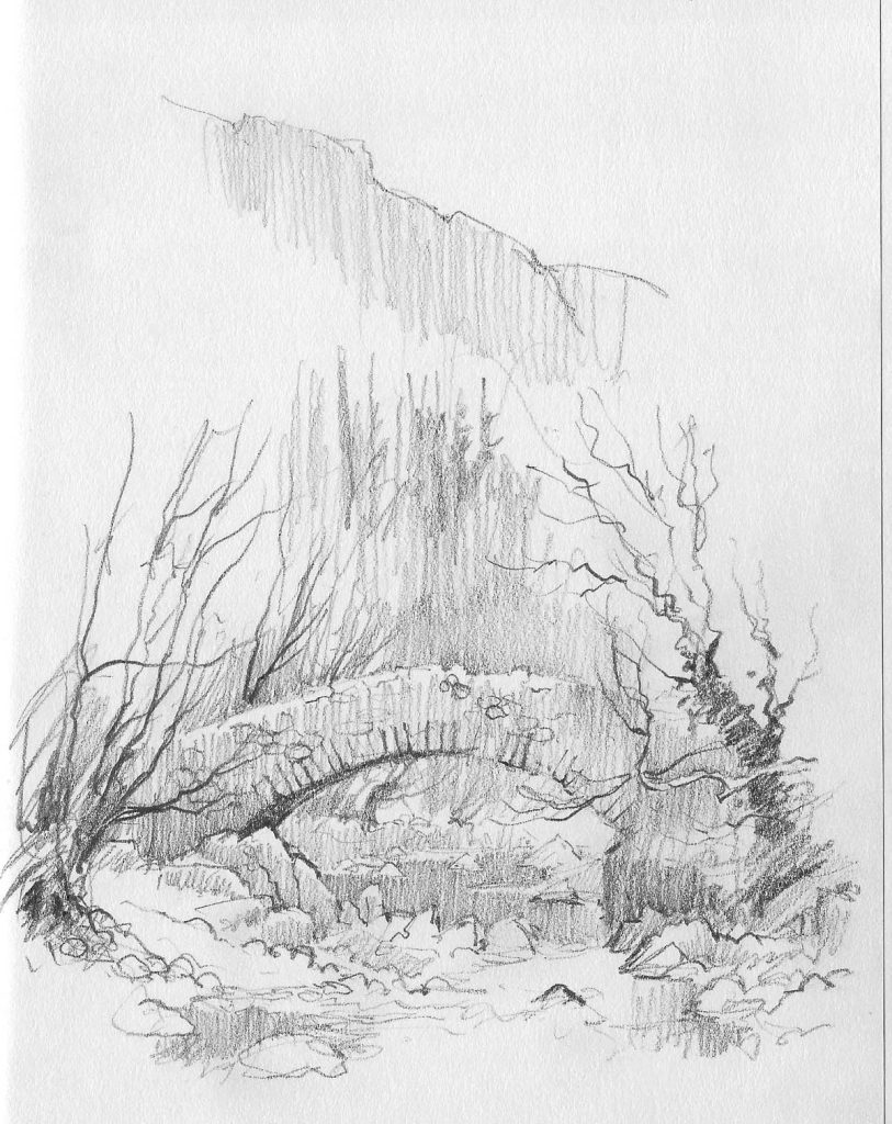
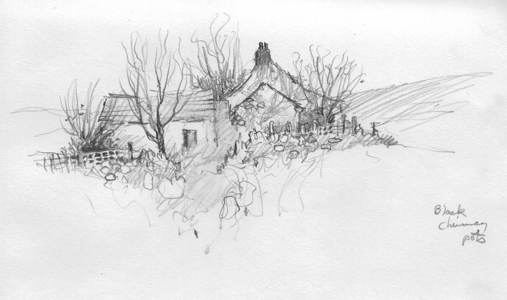
This is a sketch of the attractive old Doctor’s Bridge in Eskdale. Although not completely finished, it illustrates several vital points for landscape artists:
- By carrying out a sketch you are already arranging the composition for a subsequent painting and working out everything you need for the finished result;
- Sketching is the ideal time to assess the major tonal values in a scene- how dark? how light? do any features benefit from an adjustment of tones?
- More than anything else you are learning to observe, learning how to draw and seeing how different aspects of the scene relate to each other;
- Note the cursory manner in which the background has been rendered. If you need to work quickly this kind of treatment is useful for the less important parts of a composition.
Getting the drawing right is especially vital with watercolour painting, so do try to practice this as often as you can. It will have a great impact on your painting.
This summer has been especially hectic, culminating disastrously when I experienced a heart attack at the beginning of September. Luckily in just over an hour after ringing for an ambulance I was on the operating table witnessing the whole operation as they cleared the blockage in an artery. The NHS staff were brilliant and deserve the highest praise. Please be aware that if you get chest pain that runs down into your arms and perhaps up to your jaw you need to get help quickly – don’t delay! And don’t forget, the power of art is quite amazing. Sketching is a wonderful way to de-stress and relax you. I can’t recommend it highly enough.