I love sketching, in fact I love sketching more than painting. There is nothing like the feeling of being outside, hopefully in pleasant weather, capturing an old buildings or lovely landscape in your sketchbook.

Sketch of old cottage in Stockland, Devon, by Jenny Keal
Many of the sketches I make will never become paintings as most of them I do just for the pure pleasure of it, but every sketch I do teaches me something, sharpens my observation and improves my painting and drawing skills.
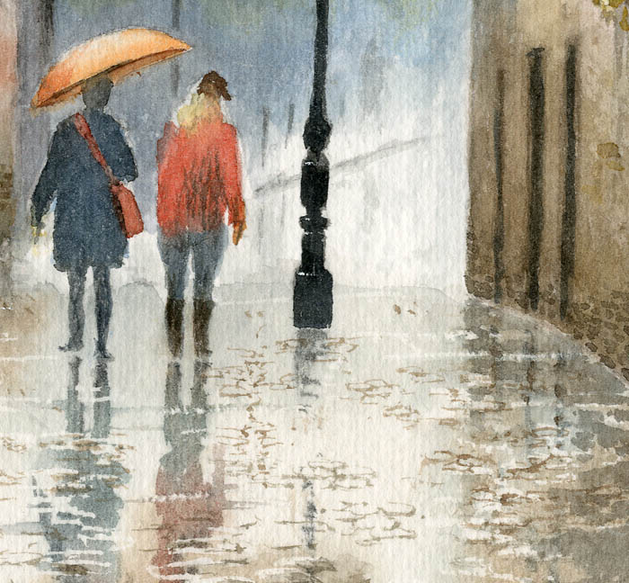
Sketching in watercolour is not as difficult as you might imagine, and there is a sense of liberation about painting a watercolour in a sketchbook that is absent when working on a sheet of expensive watercolour paper in the studio. You do not have to worry if it goes wrong as it is ‘just a sketch’ . You can slosh the paint around and so often I prefer the looseness of the sketch to the carefully considered finished painting, whether it is in watercolour or pastel.

Typical Exmoor scenery, (photo)

Lynmouth Devon (photo)
If you would like to experience this sense of liberation you could join me in Lynmouth, Devon from 20th to 23rd May this year. We will be sketching in watercolour out of doors, and then turning these sketches into pastel paintings in the studio. You don’t have to use pastel of course, you can use whatever medium you prefer. The main emphasis will be on capturing the marvellous Devon scenery, pretty cottages, tumbling streams, woodland and even the coast.
One of the benefits of watercolour sketching is that it definitely improves your studio watercolours.