David Bellamy – Sketch-notes

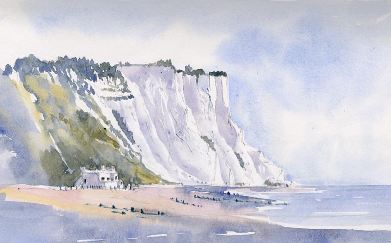
Last week I did a watercolour demonstration for Hythe Art Society in Kent. It was their 50th anniversary and the event was held in the baronial hall of Lympne Castle, a grand place with marvellous views across to the French coast. It was followed by a splendid cream tea – a most enjoyable occasion, and what a lovely art society! May their next 50 years be a great success.

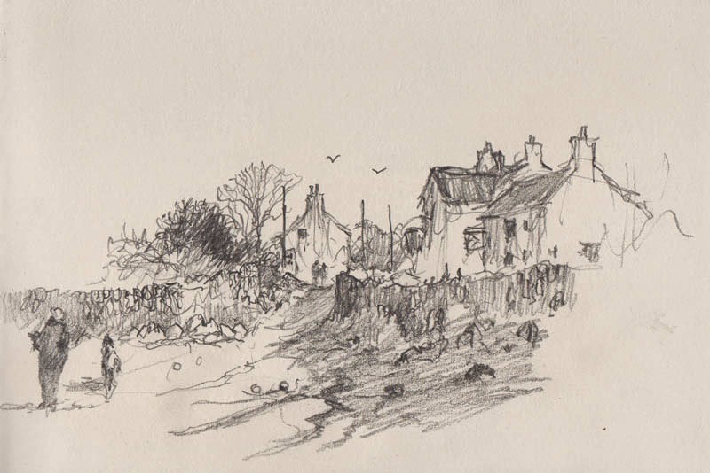
Naturally I was keen on taking the opportunity while on the Kent coast to do some sketching, and though there was not much time I managed a quick pencil sketch of the fishermen’s beach at Hythe.

The fishing boats were backed by a couple of the old Martello towers that run along the coast, thus giving it a touch of local flavour. As you can see, I included quite a few written notes on the sketch to remind me not just of colours, but any other useful information such as the uniform level of the base of the clouds which was very marked and the whole revealing an obvious diminution in the size of the clouds as they receded into the distance. Tonal values were also important with the main shadow area over the closer tower, so I have emphasised this. Notes on observations can be of enormous help to the artist, and even if you are not sketching it is worthwhile keeping a notebook in your purse or pocket to add to any photographs you may take. Sadly the fishermen’s livelihood is now threatened by building taking place to the right of the picture.
Next week I shall be demonstrating at the Patchings Art Festival in lovely countryside just north of Nottingham. My appearances will be at 1pm on Thursday 4th, 1pm on Friday 5th, and 11am on Saturday 6th, with each demo lasting around one hour, so do come along if you are attending the festival. I shall be using the brilliant Saunders Waterford High-white papers made by St Cuthberts Mill. Hope to see you there!

Jenny Keal – Sketching in Kent

David and I have just returned from a trip to Kent where David did a demonstration for Hythe Art Society at the stunningly beautiful Lympne Castle, overlooking Romney Marsh, to celebrate their 50th Anniversary. We were made very welcome by this warm and friendly art group and shared their celebration tea with them after the demonstration.

We took the opportunity whilst in this beautiful corner of England to explore Dover Castle, Folkstone Harbour and St Margaret’s at Cliffe, which yielded numerous sketching subjects. The weather was beautiful as we sketched the White Cliffs of Dover in the hazy sunshine.

white cliffs sm

White Cliffs of Dover, St Margaret’s at Cliffe, sketch by Jenny Keal

I know I’ve said it before but I can’t emphasis enough how important sketching out of doors is to improve your painting. The watercolour sketch above only took about 30 minutes to complete. Working in a hardback cartridge paper sketchbook, with a slight breeze to dry the washes, I was aiming to capture the freshness of the morning and the delicate quality of the light. Leaving out lots of foreground detail to retain the freshness I was aiming for.

db kent 006

Photograph, St Margaret’s at Cliffe

So often a sketch can capture something that is lacking in a finished painting, and working purely from a photograph can rarely portray the magic of a place. When I look at the sketch I can smell the sea, but not when I look at the photograph.

David Bellamy – In Praise of the Tea-Pot

Maintaining morale when out sketching on location is vital, and while some might find a whisky flask useful, I generally rely on tea. Sadly last week in Pembrokeshire the cottage where I stayed lacked that vital ingredient, the teapot. Naturally, this was pretty disastrous, so when out and about I made the most of any such facilities. In the sketch below the right-hand building is a superb tea-shop selling the most delicious cakes, and this is why you might detect a certain hastiness in the rendering of the pencil-work.

However hasty we may be in sketching, it pays to consider the composition carefully when creating a painting from the sketch or photograph. Unless the subject is quite a simple affair I normally carry out an intermediate studio sketch to work out where I wish to place the important elements and the main emphasis, together with the sort of atmosphere I wish to convey. In this instance I would move the composition to the right a little so that the left-hand house did not appear in the centre of the composition, as this would be my centre of interest. I would need more detail to be included above the left-hand wall and figures (detail missed because of the urgency of the tea situation), so I would have to resort to memory, a photograph, or the good old imagination. The main figures would be placed further to the right, a little closer to the centre of interest, and I would make full use of the dark runnels of water descending from the centre right – I have already bent them slightly to come towards the viewer as a lead-in. These are the kind of thought processes that go through my mind before I begin the painting.

Don’t underestimate the value of tea for the artist. I’ve even used it on a painting outdoors on occasion. Last autumn while I was running a landscape painting course a lovely German lady was painting a cottage, which filled her paper. When I asked her what was her focal point she replied, “The tea-pot.” Sure enough, there was a teapot in the window. Such observations may not only bring a smile to your viewers, but might also result in a sale.

David Bellamy – Adding energy into your watercolours

Artists who work solely from photographs really do miss out on those marvellous energizing sensations of being tossed around in the wind, or being spattered in face and sketchbook by rain, snow, hail, or whatever. These sensations link you with the natural world, and provide a tremendous advantage when you wish to really make your paintings more dynamic and full of movement. But, of course, not everyone wishes to go through such experiences.

This  section of drystone wall and wind-swept bush is part of a watercolour painting where I began with masking fluid painted over where the stonework would appear. The dark bush throws up a strong tonal contrast with the top of the wall, and after this had dried I removed the masking fluid and brushed a light blue-grey wash over the right-hand end of the wall to subdue that part.

For the branches I mixed some burnt umber and French ultramarine and applied it with a number 1 rigger. To give a sense of strong wind and movement I painted with vigorous strokes outwards from the centre of the bush. When this was done I spattered a number of small blobs or spots with the same mixture, to further enhance the feeling of robust movement in the branches. With all the branches bent in the same direction it suggests a rather windy day.

Watch for these effects when you are out and about, and note them, even if you don’t have a sketchbook or camera with you. You can, of course, include them in a composition where there is no wind, just to liven things up a but, or to create a sense of movement. This can be really effective on water – I’ve just returned from a few days in London and when sketching on the Thames the water was alive in the wind, creating a real sense of sparkling movement in the sunshine.

Have a go at this more vigorous approach – it really does give your work a marvellous boost.

David Bellamy – Sketching complicated harbours

It’s a tremendous bonus when everything seems to work so well – my Christmas holiday was extended this year by a trip to Devon, and my luck was in: Dartmoor was at its best in frosty conditions with not a cloud in the sky. I was also greeted on the coast with lovely sunshine and some strong atmosphere at times, which suited me down to the ground.

I carried out a couple of sketches of Teignmouth Harbour in late afternoon lighting, and as it is an extremely detailed scene I really needed to subdue the urge to put everything into the sketch. What really attracted me was how the sunlight and cloud shadow highlighted various aspects of the scene, so this called for patience to wait for the right moment to capture those parts that attracted me. The far hillside was crammed with buildings, so my aim was to use cloud shadow to reduce this overwhelming mass, and also to throw the emphasis onto the white boat. I worked on blue-grey tinted watercolour paper, using white gouache for the highlights, much of the washes being done later. Although some of my houses are a little too large, this matters little in a sketch as the finished work can be corrected. Being selective about what you include in a composition is vital, otherwise the work becomes far too cluttered.

This paper is kept in loose sheet form in a sketching folder, with several other types of paper, some of which are tinted, some NOT (or cold pressed), rough or hot pressed, and this gives me great flexibility in choosing the right paper for a particular subject. Carrying a pad for each type of paper would probably need a packhorse with me on sketching trips, so think about making up a pack of sheets of your favourite papers when you work away from home, or on holiday. For further guidance on light and atmosphere see my Skies, Light & Atmosphere in Watercolour 

I hope you all had a great Christmas and wish you much happy painting in the new year.