David Bellamy : The Value of White Gouache

Featured

DAVID BELLAMY: THE VALUE OF WHITE GOUACHE

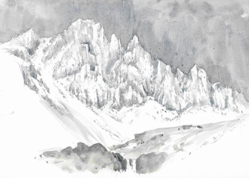
This is the time of year when many get out their sketching gear ready to go on holiday and enjoy some artwork in a new place. I always take my box of watercolour pans along with me, mainly for watercolour sketches, though sometimes I work on a full painting out of doors. For certain subjects it’s actually quicker working in watercolour than trying to render the subject in pencil or pen.

In addition to the half-pan colours I carry a few tubes of watercolours, and these are usually colours that I don’t have in my box but I expect to be useful for a particular trip. A secondary reason is that if I happen to lose my box of paints at least I have the tube colours to fall back on. One tube I always take is that of white gouache, as it is so useful. As well as being essential for tinted papers it is great for little highlights or perhaps rectifying part of the work that has gone astray.

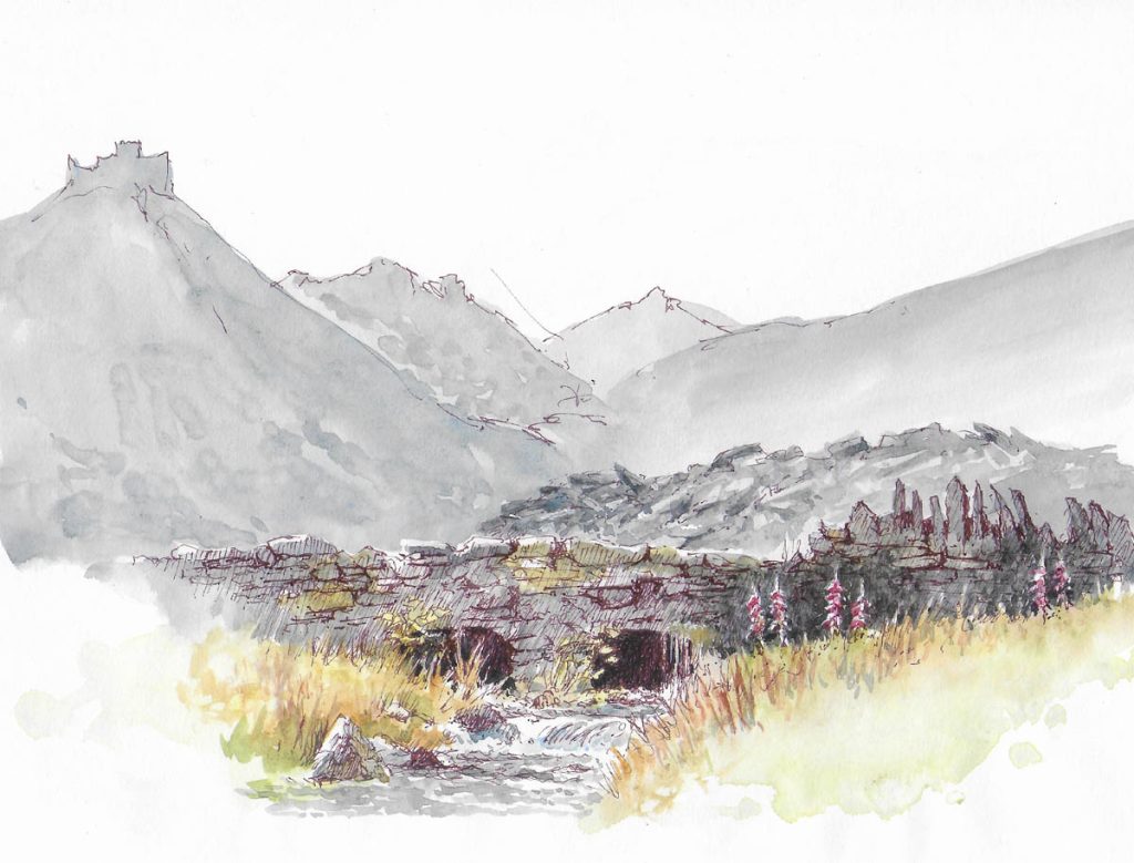
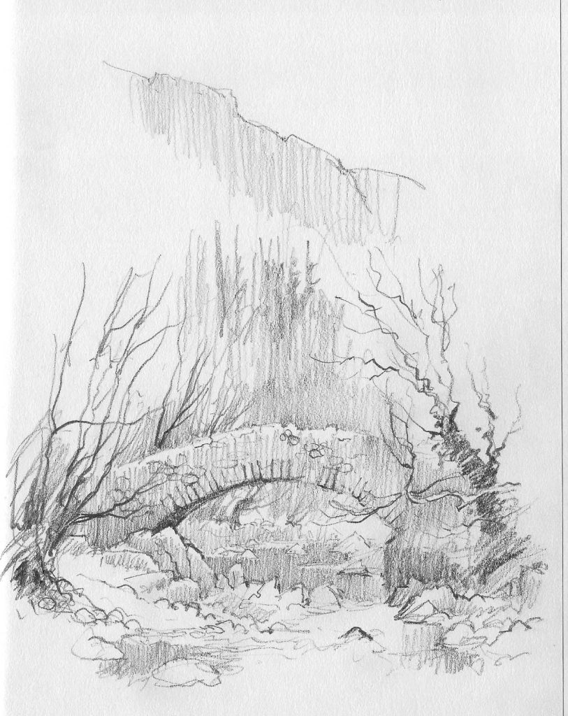
I sketched this stone bridge last week in Cwmorthin, a slate-quarrying area near Blaenau Ffestiniog, and you can see the piles of slate heaped up behind the bridge, as well as mountainous slate slag-heaps in the distance. Those I only indicated vaguely, as the bridge was my main objective. I drew this with a sepia pen and wanted to highlight the foxgloves as they broke up the stonework and added colour to the scene. Alas, I messed this up a bit. One of the difficulties we have as landscape artists is that we don’t have the great range of tones that occur in nature, so we have to modify our tones a little. My foxgloves weren’t too bad, but I felt they could stand out better, so I applied white gouache over them and then when that was dry overlaid alizarin crimson over the gouache. This certainly made them stand out more, and although they are far from perfect I do have a reasonable sketch from which to work up a painting. So it’s always helpful to have a tube of white gouache with you on your travels.

On Saturday I shall be book-signing at Erwood Station Gallery & Craft Centre, about 8 miles south of Builth Wells just off the A470, from 2 to 4 pm. I will also be showing quite a number of the painting from the new book, Watercolour and Beyond, with captions on certain techniques and effects in the painting, and I’ll be happy to answer any queries you may have about painting landscapes, so do come along if you can make it. It’s a lovely spot overlooking the River Wye. Their phone number is 01982 560555. The paintings will be on display throughout July, so if you can’t make it on Saturday they will be around for a while. And incidentally, the book covers quite a bit about working with gouache paints. Enjoy your summer travels and keep safe!

DAVID BELLAMY: PAINTING ICESCAPES

Featured

After five days of gloomy weather in the mountains of Snowdonia last month I decided I just had to go for the subject that was my prime target this time, whatever the last day threw at me. I aimed to climb up Cwm Tryfan to a spot where I could sketch Bristly Ridge, and hope the view was clear when I arrived. The light started well, but deteriorated to the murky mich-mash it had been all week. Plastered in thick ice, the east face of Tryfan gave me hope that my target scene would be likewise, but just being on the mountain gave me such joy, and fired me to do several sketches on the way up.

When Bristly Ridge eventually hove into view it took my breath away. Although I was familiar with the face and had climbed it in ice-rimed conditions, it presents an awesome spectacle, especially after many days of icy easterly blasts. I moved to a position where an attractive cascade and brook offered a superb lead-in and then sat on a friendly nearby rock to sketch in an A4 book. Unfortunately my position was rather exposed to that useful but hostile easterly that still blasted away, but initially the effort of getting up there kept me warm.

The poor light made observation of much of the rock architecture almost impossible to make out, but the ridge outline stood out well, as did the main gullies. I began with a grey pen, quickly drawing in the main features, well aware that I needed to work fast. As the temperature hovered around the freezing point the washes of French ultramarine with a touch of lunar black worked well without freezing up. I inserted the more prominent features first, working right across the composition, then applying a more impressionist style to suggest the lesser important crags and gullies.

A cuppa revivied me but the cold really began to penetrate so I dotted in a couple of climbers some two-thirds of the way up the left-hand slope but could not see the third one at the time. Then I hurriedly included the cascade and rocks, though did not have enough paper left to do a proper job. This is just a basic rendering of the scene, but in a painting I would bring it to life with creative lighting, and not include quite so much detail, losing some with cloud or shadow.

This was something of a nostalgic return as I have had many wild adventures here, some of them extremely life-threatening, a fact that intensifies my love for this magical spot, one of the most impressive in the British mountains.

DAVID BELLAMY Tonal Sketching a Landscape

Welcome to my first blog of 2025 and I wish you all a rather belated Happy New Year. May you have much success with your paintings!

As you may know, I am very keen on sketching, both for the sheer enjoyment of sketching a scene amidst nature, and for recording a composition to work up as a painting back in the studio. On expeditions, holidays and trips they are also marvellous ways of retaining memories of activities, people and places.

This time I’d like to highlight the benefits of tonal sketching in pencil, that is, where you include a lot of tonal areas rather than simply rely on a linear approach. This canal scene illustrates how the dark areas bring out the shape and character of the bridge, the trees and boats, while the medium tones both link the light and dark features and suggest detail and minor shapes. These medium tones become very important in an atmospheric sketch where you may be depicting mist, cloud, sunshine and other less strident features. I used a 4B pencil on a page of A4 size cartridge paper.

As you can see, in this case I have liberally noted down colours and at the top right drawn a larger version of the prow of the narrow-boat so that certain small details become clearer. This is useful if I will be working up a large painting later. Apart from the fact that you are recording the scene in detail and gaining an understanding of it, some details of which might become lost in a photograph of the place, you are laying out a ready-made composition and will probably not need to do a studio sketch from the photograph to ensure that everything is as you wish for in the finished painting.

You may have already seen the new merged Leisure Painter and The Artist magazine, which is packed with great information and illustrations. With so many publications now turning to digital versions I feel it’s so good to support the paper versions – I’m not so happy messing about on small screens! I have an article in the current issue on sketching during my trip to Transylvania last summer. Don’t forget to keep warm when you are out sketching!

David Bellamy: The value of drawing

Many of us are so eager to start painting that we tend to gloss over the need to get the drawing right before our brush touches the paper, and then we wonder why the composition doesn’t work too well. I love drawing, and drawing and doodling are a wonderful therapeutic activity, ideal for calming one after the stresses of modern living. I take my sketching in the field very seriously, even when I may have no need for any more sketches to add to the thousands already done.

This is a sketch of the attractive old Doctor’s Bridge in Eskdale. Although not completely finished, it illustrates several vital points for landscape artists:

  • By carrying out a sketch you are already arranging the composition for a subsequent painting and working out everything you need for the finished result;
  • Sketching is the ideal time to assess the major tonal values in a scene- how dark? how light? do any features benefit from an adjustment of tones?
  • More than anything else you are learning to observe, learning how to draw and seeing how different aspects of the scene relate to each other;
  • Note the cursory manner in which the background has been rendered. If you need to work quickly this kind of treatment is useful for the less important parts of a composition.

Getting the drawing right is especially vital with watercolour painting, so do try to practice this as often as you can. It will have a great impact on your painting.

This summer has been especially hectic, culminating disastrously when I experienced a heart attack at the beginning of September. Luckily in just over an hour after ringing for an ambulance I was on the operating table witnessing the whole operation as they cleared the blockage in an artery. The NHS staff were brilliant and deserve the highest praise. Please be aware that if you get chest pain that runs down into your arms and perhaps up to your jaw you need to get help quickly – don’t delay! And don’t forget, the power of art is quite amazing. Sketching is a wonderful way to de-stress and relax you. I can’t recommend it highly enough.

DAVID BELLAMY LOSING THE FOREGROUND

How often have you viewed a scene where an exciting subject stands in the middle distance and there is a boring or ugly large feature blocking the foreground? These moments can be truly frustrating, yet it is well worth trying to work round the problem if the main subject looks worthwhile. You might be able to alter some of the details in the offending foreground feature, perhaps obscure the worst parts or introduce some really dark shadow to blot it out completely. My own preference is to use a vignette technique if possible, to lose the immediate foreground to create a more pleasing composition.

This is a rough little watercolour sketch I did while overlooking Brasov in Transylvania. The roofs, towers and domes in the middle distance appealed to me, but the foreground was marred by large buildings that were much less attractive. To include these as they appeared would dominate the composition, so I decided to just record their roofs and lose all other detail. There were hardly any windows or doors on this side anyway, so I just hinted at a little foliage and then worked in the large conifer, also losing that at the bottom. I had intended to lay some spatter over the foreground when I returned to base, but somehow forgot. A little spatter and maybe some suggested light foliage would enhance it further. I normally prefer to include a gap where there is a feature right across the foreground to suggest a lead-in, so if I followed up with a painting of this scene I would probably create such a gap perhaps to the immediate right of the large conifer.

With summer here it’s a great time for getting out to paint or sketch before nature, so I hope you are making the most of it. If you are nervous about working out of doors with or without people around then just take an A6 sketchbook in your pocket and a few pencil stubs and people will think you are just making a few notes. That will help you gain confidence to work on larger, more ambitious work. In Transylvania I was naturally a little wary of bears, Goths and vampires, but all passed without a great deal of mishap. Happy sketching!