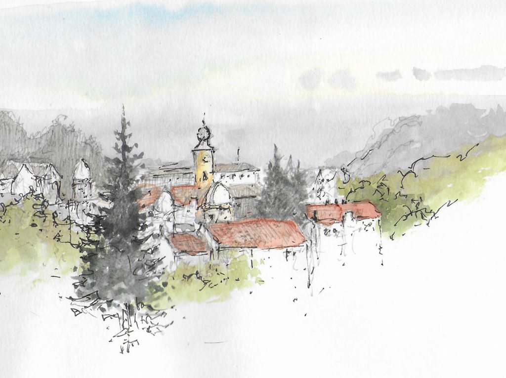
With modern super-granulating colours you can now introduce some amazing effects into your watercolour landscapes, and experiment with abstract passages to create interesting results. In this scene from my new book, Watercolour and Beyond, only a few motifs anchor the scene to reality: the hard shapes of the dark rocks; rocks detail in the top left; and the bush at the top.
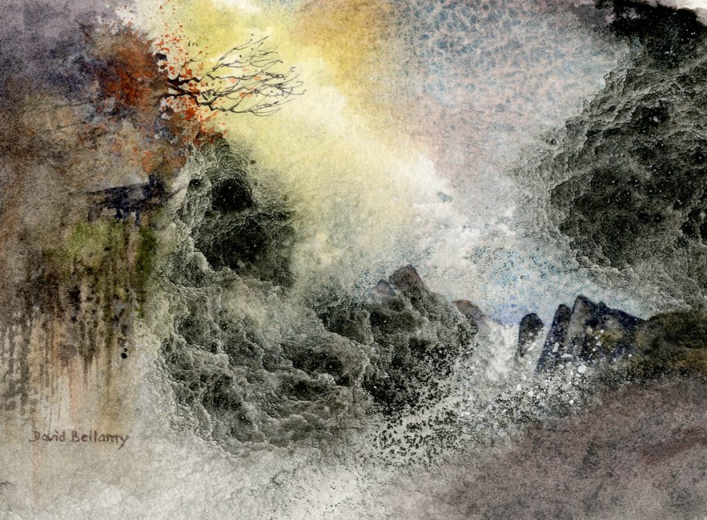
The cascade of light was painted with sheer abandon, flowing in nickel titanate yellow and lunar blue into the upper section, then applying lunar black, both the latter two colours heavily granulating. I then immediately squirted copious amounts of granulating medium into the lunar black, using a pipette, varying the angle in places. Some of the rocks were painted wet-into-wet, while the more prominent ones were added once the paper had dried completely. The protruding bush was drawn with watercolour loaded onto the nib of a dip pen to achieve the very fine effect, and I completed the work with some spattering of white gouache on the bottom right to suggest spray, and transparent red oxide over the bush.
I painted this on Bockingford 200lb rough paper and the paints are the superb Daniel Smith Extra Fine Watercolours
Watercolour and Beyond is published by Search Press We no longer sell by mail order, but the book can be obtained direct from Search Press or any good book shop. It was great fun to write, with the emphasis on experimentation, and written to introduce a fun element into painting, while at the same time depicting some fascinating new techniques with watercolour painting. Henry Malt in Artbookreview.net says of the book: “What we have is, quite simply, his best book” I hope you enjoy it!