David Bellamy – Painting the Wye

It’s been some time since I last created a blog post – the problem has been that the Blogspot blogging software appears to have been crapulated by the blogging company without warning or providing any idea of how to fix it. The pictures simply appear as a string of incomprehensible characters, which of course, is not what you would want to see. Additionally I have been away from home a lot this summer, but now we’re trying to fix it.

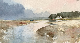
The image I have before me is an 8-line string of characters, but I am hoping that the resulting image on your screens will be a watercolour of the River Wye in Summer. The mountain and water have been kept simple, the more distant water a horizontal sweep of cobalt blue with very little water on the brush, softening down into a light area, with some dark reflections introduced at the sides. The dark tones on the closer trees suggest the impression of distance in the composition. I have over-done the foreground flower collection a bit, but sometimes it is interesting to include strong detail in the foreground when most of the composition is quite simple. The painting will be part of a small exhibition at Erwood Station Gallery & Craft Centre, which lies a few miles south of Builth Wells in Powys. It starts on Saturday 23rd September and runs until 15th October, every day. I shall be giving a demonstration of painting the Wye in watercolour on Monday 25th September at 7pm, admission by ticket only because of limited space. Telephone 01982 560555 for the Centre. More details with the next blog which hopefully will have all the problems resolved, although at the moment I’m more inclined to believe in magic than these software geeks!

David Bellamy – Liberate your painting with scraps of paper

I often find that when I’m testing a wash or new colour on a scrap of watercolour paper that I produce some marvellous results, yet when I try to repeat the exercise in a proper painting it often falls far short of what I hope will happen. So why not try to capitalise on this perversity by now and then painting on a piece of scrap paper that you might otherwise throw away?    This little watercolour was painted on a discarded piece of 300lb Saunders Waterford rough paper 9 inches by 4.5 inches, and I loved every moment painting it. With such a small, insignificant size you tend to lose any inhibitions, and it’s certainly a liberating feeling, as you feel you have nothing to lose even if you make themost astounding mess!

    One of the main features I love is the soft wet-in-wet reflections in the water below the cottage. These were achieved by wetting the area of the water below the building and out as far as the central boats, leaving it for a few minutes to start drying, and then applying the dark green-grey reflections of the massed trees into the wet area, leaving the part directly below the cottage as white paper. At this stage it’s vital to watch how the dark reflections creep outwards as though they deliberately want to annoy you. With a damp – a really ‘thirsty’ brush (a number 6 round brush is usually fine for this) – pull out any of the dark colour that edges its way beyond where the reflections should appear. You may need to do this more than once.

    This painting appears in my Seas & Shorelines in Watercolour book, recently published by Search Press, which not only covers a really wide variety of coastal scenery and features, but is also crammed with sky treatments of all kinds that you should find useful for adopting in your own work. Signed copies are available via my website  ….and don’t forget to make full use of those bits of scrap paper lying around!

David Bellamy – Seeking out a rural lane to paint

I have a great affection for rural lanes, especially old rutted cart-tracks. While they are superb for leading you into a composition they are also excellent subjects in their own right. When I plan a sketching trip I often seek out winding lanes on the walking map, and where they lead to an interesting-looking subject such as a mountain or hill, then there is a strong chance of a good subject.

This particular lane heads towards the Brecon Beacons and I tramped it on a sunny winter day. I particularly liked the way the low sunlight cast shadows across the lane, and was keen to include this aspect, as well as giving the feature a few extra ruts for good measure. Ruts, puddles, clumps of grass and weeds and stones can be exaggerated or even added if they are not present, to give the composition more character. Keep a file of drawings, sketches and photographs of these countryside features so that you can add them in when needed. Undulating hedgerows with gaps here and there enhance the rustic nature of the place as do mature trees and bushes, and if you’re feeling really bold why not include a rustic shepherd wending his weary way home?

The painting was done on a sheet of quarter-imperial Saunders Waterford rough paper, a beautiful surface to work on, and the rough surface enhanced the track, especially where I used drybrush strokes.

It’s been all-action since my last blog, from the marvellous annual festival at Patchings Art Festival in Nottingham’s Robin Hood country where I demonstrated the Saunders Waterford papers for St Cuthberts Mill, and had the pleasure of meeting a lot of you. I’ve also just returned from an immensely rewarding trip to Germany, so that has a lot of potential for some great artwork.

I do hope, like me, you’ve enjoyed this amazing summer and made full use of it with your paintbrush!

David Bellamy – Obsessed with bottoms

As landscape painters why are so many of us obsessed with bottoms? Why do we feel the compulsion to describe everything in minute detail? It’s not necessary and in fact detracts from the overall effect in a painting.
I have cut out some of this composition so that we can get in closer to view the relevant bits. Note the drystone wall on the left, the white walls of the buildings and the small gate immediately to the right of the barn, and how I have not rendered a definite bottom line in each case. By omitting this I have endeavoured to make the effect more natural. Usually I only paint in the top two or three bars of a five-bar field gate. You can see that for the right-hand hedgerow I have indeed given it a fairly distinctive bottom, probably a minor aberration when I was desperate for coffee! It’s not a great problem as it is in the distance and the bottom part of the hedgerow could be softened off with a damp brush.

So watch those bottoms as you’ll get a more natural effect if you keep them soft. Hard boundary lines around a feature can make it look cut-out, rather like a garish sticking plaster on a donkey’s ….er, bottom.

The watercolour was painted on the fabulous Saunders Waterford 200lb rough high white paper in order to make the most of the textures on the hillside.

David Bellamy – Making the most of poor weather

I hope all of you out there had a great festive season, or if Christmas isn’t your thing then you have been enjoying yourself. I seem to have been everywhere except by the laptop, hence the long silence. One place I did visit just before Christmas was sunny Devon, but as I found it gloomy and misty I decided to make the most of the atmosphere and capture some wet-into-wet mistiness. Whatever the weather is doing out there it always has something for the landscape painter.

This watercolour sketch was carried out on a cartridge sketch-pad. I chose this because firstly the smooth paper dries quicker than a rougher surface, which in the damp atmosphere would take some time to dry; and secondly I wanted to juxtapose the softness of the wet-in-wet technique with the hard sharpness that is accentuated on smooth paper. If you don’t like cartridge paper for quick washes try a hot pressed paper – Bockingford comes in ideal HP pads for this sort of work. First of all I laid on Naples yellow in the sky, then drifted it to the left where I blended in a light green wash where the two largest trees appear.

Without pausing I painted the fainter tree in with ultramarine and burnt umber using a strong mixture to keep the shape of the tree – working into the damp paper you really don’t want much water on the brush!  Again without pausing I then drew into the green wash with an indigo watercolour pencil while the wash was still damp. I sat back and drank a coffee while the sketch dried and then I laid a medium tone around the trunks of the tall trees, thus highlighting them. Note also how I have left the vegetation under the trees sharp-edged to counter the soft, misty background – much easier to achieve on a smooth surface. It’s only a rough sketch but it gave me great enjoyment and brightened up an otherwise gloomy day.

If you need cheering up then why not tune in to CBEEBIES on BBC Television on Saturday 9th January at 10.45am and 15.40 – Catherine, my daughter is doing some of her whacky stunts. She is out in Australia at the moment and next month will be performing in Adelaide.

A very Happy New Year to you all and may it be your best painting year yet!