Strong evening or early morning light, when it is low on the horizon, can produce some powerful atmospheric effects, such as losing detail, creating a dynamic sense of drama and changing the actual colours of various features. However, it’s not always easy to look into fierce sunlight and observe the scene for any length of time, even with sunglasses. Taking a series of photos, each with a different aperture setting can reap rewards, but if you are able to quickly capture the essential elements of the scene with a colour medium, so much the better. Watercolour pencils can be very effective for this, as watercolour paints can be quite a challenge in such fastly-changing effects.
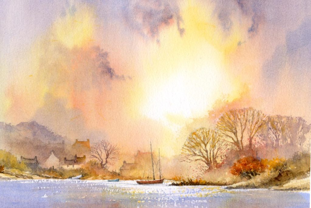
Evening light, Llangwm
In this painting carried out on Waterford 300lb NOT paper I created the light area in the sky with Naples yellow around a white spot and then introduced quinacridone gold and permanent alizaring crimson. Working quickly I brought in washes of weak French ultramarine, in places mixed with cadmium red for the stronger wisps of cloud. These wisps were applied with a large swordliner brush. After allowing the paper to dry I painted in detail of trees and buildings with mixtures or French ultramarine and cadmium red in various strengths, sometimes with hardly any ultramarine. Aussie red gold also enlivened things up in places, particularly the right-hand bush.
By leaving out certain details like one end of a building on the sunlit side, the sense of mood is increased, with the colours becoming cooler the further away they are from the centre of the light. You may well have existing photos that can be used to create a work of this nature, but do take care when looking into fierce sunlight and wear dark sunglasses to protect your eyes. Avoid staring directly into the sun.
Well, Christmas is upon us once more, and hopefully you will find some artistic present in your stocking! Have a great Christmas and I wish you every success with your paintings in 2024, and good health.
My exhibition at Erwood Station was a great success with sales, interest and raising money for the Campaign for the Protection of Rural Wales,although the initial part proved a little difficult as I was under the weather for a while. It’s great to have exhibitions in the major galleries, but this time I was really happy to do something locally.
Erwood Station will continue displaying some of my work, and it’s a lovely place to visit.The scene I am showing today is a watercolour of the Brecon Beacons where I have used lighting effects to create interest. Before carrying out a painting it really helps if you consider your ligting arrangement beforehand. This particular composition shows quite complicated lighting areas, and for this I did a preliminary studio sketch with emphasis on the tonal values of the various passages. Normally I prefer to let the main light flood over the focal point – in this case the farmhouse and outbuildings, but I strayed from the norm here by keeping an area of light in the middle distance, beyond the farm, with the farm itself not especially well-lit. Trying new variations from your usual approach can be exciting and lead to interesting effects. The light on the background peaks provides variation, though I did not want this to compete too strongly with the focal point. I love interesting skies and sometimes indulge in cloud-watching for some time, and although this composition could well have been served effectively with a simple sky, I often can’t resist working up a cloud mass that contains a striking patch of light as in this case. Do take time to consider your lighting treatment in your painting as it can make a terrific difference to a work.
Once again, autumn is with us, and the opportunity to indulge in bright, warm colours in our landscape paintings. This time last year I found the striking colours in the Bavarian Alps absolutely mind-blowing, with every day in brilliant sunshine.
This scene shows a track leading to Little Langdale in the English Lake District. I was lucky at the time to encounter snow on the distant fells, and this accentuated the bright colours of the right-hand small tree. For this I used two of my favourite Daniel Smith colours – Aussie red gold, which was applied first and when this was dry I added transparent red oxide. These two work extremely well for autumn scenes. The dark ridge in the middle distance was rendered with Moonglow, another useful colour, and in places I have pulled out the colour with a small sable to indicate lighter patches.
The painting is reproduced in my Landscapes Through the Seasons in Watercolour book, signed copies of which are available from my website
Watch out for those autumn colours and make sure you are armed with the right colours……..and if you get some snow as well, then that’s a great bonus!
A few weeks ago I received an interesting query about how one determines what colours to use in response to a landscape. I could write a book on this fascinating subject, but I’ll try to answer that as best I can in this limited space and perhaps follow it up with an article on the subject later.
In some of the practical art books I read during my early days we were warned against relying too much on the colours in photographs taken of landscapes as the colour reproduction was often unrealistic, and it was best to work from the landscape first-hand to achieve the precise colours in the scene. This approach, however, adopts the premise that we simply want to copy exactly what is in front of us, and to blazes with any of our own artictic creativity. In our paintings we are not trying to emulate photography.
In this painting the topographical features and buildings are fairly faithful to the scene, but the colours could not be much more different to what was actually present on this occasion. I have grossly romanticised the colours with mauves, orange, alizarin and other colours for both sky and land, and created a glimmer on the water. JMW Turner likewise used colour on many occasions for its emotional power, rather than sticking to what was before him, much to his contemporaries’ astonishment. Colour is closely bound to mood and emotion, so much thought should be given to your proposed palette before you begin painting.
You may wish to take a less romanticised approach, but even so it is perfectly legitimate to alter the colours from the original scene. Colours are affected by the weather, light, seasons and a host of other factors. For example, one day a field can be a pale green perhaps, and the next when the farmer has cut the hay it can be a distinct Naples yellow. Fields get ploughed up and lighten in tone and colour when the dry out, and I have seen a cottage roof change in brilliant sunshine from black to the most brilliant gleaming whiteness after a shower of rain followed by more sunshine. I often change a field by the centre of interest from a dull green to a shimmering yellow to draw the eye in, and perhaps do the opposite to the landscape at the edges of the composition so that it doesn’t draw the eye away from the centre of interest.
Landscapes are commonly overwhelmed with greens, but if you try to copy every green you can see you will be ovewhelmed, and the result can look chaotic. What may look right in reality or a photograph simply may not work in a painting. We need to interpret colour as much as we need to do so with other aspects of a scene. Choose a maximum of three or four greens. Variegate them by dropping in other colours while they are still wet, but also consider changing them for a totally different colour. I’ve even seen red grasses out there, so you have quite a range to choose from!
OK, but what if you see a colour out there that you really like, and want to replicate? Study it carefully and experiment with as many colour mixes as you can in an effort to achieve a decent result, but you need to do this on separate paper, not on the composition you are working with. If it’s still not working touch in a third colour into the mix. Another way is to take out colour swatches of various greens (or whatever colour you wish to relicate) and try to match one as close as possible to what excites you, noting whether it is darker, lighter, warmer, cooler, more or less intense, and so on. Back at home you can then experiment further and study other artists’ work to see if they have created a similar colour, and by which mixtures have they achieved the result.
I hope this helps. I’ve recently returned from Cornwall where I ran a course organised by Alpha Painting Holidays. Matthew not only organised a great location, but also organised some truly wild weather which brought us some amazingly dramatic seascapes with huge breaking waves. It was great fun.
I have a zoom demonstration on Saturday 24th September at 12.30 pm in conjunction with Patchings Art Centre, so do please join us if you can. It’s free and will last one hour. I shall be demonstrating coastal scenery, and the link is as follows:
I see my last blog was on 1st July, the long gap being the result of an all-action summer with little time for writing. In August I visited Germany, partly to do some research and partly as a holiday. Getting round the Covid tests proved quite a challenge, creating stress and uncertainty on occasion. In Wales I ordered a self-test from Boots, only to find I could not send it in time because there were no Priority Post-Boxes in the area, although the Royal Mail showed plenty of these around, including one apparently in Llanelwedd Quarry of all places! This is totally unacceptable behaviour.
In Pembrokeshire I’ve recently dropped off a number of paintings at the Waterfront Gallery in Milford Haven. The gallery shows a wide variety of paintings styles and is a very pleasant place to visit.
This is part of one of the paintings at the gallery, and shows a quiet corner of the composition. The centre of interest is away to the left, off-picture here, and the boat acts as a means to balance the composition. I did not wish to make it too prominent, so I lost the bottom of the blue hull in the muddy foreshore and dotted in white gouache blobs here and there to add interest in suggesting seagulls. On such a small scale it’s not easy to give the impression of birds, but I used a number one rigger and tested the white gouache on dark rough paper before applying it to the actual painting. This method also has the advantage of getting rid of excess white paint on the brush before doing it for real. If you over-blob and get a ghastly mess, simply wash it off with a damp brush, dry the area with a tissue and wait till the paper is dry and then try again. With practice you’ll find this will improve enormously.
I shall try to make my blogs more regular in future, but the call of the wild is hard to resist……..


