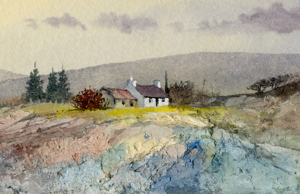
David Bellamy – Painting with harmonious colours

 One event in the year that I especially look forward to is the Patchings Art Festival, and I shall be demonstrating there once more on the fabulous Saunders Waterford  and Bockingford papers, in the St Cuthberts Mill marquee on the mornings of 13th, 14th and 15th July. If you’ve never been, do treat yourself this year as it is a terrific show in lovely surroundings, and overflowing with artists demonstrating their various styles. There’s no place quite like it for being supercharged with artistic inspiration! 

 This is just part of a small watercolour as I want to highlight more of the detail, and some of the techniques used I will be showing at Patchings. The moody background was created with the wet-into-wet method, with the whole of the background carried out with just burnt umber. Whilst the wash was still wet I suggested the trees with a rigger, the larger ones with a number 4 brush, and with hardly any water on the brush – almost pure paint so that it did not run. Naturally I test it on the side first to check if the timing is right.

 On this side of the bridge I introduced other colours: yellow ochre, cadmium red and French ultramarine. My aim was to keep the colours in harmony, all in the brown-ochre segment of the colour wheel. The ultramarine, of course is not in that category, but I’ve mixed it in such a way that it is simply darkening the effect with burnt umber, and not displaying any sign of its blueness. Adopting this approach will give your work a great feeling of unity.

I hope to see you at Patchings in July and for further information on the Patchings festival check out these links:

David Bellamy – The importance of your little blobs

 I see my last blog was on 1st July, the long gap being the result of an all-action summer with little time for writing. In August I visited Germany, partly to do some research and partly as a holiday. Getting round the Covid tests proved quite a challenge, creating stress and uncertainty on occasion. In Wales I ordered a self-test from Boots, only to find I could not send it in time because there were no Priority Post-Boxes in the area, although the Royal Mail showed plenty of these around, including one apparently in Llanelwedd Quarry of all places! This is totally unacceptable behaviour.

In Pembrokeshire I’ve recently dropped off a number of paintings at the Waterfront Gallery in Milford Haven. The gallery shows a wide variety of paintings styles and is a very pleasant place to visit. 

This is part of one of the paintings at the gallery, and shows a quiet corner of the composition. The centre of interest is away to the left, off-picture here, and the boat acts as a means to balance the composition. I did not wish to make it too prominent, so I lost the bottom of the blue hull in the muddy foreshore and dotted in white gouache blobs here and there to add interest in suggesting seagulls. On such a small scale it’s not easy to give the impression of birds, but I used a number one rigger and tested the white gouache on dark rough paper before applying it to the actual painting. This method also has the advantage of getting rid of excess white paint on the brush before doing it for real. If you over-blob and get a ghastly mess, simply wash it off with a damp brush, dry the area with a tissue and wait till the paper is dry and then try again. With practice you’ll find this will improve enormously.

I shall try to make my blogs more regular in future, but the call of the wild is hard to resist……..

David Bellamy – On-line watercolour workshop of a Mountain Painting

I write this as a follow-up to my online workshop this afternoon on Shopkeeparty, which was a simple 45-minute demonstration in watercolour of the Middim Khola River in the Nepal Himalaya where I led a trek and paint group in 2000. The aim was to demonstrate how to achieve a sense of space and distance, create a tranquil mood in dramatic backlighting, dropping in spot colour and illustrating several brush techniques.

This shows the finished painting: I added a little extra sparkle by scratching with a scalpel below the trees and finally painted in a few dark blobs in the foreground to suggest larger stones in the river, but otherwise it is basically as completed during the workshop. If you took part I hope you enjoyed the experience and if you missed it you can still find it on Youtube

Next Tuesday, 11th August I will be running a watercolour Masterclass again with Shopkeeparty, and this will last around 2.5 to 3 hours. The subject will be Blencathra mountain in the Lake District with Thirlmere in the foreground, and of course with much more time I will be covering so much more, showing mountain structure, atmosphere, reflections in still water, massed and individual trees, crags, how to introduce more colour naturally, brushwork, negative painting and much more. I will be using my favourite, Saunders Waterford paper. Details are available at    https://shopkeepeasy.com/davidbellamy   You will be able to ask questions throughout and we will move at a pace that will ensure you can keep up with the painting being demonstrated. The Masterclass painting will bring in more colour than the above scene which was aimed at creating a strong moody backlit subject.

In the meantime, enjoy your painting!

David Bellamy – Creating a Splash

One aspect of life I am really missing in lockdown is being by the sea, and especially my native Pembrokeshire with it’s incomparable combination of sandy beaches and stunning cliff scenery. I’m desperately in need of being splashed in the face by some wild breaker crashing on the rocks, so I thought you might like to see how I tackle these fascinating actions of the sea.

This is the sort of sea that all self-respecting sailors should be indoors, but the kind I love to catch in a sketch. Just being there and observing what happens when the sea crashes onto the rocky anvils helps you understand what is going on, and happily it is repeating itself all the time. I often stand mesmerised by these moving images, then snap out of my reverie and consider how I would render the effect in watercolour. By watching every part of that moving scene in succession you will learn a lot about moving water and a sketchbook plus a watersoluble pencil will help you record the moment without any need to be completely accurate.

To capture the white splashes in this painting I brought down the cliff colour – light red with spots of cadmium red here and there at the top, then halfway down introducing purple – a mixture of cadmium red and French ultramarine – for the lower cliff. I laid it down as a very wet wash, but as I came closer to the rocky anvils I wiped the brush on a towel to lose the excess liquid and then rolled the number ten round sable on its belly around the top of the rocks. This created an intermittent and ragged edge of purple around the white of the paper above the rocks. Where it went wrong and left an ugly mark as sometime happens I quickly pulled out the offending splodge with a damp brush, although if I can’t manage that at the time I simply let it dry and then scrub it out with a damp old brush (not your brand new number ten sable!). This was painted on the beautiful Saunders Waterford rough surface which helps enormously to create the ragged edges round the splashes as well as rock textures. A NOT surface will work well but the rough version will help you even more in this instance. There are many examples of these various techniques for rendering waves and sea action in my book Seas & Shorelines in Watercolour which can be obtained from my website http://www.davidbellamy.co.uk

There are other ways of capturing these splashes – sometimes I wet the area above the rocks and then lower the purple wash (or whatever colour I am using) into the wet area, working it round the splash. This has a lovely clean effect but you often will need to adjust the shape of the splash by pulling out colour with a damp brush. Try these lovely effects out on scrap watercolour paper first and have fun! Right, without the sea and on a very hot day here I think it’s time to go and jump in the river…………..    take care!

David Bellamy – Painting the river bank

So often with landscape painting it is those less significant features that trip us up – that clump of grass in the foreground, or awkward blob of a hill in the background. Dealing with these is often best accomplished by reducing the item to a mere suggestion or hint to reduce their impact. This aspect of painting was recently brought to my attention by one of my blog-readers who was having trouble with river banks and reflections.

The painting I have chosen to illustrate this problem varies considerably from the photograph of Ian’s subject, but does hopefully answer some of the points raised. Where the farther left-hand bank abuts the sparkling part of the stream I have painted mainly yellow ochre, but dropping in some light green and red in places while the paint was still wet. When this area had dried I then modelled the sloping bank by working in the darker hollows with a mixture of something like cobalt blue and raw umber, softening off the darkness of the wash so that it left the original yellow ochre parts light at the top curve of the bank where it catches the light.

Notice the closer left-hand bank is darker, and this helps suggest depth. It’s fine to have part of the bank dark, caused by shadow, but best not to have the whole line of the bank in the same dark tone. You don’t have to paint it exactly as it appears, so introduce some lighter spots and stamp your own creativity on the work. With the field beyond the bank, keep this as a simple wash similar to that on the left side. If there are light or dark lines along the bottom of the bank where it meets the water then make this effect intermittent as it can intrude if taken all the way along the river.

The reflections in this scene were mirror-sharp in the placid foreground pool, but I wanted them to be less prominent and rendered them using the wet-in-wet method, dropping in dark reflections and then pulling out the light ones with a damp brush, but that is best left for a separate blog in the future. I used Saunders Waterford NOT paper for this watercolour.

Water is a devilishly difficult subject to paint, but when you get it right it really does make the painting sing!