Next month, my new book, Watercolour and Beyond is published by Search Press. It’s quite different from my earlier books in that although it begins with traditional techniques it is mainly concerned with introducing new methods to watercolour landscape painting. One example shows how to use masking fluid not just for masking out intricate details, but to employ it in a much more creative manner. Or producing delightful effects by stamping with cosmetic sponges and variegated colours. Super-granulating colours can achieve spectacular passages in your work, and by introducing non-art materials into your landscape compositions your can add a new dimension. There are also ideas for various projects, some of which don’t involve creating wall-hung art, but give you alternatives for your work.
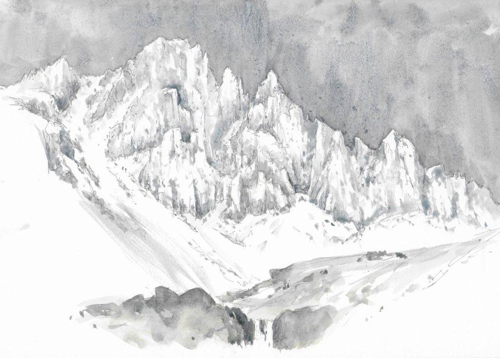
The painting I have chosen as an example from the book shows how a foreground can be embellished with Daniel Smith Watercolour Ground, which is rather like gesso in consistency, but it will happily take your watercolour washes. I have cut out a large part of the composition so that it’s easier for you to see the amazing textural effects you can achieve with this method.
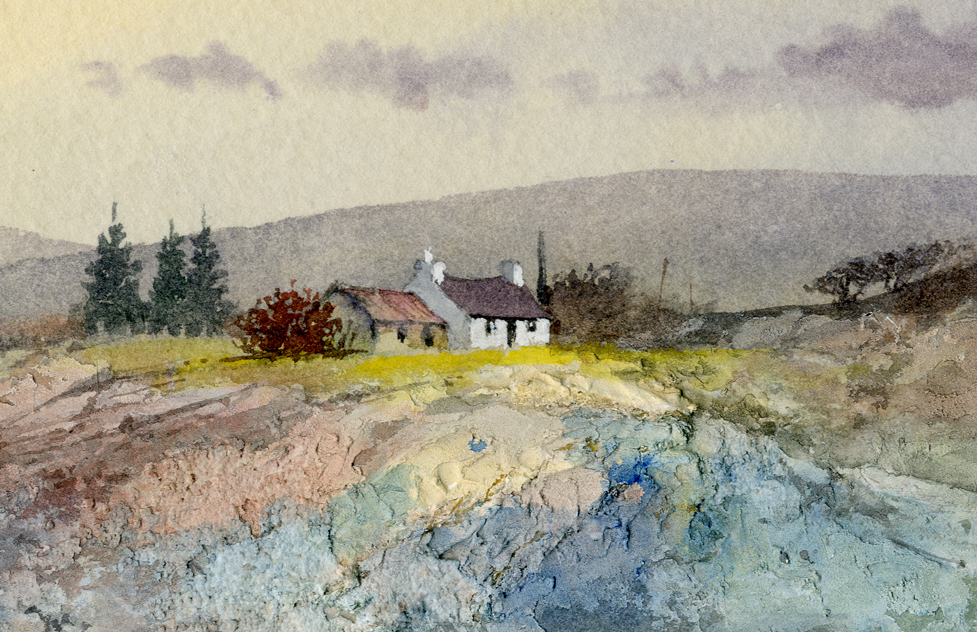
To suggest the rough foreground Daniel Smith Watercolour Ground was laid on with a painting knife a couple of days before beginning the painting, and in the final stages I laid washes of Naples yellow, potters pink and pthalo blue over the watercolour ground, merging them all in while they were still wet. The ground is especially effective in rendering rocks, cliffs, rough walls, mountainsides, river banks and many other landscape features.
One of the main aims in writing Watercolour and Beyond was to encourage experimentation and bring a sense of joy into painting. Whether you paint full-time or just now and then you will find the techniques and ideas crammed into its pages will give you plenty of inspiration and a wonderful feeling of trying something new in your painting. We no longer have a mail-order shop, but of course you can get the book direct from www.searchpress.com or from your local bookshop.
On Saturday 3rd May the Erwood Station Landscape Artist of the Year competition gets under way with the first heat. There will be one heat each month throughout the summer, and if you wish to participate you can get information at 01982 560555. It is a great place to spend the day painting with others, and is a great learning experience. I shall be one of the judges during the first heat, so maybe I’ll see you there.