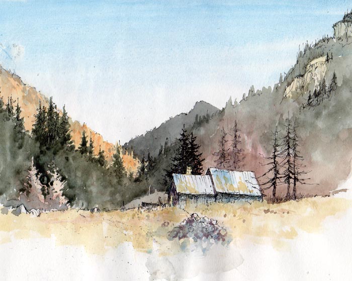
After five days of gloomy weather in the mountains of Snowdonia last month I decided I just had to go for the subject that was my prime target this time, whatever the last day threw at me. I aimed to climb up Cwm Tryfan to a spot where I could sketch Bristly Ridge, and hope the view was clear when I arrived. The light started well, but deteriorated to the murky mich-mash it had been all week. Plastered in thick ice, the east face of Tryfan gave me hope that my target scene would be likewise, but just being on the mountain gave me such joy, and fired me to do several sketches on the way up.
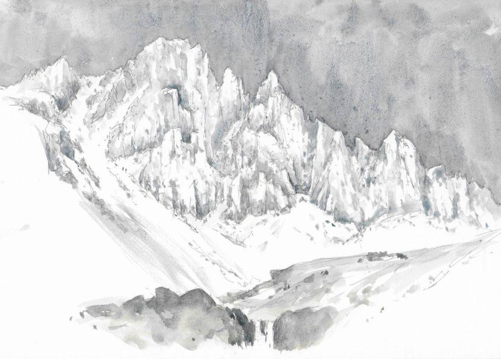
When Bristly Ridge eventually hove into view it took my breath away. Although I was familiar with the face and had climbed it in ice-rimed conditions, it presents an awesome spectacle, especially after many days of icy easterly blasts. I moved to a position where an attractive cascade and brook offered a superb lead-in and then sat on a friendly nearby rock to sketch in an A4 book. Unfortunately my position was rather exposed to that useful but hostile easterly that still blasted away, but initially the effort of getting up there kept me warm.
The poor light made observation of much of the rock architecture almost impossible to make out, but the ridge outline stood out well, as did the main gullies. I began with a grey pen, quickly drawing in the main features, well aware that I needed to work fast. As the temperature hovered around the freezing point the washes of French ultramarine with a touch of lunar black worked well without freezing up. I inserted the more prominent features first, working right across the composition, then applying a more impressionist style to suggest the lesser important crags and gullies.
A cuppa revivied me but the cold really began to penetrate so I dotted in a couple of climbers some two-thirds of the way up the left-hand slope but could not see the third one at the time. Then I hurriedly included the cascade and rocks, though did not have enough paper left to do a proper job. This is just a basic rendering of the scene, but in a painting I would bring it to life with creative lighting, and not include quite so much detail, losing some with cloud or shadow.
This was something of a nostalgic return as I have had many wild adventures here, some of them extremely life-threatening, a fact that intensifies my love for this magical spot, one of the most impressive in the British mountains.