How often have you viewed a scene where an exciting subject stands in the middle distance and there is a boring or ugly large feature blocking the foreground? These moments can be truly frustrating, yet it is well worth trying to work round the problem if the main subject looks worthwhile. You might be able to alter some of the details in the offending foreground feature, perhaps obscure the worst parts or introduce some really dark shadow to blot it out completely. My own preference is to use a vignette technique if possible, to lose the immediate foreground to create a more pleasing composition.
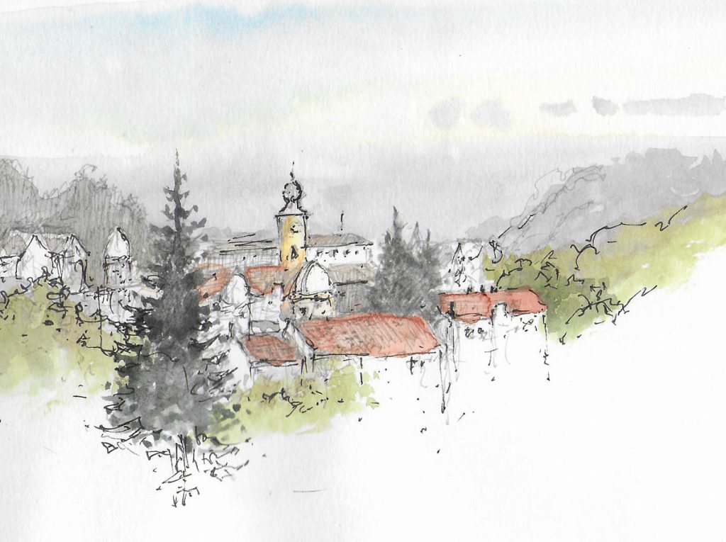
This is a rough little watercolour sketch I did while overlooking Brasov in Transylvania. The roofs, towers and domes in the middle distance appealed to me, but the foreground was marred by large buildings that were much less attractive. To include these as they appeared would dominate the composition, so I decided to just record their roofs and lose all other detail. There were hardly any windows or doors on this side anyway, so I just hinted at a little foliage and then worked in the large conifer, also losing that at the bottom. I had intended to lay some spatter over the foreground when I returned to base, but somehow forgot. A little spatter and maybe some suggested light foliage would enhance it further. I normally prefer to include a gap where there is a feature right across the foreground to suggest a lead-in, so if I followed up with a painting of this scene I would probably create such a gap perhaps to the immediate right of the large conifer.
With summer here it’s a great time for getting out to paint or sketch before nature, so I hope you are making the most of it. If you are nervous about working out of doors with or without people around then just take an A6 sketchbook in your pocket and a few pencil stubs and people will think you are just making a few notes. That will help you gain confidence to work on larger, more ambitious work. In Transylvania I was naturally a little wary of bears, Goths and vampires, but all passed without a great deal of mishap. Happy sketching!