DAVID BELLAMY: LANDSCAPE COMPOSITION

Taking time to consider your composition before you begin painting is critical, and unless you are working from a sketch with a fairly well-planned composition it’s worth doing one or two studio sketches to plan the overall design. While we may feel that composition is solely concerned with the positioning of the various elements of a scene, we also need to think about the atmosphere and lighting conditions, and how this will affect the finished result.

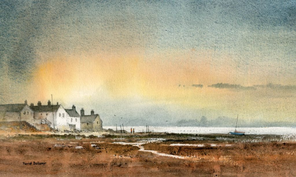
In this watercolour of Ravenglass in Cumbria I have kept the horizon line below the halfway mark and the focal point – the cottages – approximately one third from the bottom and one third from the left-hand side in the classic golden rule of thirds. There are times, however when you may wish to ignore this rule, so don’t feel you are bound to it. Happily in watercolour you can always cut a bit off the side, top or bottom if you want to adjust matters! While most of the detail is around the cottages I placed a boat over on the right-hand side to balance things out: it doesn’t compete with the focal point but helps the overall design. Note that the boat is happily looking into the composition. It was in fact sulking a long way off to the right.

The streaks of water in the foreground were all over the place, so I changed them to use as a lead in to the focal point. Closer to the left-hand edge I have washed a dull shadow over the buildings, as it is best not to introduce strong detail or contrasts at the very edge. Between the posts to the right of the cottages you can see two figures, although these might well be mistaken for giant sticks of rhubarb as I haven’t given them much shape, Figures and animals of course draw the eye and it’s helpful to position them near the main detail. Finally we come to the format. I wanted to suggest a tranquil, early evening mood, so I opted for a rectangular layout emphasising the horizontals in the sea, the cloud formation and the ground detail, with the distant land lost in the haze by laying a glaze over it. It was painted on Saunders Waterford rough 140lb paper using Daniel Smith extra-fine watercolours.

Just to remind you that I shall be demonstrating how to use Daniel Smith watercolour sticks sticks at Erwood Station Gallery & Craft Centre on Friday 7th June when I will be signing copies of my new book David Bellamy’s Complete Guide to Landscapes. Action starts at 2pm and I will be there till 4pm so do come along and join in the fun. Erwood Station is a great place to hang out, enjoy a cappuccino and they have the most delicious cakes and pastries! I’ll also have framed and unframed paintings at a discount, but do come and have a look at these magical painting sticks and ask any questions. Erwood Station is about six miles south of Builth Wells, just off the A470 from where it is well signposted. Telephone 01982 560555

David Bellamy – Greys in watercolour landscapes

For the landscape painter grey is an extremely useful colour, often to set the mood, or equally importantly to provide a passage of quiet dullness that can be vital to make those exciting vibrant and perhaps bright colours stand out. In this scene of a stream in the New Forest, painted on Waterford NOT 140lb paper, I have used the superb Daniel Smith Lunar Blue to create the background, an exciting blue-grey colour that has interesting characteristics that may not at first sight be apparent. At it’s full strength as you can see on either side of the main tree-trunk where it defines the tops of the grasses, it reveals a powerful granulation, yet on the right-hand side where I have simply laid a weak wash of the same colour, there is no granulation. The stronger tone used, the more prominent become the granulations.

Daniel Smith have introduced a number of useful new greys into their collection recently and I’ve been trying out some of them. Alvaro’s Caliente grey is a lovely, warm grey which is quite dark at full strength, and is excellent for creating moody landscape backgrounds. The cooler Alvaro’s Fresco grey can inject a feeling of drama into a composition, for example if you may like to portray a cold sea or stormy sky, or simply cool shadows. The third grey I tried was Joseph Z’s neutral grey, a versatile colour that will be a welcome addition to the landscapist’s palette, again for creating moody scenes. All these greys can of course be modified by mixing, but one great advantage of these Daniel Smith greys is that the artist will already have a selection of interesting and varied greys without having to do any prior mixing, and in each case above the colours can produce a wide variety of  tonal values.

 I shall be demonstrating next Thursday, Friday and Saturday at the marvellous Patchings Art Festival, in the St Cuthberts Mill marquee, using the superb Saunders Waterford and Bockingford papers. Our stand will be beside the marquee so do come and chat and learn more about these excellent products and see other examples after the demonstrations. I will also be signing copies of my new book, David Bellamy’s Seas & Shorelines in Watercolour, just published by Search Press and is the No.1 Landscape painting best-seller on Amazon. You can obtain signed copies from my website  I hope to see you at Patchings

David Bellamy – Hand-bagged in Dubrovnik while painting

The sun beat down as I sat in a pleasant, shady spot beside Cavtat harbour demonstrating a watercolour, when Tarzan and Jane hove into view, both bronzed as they stood before us brazcavtat-harbourenly flexing their pectorals. Both were clad solely in thongs, otherwise naked and obligingly creating a combined landscape and life class all rolled into one. They moved round us, causing titters among the group, and at times my brush went distinctly wayward as I heaved with laughter at this incredible display of narcissistic clownery. Jane sat down in front of us, smiling like a Cheshire cat at the group, and presumably hoping someone would paint her.

This sort of distraction can un-nerve the alfresco artist, but the group chuckled valiantly and took it in their stride, producing some excellent work. Later in the week I demonstrated again in Dubrovnik, which unfortunately was so choked with cruise-ship tourists that there was hardly room to swing a sable, and as I painted I did get hand-bagged several times.

    So, it was with relief we sailed to the island of Sipan where I found a shady spot to demonstrate watercolour pencils. An old bicycle formed an excellent centre of interest – it was leaning against a wheelbarrow, which was leaning against the tree, so in the interests of simplicity I left out the barrow and about a million other equally exciting things lying around, to illustrate the need for keeping things simple. I faded out the buildings adjoining the old barn. The pencils were applied first in the various colours and then this was washed over with water, blending in the colours and then drawing into the wetness with a dark watercolour pencil where I wanted to emphasise details. If you feel your watercolours get a little out of control then try the watercolour pencils. This work was done on Bockingford 140-lb hot-pressed paper, an excellent surface for these pencils.

Our annual Watercolour Seminar is just about upon us, and this year we are back in The Settlement in Pontypool, a superb venue. It takes place on Saturday 1st October and there are still places left if you feel like coming along. The theme will be injecting mood and drama into a landscape and I will be using the exciting range of watercolours from Daniel Smith, demonstrating how to take advantage of these amazing colours and give your paintings some extra zip. As well as a demonstration I will be giving an illustrated talk on the same theme, covering a wide range of landscape subjects. Details of the seminar are on my website. We look forward to seeing you there.

David Bellamy – Using tonal effects to suggest mood and space

Injecting mood into a landscape painting not only makes the overall effect much more exciting, but can create a strong sense of space and distance in the work. Although this scene of Faversham Creek in Kent already had a feeling of great space I wanted to exaggerate the atmosphere even more in the finished painting.
I chose a blue-grey tinted paper for this watercolour and deliberately kept the distant wooded hillsides very faint in order to create a striking contrast with the foreground features. The strong tones on and around the buildings help to push the faint hills well into the background. If everything is given the same degree of tonal strength then it will be hard to distinguish various features from each other, even with contrasting colours. Masts, gulls and some white boats were rendered in white gouache, and I have only included the main part of the composition so that the distant hills can be seen better.

I shall be giving another of my annual seminars at the Settlement, Pontypool on Saturday 1st October, and it will be covering how to create mood and drama in a painting, beginning with a watercolour demonstration, and this will be followed by an illustrated talk on the subject, including a great many examples of different landscapes and coastal scenes. You can find details on my website http://www.davidbellamy.co.uk/seminar-pontypool-october-2016/  I shall be demonstrating the exciting Daniel Smith watercolours and Saunders Waterford paper, and there will be plenty of time for you to ask any questions, so I hope to see you there.

David Bellamy – The negative painting technique in watercolour

This weekend we had our annual watercolour seminar in Pontypool, and as usual we had a very enthusiastic audience. It’s always good when lots of questions are forthcoming and people create a real buzz with their obvious excitement about indulging in watercolour painting and learning new techniques. When they can see the techniques being demonstrated close-up on the screen it really fires them up.

One of the techniques I was questioned about this weekend was that of the negative painting method. In watercolour, because it is a transparent medium and we cannot effectively paint a light colour over a dark one, we need to resort to other ways of working. We can use masking fluid, which reserves the white paper, but can be clumsy at times. Another method is to rub a candle across the paper to form a resist, but this is hopeless if you need intricate detail. A third technique is to paint gouache or acrylic over the dark area, but here the opaque paint can appear intrusive often losing that lovely sense of watercolour transparency and spontaneity.

The picture shows part of a painting mainly completed out of doors. It reveals a number of negative painting examples: the trunk and branches of the birch tree; the right-hand boulder; where the dead bracken stands out against the dark background; and the edges of the falling and turbulent water. The sole method I have used here for each of these examples is to work round each feature with a darker colour. In the case of the red bracken, this was painted on first, allowed to dry, and then the dark background wash brought down to describe the birch tree, the boulder, the water and of course, the red bracken.

This techniques is extremely effective and well worth learning. I don’t normally put quite so much negative work into one painting, but this was meant as an illustration on how to apply it, and can be seen on my Painting Winter Landscapes DVD, which accompanies the book with the same title. For more information see my website or that of APV Films who produced the film.