David Bellamy – Painting an tranquil evening sky

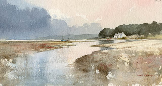
 I’ve just delivered some paintings to the Attic Gallery in Swansea’s Maritime Quarter for a mixed show running until 26th March, and there are some excellent works on display. You will find the gallery at 37 Pocketts Wharf, SA1 3XL and the telephone number is 01792 653387. My mainly Pembrokeshire scenes includes one of my favourite locations of East Angle Bay.

This watercolour shows a tranquil winter evening with Angle church forming the centre of interest. I’ve kept the main design in harmony with the emphasis on horizontals on the creek, the lie of the land and with the clouds. In the sky the Aussie red gold also has a horizontal bias and is deliberately strong around the lightest part of the sky to heighten the glow. Positioning the church with the creek leading towards it, and the reflected light on the water brings it all together and it is important to ensure that all these varied elements support one another in this way. Sometimes nature needs a little tweaking to produce a good composition. 

 If you are planning on exploring more of the UK rather than travelling abroad this year you may well find the Great British Wildlife & Environment Map of great help. It features over 1,500 wildlife hotspots, eco events, conservation projects and days out in the natural environment, places where it holds interest for those artists who love to get out amidst nature and perhaps sit quietly to observe wildlife. It has an amazing amount of detail on both sides and is produced by marvellousmaps.com

David Bellamy – The importance of your little blobs

 I see my last blog was on 1st July, the long gap being the result of an all-action summer with little time for writing. In August I visited Germany, partly to do some research and partly as a holiday. Getting round the Covid tests proved quite a challenge, creating stress and uncertainty on occasion. In Wales I ordered a self-test from Boots, only to find I could not send it in time because there were no Priority Post-Boxes in the area, although the Royal Mail showed plenty of these around, including one apparently in Llanelwedd Quarry of all places! This is totally unacceptable behaviour.

In Pembrokeshire I’ve recently dropped off a number of paintings at the Waterfront Gallery in Milford Haven. The gallery shows a wide variety of paintings styles and is a very pleasant place to visit. 

This is part of one of the paintings at the gallery, and shows a quiet corner of the composition. The centre of interest is away to the left, off-picture here, and the boat acts as a means to balance the composition. I did not wish to make it too prominent, so I lost the bottom of the blue hull in the muddy foreshore and dotted in white gouache blobs here and there to add interest in suggesting seagulls. On such a small scale it’s not easy to give the impression of birds, but I used a number one rigger and tested the white gouache on dark rough paper before applying it to the actual painting. This method also has the advantage of getting rid of excess white paint on the brush before doing it for real. If you over-blob and get a ghastly mess, simply wash it off with a damp brush, dry the area with a tissue and wait till the paper is dry and then try again. With practice you’ll find this will improve enormously.

I shall try to make my blogs more regular in future, but the call of the wild is hard to resist……..

David Bellamy – Creating a tranquil mood in a landscape painting

As many of you will be aware, I love painting wild seas crashing on a rugged coast, but there is much to be said for the calmer moments. To emphasise this you need to concentrate on the horizontal elements as you will see in the painting below.

As you can see, the sky comprises a series of horizontal cloud effects of evening light, and this is further emphasised by the long, horizontal horizon, with the vertical features such as the mature trees pushed well into the distance. To further enhance the calm mood of the scene the washes laid over the estuary are flat, undetailed ones, and even the line of waders in the foreground conforms to a horizontal pattern. And what if you’re looking for a suitable animal to include in a calm scene – well for me none can compare with the dear old Friesian cow for suggesting a scene of utter calm and tranquility.

This painting can be found in my Seas & Shorelines in Watercolour book which is available from my website  The original painting is on display in the Attic Gallery in Swansea, Tel. 01792 653387  The gallery is open from Wednesday to Saturday 10am to 4pm and can be found at 37 Pockett’s Wharf, Swansea, SA1 3XL where a number of my paintings are on display at the gallery with a lot of other exciting artwork.

    Enjoy your painting!

David Bellamy – Liberate your painting with scraps of paper

I often find that when I’m testing a wash or new colour on a scrap of watercolour paper that I produce some marvellous results, yet when I try to repeat the exercise in a proper painting it often falls far short of what I hope will happen. So why not try to capitalise on this perversity by now and then painting on a piece of scrap paper that you might otherwise throw away?    This little watercolour was painted on a discarded piece of 300lb Saunders Waterford rough paper 9 inches by 4.5 inches, and I loved every moment painting it. With such a small, insignificant size you tend to lose any inhibitions, and it’s certainly a liberating feeling, as you feel you have nothing to lose even if you make themost astounding mess!

    One of the main features I love is the soft wet-in-wet reflections in the water below the cottage. These were achieved by wetting the area of the water below the building and out as far as the central boats, leaving it for a few minutes to start drying, and then applying the dark green-grey reflections of the massed trees into the wet area, leaving the part directly below the cottage as white paper. At this stage it’s vital to watch how the dark reflections creep outwards as though they deliberately want to annoy you. With a damp – a really ‘thirsty’ brush (a number 6 round brush is usually fine for this) – pull out any of the dark colour that edges its way beyond where the reflections should appear. You may need to do this more than once.

    This painting appears in my Seas & Shorelines in Watercolour book, recently published by Search Press, which not only covers a really wide variety of coastal scenery and features, but is also crammed with sky treatments of all kinds that you should find useful for adopting in your own work. Signed copies are available via my website  ….and don’t forget to make full use of those bits of scrap paper lying around!

David Bellamy – Painting desert and tropical scenes in watercolour

I was asked recently about painting tropical scenes and how this differed from my usual British landscapes. Although I haven’t done any tropical work for a while, over the years I’ve painted quite a number of scenes in the tropics, especially in East Africa with its wide range of spectacular scenery. Desert scenery is one of my favourite genres, as the figures and colours can be quite exotic, and one tends not to find the painting water freezing up, as in more northerly climes. Unfortunately I don’t have any record of earlier jungle and tropical plant scenery paintings, so this is the closest I can find, until I manage to paint further tropical scenes, which probably won’t happen until next winter.

This watercolour shows a wadi in the Atlas Mountains of Morocco towards evening, with women washing clothes in the river. We were returning from an expedition when I spotted this marvellous composition, and did a quick pencil sketch of it, even though I felt pretty tired and was likely to be assailed by hundreds of kids demanding pencils.

I take much the same colours with me to the hotter climates, as I do in Europe, but tend to use more of the brighter colours. This watercolour was done on Saunders Waterford 140lb hot-pressed paper which is excellent for bringing out the vitality of the brighter colours, really making them sing. I used vermilion in the sky, with gamboge in the brighter parts. As with most landscape work it helps to suggest space and distance with cooler colours in the more distant passages, and this can also throw the emphasis on to those areas of brighter colours, whether lush vegetation or other features. Here I used French ultramarine for the background. You can create really striking colour effects by juxtaposing complementary colours, for example bright red flowers or plants set in vivid green foliage. I hope these tips will help those of you who like more exotic scenery………..until I can get back into the jungle.