David Bellamy – Liberate your painting with scraps of paper

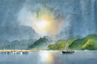
I often find that when I’m testing a wash or new colour on a scrap of watercolour paper that I produce some marvellous results, yet when I try to repeat the exercise in a proper painting it often falls far short of what I hope will happen. So why not try to capitalise on this perversity by now and then painting on a piece of scrap paper that you might otherwise throw away?    This little watercolour was painted on a discarded piece of 300lb Saunders Waterford rough paper 9 inches by 4.5 inches, and I loved every moment painting it. With such a small, insignificant size you tend to lose any inhibitions, and it’s certainly a liberating feeling, as you feel you have nothing to lose even if you make themost astounding mess!

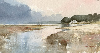
    One of the main features I love is the soft wet-in-wet reflections in the water below the cottage. These were achieved by wetting the area of the water below the building and out as far as the central boats, leaving it for a few minutes to start drying, and then applying the dark green-grey reflections of the massed trees into the wet area, leaving the part directly below the cottage as white paper. At this stage it’s vital to watch how the dark reflections creep outwards as though they deliberately want to annoy you. With a damp – a really ‘thirsty’ brush (a number 6 round brush is usually fine for this) – pull out any of the dark colour that edges its way beyond where the reflections should appear. You may need to do this more than once.

    This painting appears in my Seas & Shorelines in Watercolour book, recently published by Search Press, which not only covers a really wide variety of coastal scenery and features, but is also crammed with sky treatments of all kinds that you should find useful for adopting in your own work. Signed copies are available via my website  ….and don’t forget to make full use of those bits of scrap paper lying around!

David Bellamy – Painting around the New Forest

  I now have a number of paintings on display at Beaulieu Fine Arts, an excellent gallery with several rooms full of exciting and varied art. It’s a delightful spot to visit as you can also spend time exploring the New Forest, which is especially glorious in spring-time. The watercolour shown here is of a tranquil view of the river near Bucklers’ Hard, one of several local scenes I’ve painted. I have not neglected my wilder compositions, though, so you will find a mixture. In summer the massed greens can appear a little overwhelming, so I have introduced more grey into the further tree-clad ridges.

The gallery is at Manor House in High Street, Beaulieu, Hampshire, SO42 7YA and the telephone number is 01590 612089   Check out the website at   www.beaulieufinearts.co.uk

I’ve just returned from an exciting trip to the Lebanon, returning with bagfuls of sketches. I encountered much dramatic mountain scenery, incredibly deep snow, amazing Roman ruins and not least so many kind and friendly people. And of course, the food was outstanding, and sometimes overwhelming, as when I went into an Iraqi restaurant for a lunchtime sandwich and ended up with seven courses – all at once! 

David Bellamy – Enhance your watercolour landscapes with simple cloud effects

I’ve just returned from running a sketch & walk course in the Lake District with a lovely group of students, where the biggest problem was a lack of water! This is something which is rarely encountered in Lakeland, and it did confound attempts to sketch certain waterfalls rather devoid of water. Still we had a great time and at least we eventually found some in Coniston Coppermines Valley.

The watercolour on the right is the view we painted, though I actually did this three years ago during autumn when there was more water in the beck, and the hillsides were alive with warm colours. This also happens to be on the cover of the summer issue of Leisure Painter magazine, featured in an article on creating wisps of cloud and streamers, which can so enhance your work. It was painted on Saunders Waterford rough 140 lb paper, and to achieve the soft misty edges I scrubbed with a damp half-inch flat brush. Losing ridges and parts of a hill or mountain can add so much mood and mystery to a landscape, and the article covers various ways in which you can achieve these effects.

These softening-off techniques are a common feature in my books, especially the Winter Landscapes in Watercolour and Skies, Light & Atmosphere in Watercolour. Some artists feel that a standard broad-washed blue or grey sky can fit any landscapes, but I put great effort into my skies to introduce exciting and interesting cloud and atmospheric effects that suit a particular landscape, so there are a great many examples of these in both books.

In Lakeland my biggest problem with the students was keeping up with the three octogenarian ladies, one of whom was leaping up and down precipitous slopes like an over-active monkey. What a great pleasure it is to see people respond so well to the beauties of nature.

David Bellamy – Visualising your painting

Recently I received an interesting email asking how to develop an artist’s ‘mindsight,’ or visualisation in constructing a painting. This is more than just assembling the various parts of a composition, and brings in more about your own feelings and imagination into the equation.

This watercolour of the Pembrokeshire coast at Amroth is an example of how visualization created a really different painting from what I saw in reality. I sketched the scene in mid-afternoon with light coming from the left. I could see the village and background hills and cliffs in strong detail and an overwhelming green. There was little atmosphere. In the studio I played around with studio sketches, tried various lighting and mood effects and considered how to increase the dramatic effect. I needed to lose most of the detail and the greenery.

I decided to change the lighting to an evening sky, bringing in atmospheric cloud to lose much of the hills, and enhance the unity by using few colours in the background, mainly French ultramarine and cadmium red. Backlighting like this adds dramatic appeal and the cascade of light above the houses highlights them as a focal point. The dark closer rocks and cliff create a sense of space, again painted in with the same colours as the background only with much stronger tones and the addition of yellow ochre in places.

How do you develop this visualisation of a scene? Firstly seek out dramatic lighting situations, sketching, recording and photographing strong atmosphere, moving around to find the most dramatic viewpoint and observing the effects created in these situations. Secondly study these phenomena at exhibitions, in books, etc, in the work of good landscape artists. Experiment with ideas, exaggerating height, tonal values and atmospheric effects, and using your imagination to create mystery, drama, intense light or moody shadows. Eliminate features that don’t work for you. This all takes time and experience, but if you make a deliberate effort to work on this aspect of painting it will improve your work enormously.

My Skies, Light & Atmosphere in Watercolour book contains a great many paintings that have been enhanced dramatically by visualising the overall atmosphere before touching the watercolour paper. Most of the skies depicted – and there is an enormous variety – have been changed to something more exciting for that particular composition. Concentrating on skies is an excellent way of beginning visualisation methods.

footnote: In view of the new GDPR data protection regulations please see our Privacy Policy here.

David Bellamy – Wonderful Distractions from Painting

    It’s been almost impossible to do much painting or writing lately, thanks to a very happy event. On 22nd February my daughter Catherine gave birth to an absolutely gorgeous little daughter, so for the first time I am now a grandad. She goes by the name of Guinevere, and I can’t wait to paint her. She’s already had a trek across the mountains at around 10,000 feet in the Italian Dolomites, when Catherine was carrying her last July, and as you can see from the photograph she is obviously deep in artistic contemplation.

For my own contemplation I’m beginning to put together thoughts and images for my next book about coastal scenery, for which I have a whole host of new work from both the UK and abroad. My Arctic book will be coming out in June, so there will be more on that later on, but it’s important to keep thinking ahead when you work on various projects. The sea has always been one of my favourite subjects, and the coastal book will be the fourth and last in my current series of how-to-paint books.

Before I go, just a quick tip on painting those boaty things – you don’t always have to insert a complicated harbour background into the composition, or indeed any sort of complex background. In this watercolour sketch I have simply brought the atmospheric sky down to meet the sand, and left it at that. Just because something is there, you don’t have to include it!

And don’t forget – if you want to get views of a boat from all angles it pays to take along a pair of wellies before you dive into that lovely mud….