David Bellamy – Quick sketching in watercolour

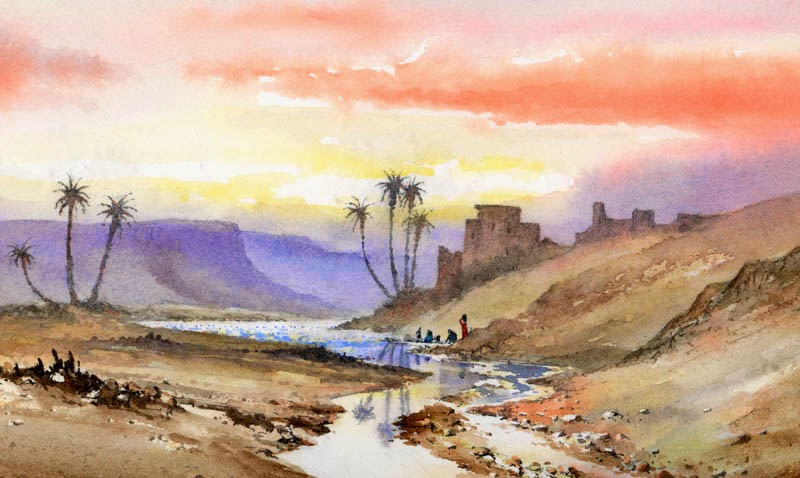
Don’t you wish sometimes that life could be really dull, drab and boring? It can get a little too exciting for much of the time, leaving you breathless and with no time to sit back and recall all the fun you’ve had. Being out on the hills tends to energise me and is far more pleasant than sitting in the studio, especially when you have to listen to the racket of builders across the road with their loud radios and screaming stone-cutters. And I usually take a cappuccino and Danish pastry out with me anyway – it’s amazing how it helps the washes flow across the paper!

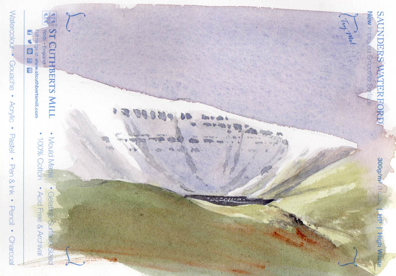
When I went out recently on the Brecon Beacons, I took with me some small sample sheets of the new Saunders Waterford High-White hot-pressed paper from St Cuthberts Mill. It really is delightfully smooth and as one would expect with St Cuthberts, it takes the washes well. As you can see in the rough sketch, the snow really does stand out on this paper. Note how the terracing of the rock outcrops appears in broken horizontal lines, with a few gullies sweeping down here and there. It’s important to spend a few moments observing these aspects as they give a marvellous sense of place in your work. This paper also works well for wash and line work, and should be in the art shops fairly soon. I can’t wait to work on some big sheets.

I shall be demonstrating at  Patchings Art Festival next month in the St Cuthberts Mill marquee, on the 9th, 10th and 11th June, so I hope you can come along and enjoy the event. It’s always a great pleasure to be there, with so many artists and crafts-people, and of course, all the materials to check out. And make sure you try out some of the Waterford HP paper!

David Bellamy – Injecting a sense of atmosphere into your paintings

If you really want to give your landscape paintings a boost one of the most effective methods is to inject a strong dose of atmosphere into the scene. Unfortunately most of the time when you sketch or photograph a subject there may not be much by way of atmosphere, so in many cases you need to inject it into quite an ordinary scene. With time and experience this becomes easier.
 In this view of the Teign estuary in Devon you can barely see the distant Dartmoor ridges, and even then they become lost in the atmosphere at the extremities. To achieve this sense of mood and distance I have used the same wash for the ridges as I have for the lower sky area. Keeping most of the edges softened also helps create mood, as does a very limited palette. There is hardly any detail in any of the background trees and promontory, and even the centre of interest – the cottage with its attendant trees has little extra colour.

This painting is part of my forthcoming exhibition Shorelines and Summits at Lincoln Joyce Fine Art, 40 Church Road, Great Bookham Surrey, KT23 3PW – telephone 01372 458481  Their website is www.artgalleries.uk.com  The exhibition runs from 28th October to 7th November. Both the coastal and mountain scenes include strong atmospheric effects in most cases.

There are still places available at my seminar which takes place from 10 am to 3 pm on 28th October in the Old Barn Hall opposite the gallery, so you can also view the exhibition. Tickets are available from the gallery or Clockwork Penguin or telephone 01982 560237 The seminar comprises a watercolour landscape demonstration and an illustrated talk, both covering how to include animals and wildlife in your paintings – and, of course, lots of atmosphere, and you will have the opportunity of asking questions. I hope to see you there.

David Bellamy – Creating a feeling of past times in your watercolour landscape

The vast range of styles, approaches and emotions generated in our paintings makes the art world such a wonderful place for us to explore. It never ceases to amaze me what an exciting world we have in the arts. I mention emotions in particular, for to respond with passion and feeling is vital in whatever genre we paint. Sure, we all do ‘bread and butter’ work, as it’s not easy maintaining that level of high emotion for our most important works.Road to the Brecon Beacons sm

Emotion in art is often triggered by a sense of nostalgia, and one small, yet effective way of introducing this into landscape paintings is to include symbols of yesteryear, whether you are painting old sailing boats, steam locomotives, or whatever your theme may be.

In this watercolour the old county road stretches away towards the Brecon Beacons, and on the right-hand side I have included the old sign-post that still stands there. This style of sign-post is slowly disappearing from the British countryside, and it’s amazing how including just a minor element like this can evoke a marvellous sense of the past. Watch out for these little gems if you like to put across this feeling of past times in your paintings. The signpost was created with masking fluid which will give you a strong, stark edge to the feature.

This is one of several of my paintings now on display at the Ardent Gallery in the centre of Brecon, tel. 01874 610710 Pop in and treat yourself to a coffee there while you look at the Christmas show.

David Bellamy – Painting on the Pembrokeshire Coast

Jenny and I have just returned from running a painting course in St Davids in Pembrokeshire, where we were blessed with some wonderful autumn sunshine for most of the week. Solva looked especially appealing in the clear light. The picture at the bottom shows me demonstrating with a ‘lay-flat sketchbook’.

  The lay-flat sketchbook is made up of the superb Saunders Waterford NOT paper backed with strong card, and designed so that each double page lays flat, so that it is easy to create a painting across both sides as shown in the illustration opposite. As the paper is flat and taut it is the watercolourists’ dream surface to work on, and I enjoyed producing the alfresco watercolour. Although this is not quite the finished painting it does show how I altered the strident background ridge above the buildings to become a misty, indefinite background which throws the emphasis onto the cottages. Changing elements of a composition to suit your creative ideas is fine. We did however, find one or two of our old favourite subjects very much changed by nature, though. The storms of last winter did much damage – by comparison a few artistic changes hardly seem significant! The line down the centre is the centre-fold. The lay-flat sketchbook is available from the Society for All Artists (SAA). Check out their site on

David Bellamy – Painting desert and tropical scenes in watercolour

I was asked recently about painting tropical scenes and how this differed from my usual British landscapes. Although I haven’t done any tropical work for a while, over the years I’ve painted quite a number of scenes in the tropics, especially in East Africa with its wide range of spectacular scenery. Desert scenery is one of my favourite genres, as the figures and colours can be quite exotic, and one tends not to find the painting water freezing up, as in more northerly climes. Unfortunately I don’t have any record of earlier jungle and tropical plant scenery paintings, so this is the closest I can find, until I manage to paint further tropical scenes, which probably won’t happen until next winter.

This watercolour shows a wadi in the Atlas Mountains of Morocco towards evening, with women washing clothes in the river. We were returning from an expedition when I spotted this marvellous composition, and did a quick pencil sketch of it, even though I felt pretty tired and was likely to be assailed by hundreds of kids demanding pencils.

I take much the same colours with me to the hotter climates, as I do in Europe, but tend to use more of the brighter colours. This watercolour was done on Saunders Waterford 140lb hot-pressed paper which is excellent for bringing out the vitality of the brighter colours, really making them sing. I used vermilion in the sky, with gamboge in the brighter parts. As with most landscape work it helps to suggest space and distance with cooler colours in the more distant passages, and this can also throw the emphasis on to those areas of brighter colours, whether lush vegetation or other features. Here I used French ultramarine for the background. You can create really striking colour effects by juxtaposing complementary colours, for example bright red flowers or plants set in vivid green foliage. I hope these tips will help those of you who like more exotic scenery………..until I can get back into the jungle.