David Bellamy – Capturing the colours of Autumn

 Once again, autumn is with us, and the opportunity to indulge in bright, warm colours in our landscape paintings. This time last year I found the striking colours in the Bavarian Alps absolutely mind-blowing, with every day in brilliant sunshine.

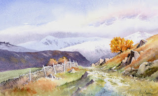
This scene shows a track leading to Little Langdale in the English Lake District. I was lucky at the time to encounter snow on the distant fells, and this accentuated the bright colours of the right-hand small tree. For this I used two of my favourite Daniel Smith colours – Aussie red gold, which was applied first and when this was dry I added transparent red oxide. These two work extremely well for autumn scenes. The dark ridge in the middle distance was rendered with Moonglow, another useful colour, and in places I have pulled out the colour with a small sable to indicate lighter patches.

The painting is reproduced in my Landscapes Through the Seasons in Watercolour book, signed copies of which are available from my website

Watch out for those autumn colours and make sure you are armed with the right colours……..and if you get some snow as well, then that’s a great bonus!

David Bellamy – Frolicking in the Desert

Most of this year I’ve been painting subjects from the Middle East, a part of the world I’ve been fascinated by since I first visited in 1963, and these works will illustrate my forthcoming book, Arabian Light, due to be published by Search Press in May 2022. The subjects cover a wide variety of scenery, buildings, figures, interiors and many others, and for a taster I show below a painting of our expedition guides dancing in the desert hundreds of miles from the nearest village. For the intense darkness I’ve used the Daniel Smith Lunar black slightly mixed with French ultramarine. The granulation strength of this colour is truly mindblowing! There’ll be more on this in future blogs.

 Another book I’m pleased to be associated with is Green Parrots in my Garden, a book of poems from the Arab Middle East by Jane Ross, a Canadian poet who has lived in the Middle East amidst threats of war, but concerns herself more with the warmth of human relationships, the wisdom of ancient desert values and the beauties of artefact and design that bring her into the hearts of the people and the essence of the region. She writes of the oasis of Wadi Bani Khalid where ‘the winds are gentle zephyrs in the thick warm air,’

      ‘But ontop of Jebel Shyams the winds are sharp and piercing,
      like needles thrusting their way through the blanket;
      fiendish, dervish, absolute and wild.’

Yes, that mountain presented so many exciting images that I forgot myself in a fiery sunset, when the light vanished so suddenly that without a torch I found myself trying to pick up all my scattered brushes and pencils in the dark then navigate across a rock-strewn plateau on the edge of a canyon. 

The books features two of my paintings in monochrome, and  Jane’s website is www.janeross.ca

It will be available on Amazon via this link.

 I wish you all a very and peaceful Happy Christmas. May you have many lovely artful arty presents, and thanks for your patience in my extremely slow blog production rate in 2021

David Bellamy – Painting autumn scenes in watercolour

Autumn is upon us, and with the trees turning colour it’s a great time to be out capturing those magical views, whether in sunshine, rain or whatever: rain can create more atmospheric scenes, but if you can catch that moment after a shower when the sun comes out and makes everything sparkle it can be truly magical – watch out for those stunning reflections of colour and light in the puddles. 

This year autumn is also bringing out my new book, Landscapes Through the Seasons, which has just been published by Search Press. It is in fact an expansion and update of my Winter Landscapes book – many people were asking about a summer book, but with other books in the pipeline I could not have written a whole book on summer landscapes for several years. The spring and autumn sections have also been expanded.

The illustration shows a watercolour sketch done on a cartridge sketchbook on a sunny November afternoon and reproduced in the book. If you are out sketching at this time of the year it really does pay to use colour, whether in watercolour, watercolour pencils, acrylics, inks or whatever you fancy. Note that the most powerful  effects occur when abutting the complementary colours of purple and orange against each other – if that tree of glowing orange doesn’t quite come in front of that distant purple hill, then give it an artistic shove and see the effect. Likewise warm yellows against the blues and purples will make your autumn scenes sing. Flying leaves and trees with just a few single leaves remaining can add to the season’s visual treasures, and these can be achieved in watercolour by little dabs of masking fluid. By applying a dark colour over these dabs you can then create sparkling light leaves when you rub off the masking fluid. Let your yellows, reds and oranges run into one another in the foliage to vary the overall effect.

The later paintings in the book are carried out with Daniel Smith Extra-fine watercolours, and many of these are exceptionally effective for autumn colours, such as Aussie red gold, transparent red oxide, moonglow and quinacridone Sienna. Quinacridone gold and gamboge are also great colours for this time of year. We all need something new to brighten up these difficult days of lockdowns, so treat yourself to some of these amazing colours.

David Bellamy – Making the most of summer landscapes

I’ve at last managed to see my grand-daughter after nine months…..far too long a time, but the re-union was a wonderful moment! Bit exhausting as well, keeping up with a lively 3-year-old. That, and other urgent work has kept me from doing any blogs for 6 weeks, I’m afraid.

Summer still clings on with some beautiful days, the trees in fine form. When painting summer trees in full leaf I find it easiest to do the foliage in two stages, firstly the lighter colour – usually green – and then the darker, shadow green. It pays to run your branches into the darker shadows, losing them naturally rather than in stark contrast. Make sure you stab little spots of the green outside the main boundary of the foliage as you see in the watercolour below, otherwise your foliage will appear lumpy.

Just above the stile and slightly to the right you will see some light spots of yellowy-green. These were achieved with gouache, which being opaque will show up over dark areas, unlike pure watercolour, and here they suggest detail within a dark, featureless part of the tree. The stile and some branches in the bottom right-hand bush have been done with the negative method whereby the darkest passages have been painted with a fine no. 6 sable brush to avoid those features.

This painting is featured in my new book Landscapes Through the Seasons, to be published shortly by Search Press. Amongst other things, it includes introducing flowers into the landscape, managing summer greens, brushwork for foliage, the power of introducing spot colour, coping with riotous summer foregrounds, emphasising a sense of spring and fiery autumn colours. The book is actually an extension of my Winter Landscapes book, as so many have enquired about one on summer landscapes. You will find details on my website, www.davidbellamy.co.uk in a few weeks time.

Make the most of what is left of summer and make sure you gather as many subjects to paint in sketch or photographic form before winter arrives and we get any further lockdowns. Painting is such a wonderful antidote to Covid-19!!!

David Bellamy – Greys in watercolour landscapes

For the landscape painter grey is an extremely useful colour, often to set the mood, or equally importantly to provide a passage of quiet dullness that can be vital to make those exciting vibrant and perhaps bright colours stand out. In this scene of a stream in the New Forest, painted on Waterford NOT 140lb paper, I have used the superb Daniel Smith Lunar Blue to create the background, an exciting blue-grey colour that has interesting characteristics that may not at first sight be apparent. At it’s full strength as you can see on either side of the main tree-trunk where it defines the tops of the grasses, it reveals a powerful granulation, yet on the right-hand side where I have simply laid a weak wash of the same colour, there is no granulation. The stronger tone used, the more prominent become the granulations.

Daniel Smith have introduced a number of useful new greys into their collection recently and I’ve been trying out some of them. Alvaro’s Caliente grey is a lovely, warm grey which is quite dark at full strength, and is excellent for creating moody landscape backgrounds. The cooler Alvaro’s Fresco grey can inject a feeling of drama into a composition, for example if you may like to portray a cold sea or stormy sky, or simply cool shadows. The third grey I tried was Joseph Z’s neutral grey, a versatile colour that will be a welcome addition to the landscapist’s palette, again for creating moody scenes. All these greys can of course be modified by mixing, but one great advantage of these Daniel Smith greys is that the artist will already have a selection of interesting and varied greys without having to do any prior mixing, and in each case above the colours can produce a wide variety of  tonal values.

 I shall be demonstrating next Thursday, Friday and Saturday at the marvellous Patchings Art Festival, in the St Cuthberts Mill marquee, using the superb Saunders Waterford and Bockingford papers. Our stand will be beside the marquee so do come and chat and learn more about these excellent products and see other examples after the demonstrations. I will also be signing copies of my new book, David Bellamy’s Seas & Shorelines in Watercolour, just published by Search Press and is the No.1 Landscape painting best-seller on Amazon. You can obtain signed copies from my website  I hope to see you at Patchings