David Bellamy – Painting figures in a mountain landscape

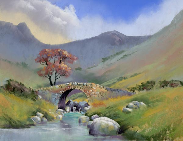
Including figures in a landscape painting is one of the most basic ways of suggesting a sense of scale, but in a vast landscape where do you position them, and how large should they be? These can be critical decisions for the artist, especially as figures tend to immediately attract the eye of the viewer. They therefore become the focal point.

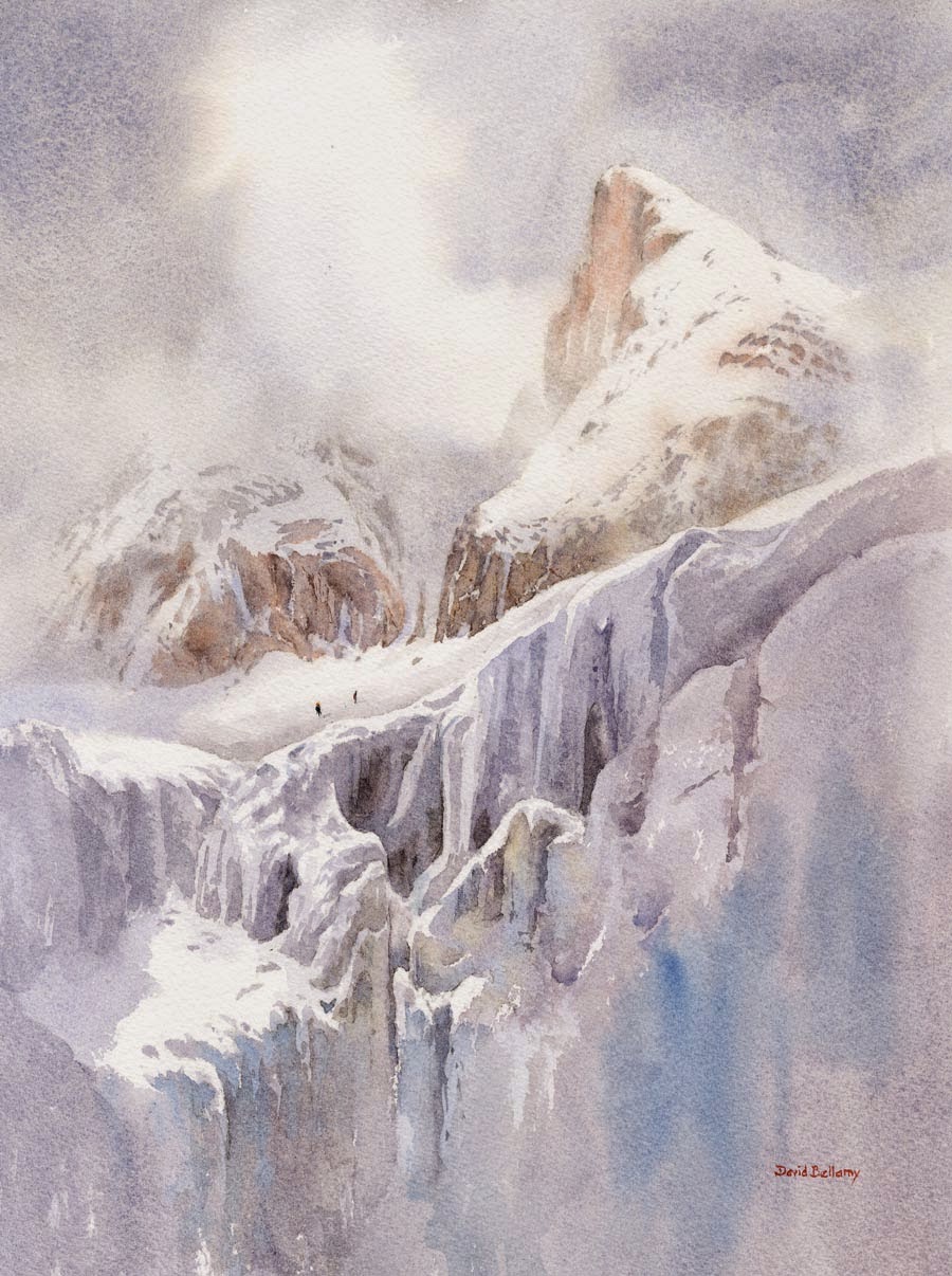
In this large watercolour of Gyrn Las in Snowdonia the two figures are barely discernible in such a small reproduction. They are actually standing at the top of the small stream descending to the right of centre in the lower part of the composition. Even in the original they are not obvious, but once you know they are there they impart a feeling of being completely dwarfed in an immense landscape. They could not have been painted much smaller without completely losing them, but had they been made much larger the scene would appear a great deal smaller.

The optimum position for placing figures is about one-third into the painting from either side and one-third from the top or bottom of the composition, but this can be varied to a degree, to suit the scene. Here they are a little less than one-third in from the bottom, but about one-third from the right-hand side.

This watercolour, and many other works can be seen in the Autumn/Winter exhibition “Harmony” at Boundary Art, Cardiff’s newest art space, where you can enjoy a Chinese tea while contemplating the exhibits which range from traditional to contemporary paintings in oil and watercolour by many artists. The exhibition runs from Saturday 14th November to 31st December. Boundary Art is at 3 Sovereign Quay, Havannah Street in Cardiff Bay, CF10 5SF  Tel. 02920 489869  Check out the website at http://www.boundaryart.com

Jenny Keal – Atmosphere and Recession

Learning how to create atmosphere and recession in a landscape painting is an essential skill for a landscape artist. Artists will have their own techniques to achieve this effect but in my new DVD Pastel Demonstration Lingcove Bridge, I explain my methods. I like to give a painting a sense of space and a strong feeling of atmosphere.

lingcove bridge 2

My favourite techniques for creating recession are through the use of colour, tone and detail. Cooler, paler colours in the distance: warmer, darker colours as you progress towards the foreground. Less detail in the background and more in the foreground, especially around the focal point.  The relative sizes of objects in the landscape is also a consideration. Trees in the distance, even if they are larger than foreground trees, need to be depicted as smaller. As Father Ted says, “this cow is small but those are far away”

Atmosphere is something that becomes easier to understand if you sketch outdoors, in front of your subject. There is nothing like getting out in the countryside to give authenticity to your landscape paintings.

These are not new ideas, the old masters excelled at giving a sense of depth through these methods. You almost certainly have heard these tips before, but it can’t be said too often.

The new DVD is 1 hour 23 minutes long and is filmed in close detail so you can see every mark I make, with a running commentary about my thought process. There is an excerpt on You Tube

David Bellamy – Reserving whites in a watercolour

One of the greatest problems concerning the watercolourist is that of reserving whites in a painting. There are several ways of tackling this: the use of the negative painting technique, masking fluid or film, scratching with a knife or scalpel, or the use of Chinese white, white gouache or acrylic. Pulling out colour with a damp brush or tissue, or sponging out when the wash is dry, are further ways of achieving a considerable lightening of the tone, although these latter methods rarely are as glaringly white as the aforementioned ones. Down the centuries white body colour has been employed, the equivalent of our white gouache or Chinese white.

These days even the main watercolour societies feature paintings carried out with much use of white gouache or acrylic paint, so there is no stigma attached to using that method, and I shall illustrate it in a future blog. Scratching can be effective for minor features such as ropes or rigging in a harbour, limited sparkle on water, and similar items, but for larger or more intricate work masking fluid or the negative painting technique is a better method.

In the watercolour on the right I applied masking fluid over the actual icefall with all its complexities, in the positions where you see the absolute white. This, of course, is the naked paper after the masking fluid has been removed near the end of the painting. For the snow lying on the peak and crags, and also for the light cloud, I used the negative painting method, that is, I worked round the white shapes with the darker sky, the rocks and shadow areas. When it was all dry I applied further shadow washes using French ultramarine and cadmium red over some of the snow and rock areas that were in shadow. I could have employed masking fluid to some of these parts, but it results in hard edges and much of the edges there I wanted to appear soft, especially the light cloud. I find it best not to mix the two techniques in the same area as it can get confusing, thus causing errors, so I have deliberately kept the top and bottom halves of the composition apart in that sense.

This is one of the paintings that will appear in my exhibition at the Windrush Gallery from 3rd to 10th May (it will be closed on 7th and 8th May), at Windrush, Gloucestershire, OX18 4TU  Telephone 01451 844425 The gallery open times are from 11 am to 5pm daily. The exhibition will cover a wide variety of scenery, including marine and pastoral paintings. I shall also be doing a watercolour demonstration Painting in the Cooler Months in Windrush village hall on Saturday 9th May at 2pm. If you wish to come along please book in advance:  j.neil299@btinternet.com or phone 01451 844425

David Bellamy – The negative painting technique in watercolour

This weekend we had our annual watercolour seminar in Pontypool, and as usual we had a very enthusiastic audience. It’s always good when lots of questions are forthcoming and people create a real buzz with their obvious excitement about indulging in watercolour painting and learning new techniques. When they can see the techniques being demonstrated close-up on the screen it really fires them up.

One of the techniques I was questioned about this weekend was that of the negative painting method. In watercolour, because it is a transparent medium and we cannot effectively paint a light colour over a dark one, we need to resort to other ways of working. We can use masking fluid, which reserves the white paper, but can be clumsy at times. Another method is to rub a candle across the paper to form a resist, but this is hopeless if you need intricate detail. A third technique is to paint gouache or acrylic over the dark area, but here the opaque paint can appear intrusive often losing that lovely sense of watercolour transparency and spontaneity.

The picture shows part of a painting mainly completed out of doors. It reveals a number of negative painting examples: the trunk and branches of the birch tree; the right-hand boulder; where the dead bracken stands out against the dark background; and the edges of the falling and turbulent water. The sole method I have used here for each of these examples is to work round each feature with a darker colour. In the case of the red bracken, this was painted on first, allowed to dry, and then the dark background wash brought down to describe the birch tree, the boulder, the water and of course, the red bracken.

This techniques is extremely effective and well worth learning. I don’t normally put quite so much negative work into one painting, but this was meant as an illustration on how to apply it, and can be seen on my Painting Winter Landscapes DVD, which accompanies the book with the same title. For more information see my website or that of APV Films who produced the film.

Thankyou to Cox and Kings

Well I didn’t win the competition organised by Cox & Kings, but they have done me a great favour by inviting me to take part. I hadn’t painted for over 6 months and this was just the spur I needed to get me started again. So thank you Katie Parsons of Cox and Kings for considering me as one of the competitors.

KimDellowMoroccoBook

The winner was Kim Dellow whose entry was a skillfully crafted travel journal. I would love to own such a beautiful sketchbook and Kim’s success in the competition is well deserved. Congratulations Kim and well done to Concetta Perot, Alan Reed and Vandy Massey for their lovely contributions.