DAVID BELLAMY GLAZING A WATERCOLOUR FOR ATMOSPHERE

The glazing technique is an extremely powerful way of creating atmosphere in your landscapes, and is a method I use regularly. This involves laying a transparent or semi-transparent wash of watercolour over part of a painting that has already been painted. You need to ensure that the paper is completely dry before laying on the glaze, although if you are very experienced you can on occasion get away with laying it on a damp surface, although it is easy to end up with a mess in that case!

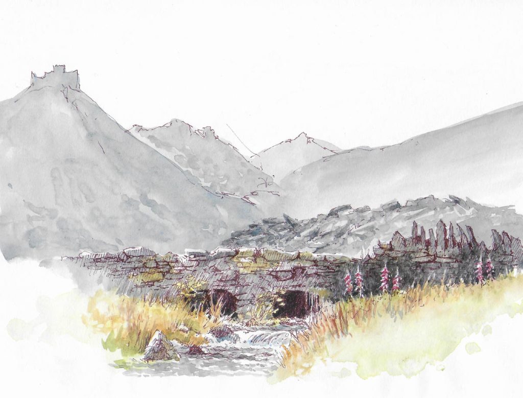
This is a watercolour sketch of a scene high up in the Sundance Mountains in the Canadian Rockies, painted in a cartridge A4 sketch-book, and is almost a monochrome. Throughout I’ve used a mixture of French ultramarine and cadmium red in various strengths of tone, firstly laying on a wash of a light version and when this had dried applying detail with a darker tone of the same mix to indicate the shadow areas on the peaks. When all the background detail had been painted I waited till it dried and then applied a glaze of the same mixture only making this darker above the large boulders and lightening it as it crept up the face of the far mountain. This softened some of the lower detail and created a sense of misty atmosphere in the valley below. I then completed the foreground detail on rocks and trees. This scene is featured in my Watercolour and Beyond book published by Search Press. It is packed with watercolour techniques and methods to enhance your paintings.

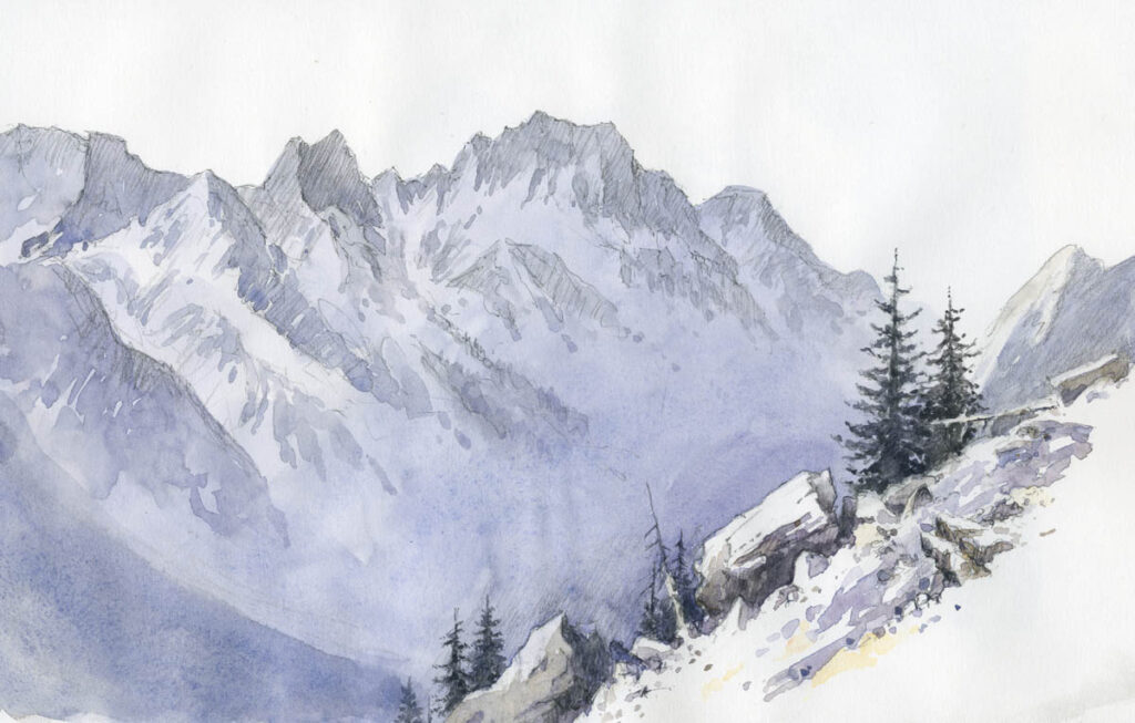
The glaze method can be used on all types of landscape, not just mountain scenery, and limiting the colours in this way further enhances the mood. With sharp contrasts in the foreground the sense of misty atmosphere is further enhanced. The technique is also great for warming up or cooling down a passage in your composition, or if you wish to highlight a particular part of it, such as a building, summit or other feature.

One extremely effective tip is to try this method out on an old watercolour, perhaps one that hasn’t really worked for you, so dig out some of you old painting and have some wonderfully experimental moments with them.

David Bellamy : The Value of White Gouache

Featured

DAVID BELLAMY: THE VALUE OF WHITE GOUACHE

This is the time of year when many get out their sketching gear ready to go on holiday and enjoy some artwork in a new place. I always take my box of watercolour pans along with me, mainly for watercolour sketches, though sometimes I work on a full painting out of doors. For certain subjects it’s actually quicker working in watercolour than trying to render the subject in pencil or pen.

In addition to the half-pan colours I carry a few tubes of watercolours, and these are usually colours that I don’t have in my box but I expect to be useful for a particular trip. A secondary reason is that if I happen to lose my box of paints at least I have the tube colours to fall back on. One tube I always take is that of white gouache, as it is so useful. As well as being essential for tinted papers it is great for little highlights or perhaps rectifying part of the work that has gone astray.

I sketched this stone bridge last week in Cwmorthin, a slate-quarrying area near Blaenau Ffestiniog, and you can see the piles of slate heaped up behind the bridge, as well as mountainous slate slag-heaps in the distance. Those I only indicated vaguely, as the bridge was my main objective. I drew this with a sepia pen and wanted to highlight the foxgloves as they broke up the stonework and added colour to the scene. Alas, I messed this up a bit. One of the difficulties we have as landscape artists is that we don’t have the great range of tones that occur in nature, so we have to modify our tones a little. My foxgloves weren’t too bad, but I felt they could stand out better, so I applied white gouache over them and then when that was dry overlaid alizarin crimson over the gouache. This certainly made them stand out more, and although they are far from perfect I do have a reasonable sketch from which to work up a painting. So it’s always helpful to have a tube of white gouache with you on your travels.

On Saturday I shall be book-signing at Erwood Station Gallery & Craft Centre, about 8 miles south of Builth Wells just off the A470, from 2 to 4 pm. I will also be showing quite a number of the painting from the new book, Watercolour and Beyond, with captions on certain techniques and effects in the painting, and I’ll be happy to answer any queries you may have about painting landscapes, so do come along if you can make it. It’s a lovely spot overlooking the River Wye. Their phone number is 01982 560555. The paintings will be on display throughout July, so if you can’t make it on Saturday they will be around for a while. And incidentally, the book covers quite a bit about working with gouache paints. Enjoy your summer travels and keep safe!

DAVID BELLAMY LOSING THE FOREGROUND

How often have you viewed a scene where an exciting subject stands in the middle distance and there is a boring or ugly large feature blocking the foreground? These moments can be truly frustrating, yet it is well worth trying to work round the problem if the main subject looks worthwhile. You might be able to alter some of the details in the offending foreground feature, perhaps obscure the worst parts or introduce some really dark shadow to blot it out completely. My own preference is to use a vignette technique if possible, to lose the immediate foreground to create a more pleasing composition.

This is a rough little watercolour sketch I did while overlooking Brasov in Transylvania. The roofs, towers and domes in the middle distance appealed to me, but the foreground was marred by large buildings that were much less attractive. To include these as they appeared would dominate the composition, so I decided to just record their roofs and lose all other detail. There were hardly any windows or doors on this side anyway, so I just hinted at a little foliage and then worked in the large conifer, also losing that at the bottom. I had intended to lay some spatter over the foreground when I returned to base, but somehow forgot. A little spatter and maybe some suggested light foliage would enhance it further. I normally prefer to include a gap where there is a feature right across the foreground to suggest a lead-in, so if I followed up with a painting of this scene I would probably create such a gap perhaps to the immediate right of the large conifer.

With summer here it’s a great time for getting out to paint or sketch before nature, so I hope you are making the most of it. If you are nervous about working out of doors with or without people around then just take an A6 sketchbook in your pocket and a few pencil stubs and people will think you are just making a few notes. That will help you gain confidence to work on larger, more ambitious work. In Transylvania I was naturally a little wary of bears, Goths and vampires, but all passed without a great deal of mishap. Happy sketching!

David Bellamy – With watercolours to Austria

September was another of those all-action months where there was no time to write blogs: sadly there are many things happening which I simply don’t have time to relate. On 14th September I had one of the proudest moments of my life when Catherine, my daughter, married Nicko. They met at clown school in Paris many years ago and had an amazing wedding with the reception in a delightful woodland setting. Overwhelmingly, the guests were actors, actresses, directors, producers, musicians, magicians, clowns (of course), singers, and folks from the entertainment industry. The Bollywood-style dance was truly jaw-dropping, and the church service rocked.

A few days later Austria beckoned: a painting group holiday arranged by Richard Cartwright of West Norfolk Arts with the assistance and local expertise of our friend Christof Hoelzl who found us some exciting locations to paint.

Based in the beautiful Stubaital valley we painted and sketched the surrounding peaks, and on a very wet day tackled a waterfall. Although I don’t do many city and town scenes we spent a day in Hall which has many splendid old buildings, and I found myself really enjoying the change. The watercolour of Rosengasse was done quickly in a cartridge sketchbook while it was spitting with rain. I could see much more than I’ve included, particularly beneath the church tower, but I did not want to over-work it, and eliminating distant detail further suggests distance.

I’ve run the colours of the walls into one another, assisted by the falling rain, while Christof gallantly held his umbrella over the sketchbook as I demonstrated. One feature I love about these Austrian towns is the ubiquitous hanging signs with their ornate metal hangers. I took the opportunity of photographing many of these to use elsewhere, possibly as collages. Note how I have vignetted the interesting stonework of the street so that only few stones are shown in the foreground.

 With autumn upon us do get ready for those glorious colours. Don’t wait just for those lovely sunny days, as the bright yellow and orange leaves reflecting in puddles can work wonders for your painting.

David Bellamy – Painting the moving composition

Have you ever painted outside when the landscape seems to be moving, jumping about or constantly changing in some way? These can be exciting, opportunistic times for the alfresco artist, but often fraught with problems. Most of the movement, apart from animals, figures or vehicles, is usually down to strong winds, which can make painting or sketching outdoors even more difficult than in light rain.

The scene is a watercolour sketch of Trevone Bay in Cornwall, carried out on a hard-back book of cartridge paper, over a two-page spread. Strong winds were blowing the clouds along at a truly fast rate, so the sky was constantly changing and the cloud shadows over sea and headlands moved astonishingly quickly. Additionally waves crashed in with such force that it threw up great white splashes all the time.

To render the sky I simply wet the whole area and waited for the excess water to run off before applying cobalt blue, working round the clouds and the wet paper automatically resulting in soft edges. In the wind and sun this did not take long to dry, so then I laid in the lighter colours over the headland, including some red on the central promontory. I had already decided this would be my focal point, and I would keep it light with the further headland dark. I could easily have decided to do it the other way round. Whatever you do, don’t try to keep changing these main tonal areas as the scene itself changes, otherwise it will lead to a mess!

Once that had dried I painted in the green top of the closer headland and used cobalt and pthalo blues in the sea, leaving the white surf and splashes as white paper. I could have positioned the main splash a little closer to the central headland to further support the focal point, but when I’m desperate for a cappuccino I sometimes blob these features in where convenient and leave the refinements for the finished painting. Most importantly, don’t feel that because a feature appears in a certain position, that you have to put it exactly there. Finally the dark headland and foreground rocks were painted.

This was done as a sketching demonstration for a course last week. My new book, David Bellamy’s Arctic Light will be published shortly by Search Press, and it’s quite different from any of my previous books – more on that shortly.

Before I go I’d like to highlight a very useful report on watercolour paints that has just been published by www.wonderstreet.co.uk  It covers a great many ranges of watercolours, including some I had never heard of, and I recommend you take a look at it on  http://wonderstreet.com/blog/which-brand-of-watercolour-should-you-choose   While I can’t comment on those paints I have not used, it does seem pretty accurate on those I do know. Enjoy your painting!