

Cotswold Cottage
One of the most thorny problems confronting the painting tutor is putting across the need to eliminate unwanted detail from a subject when the student has already been told to work directly from the subject and produce a careful rendering of the scene. As landscape artists we go out into the countryside to seek out visual material to work from and use as a basis for a composition, yet in order to produce an interesting painting we need to filter out a lot of extraneous detail. I am not interested in producing a photographic response to a scene where everything is laid out meticulously.
In this view of a cottage you will see that certain edges have been lost – there is no defining line for the bottom of either the house wall or the drystone wall, as this approach provides a more painterly response, rather than a photographic one. Also the stones are only described in a minimalistic way. In both these cases the eye of the viewer will subconsciously include these elements. An effective method here is to splash in a different colour in lieu of detail – note the patch of red to the left of centre. This can be a useful device even if the colour you apply does not appear in the scene, as it can both enliven a subject and avoid the need for too much detail.
For these stones I used a number one rigger brush – a very fine instrument with long hairs, ideal for fine work. Where I describe a number of stones in a wall I tend to ease off on the pressure where I want the stones to become lost, but another method I employ is to draw in a few more stones than I actually need, again with the rigger. Whilst these are still wet I then wash over the edge of the painted stones with one of the colours found in the wall, thus losing some of the stones at the edges, and at the same time creating a gradual losing of the detail that can appear more natural. An interesting exercise you can do is to paint the same scene twice: once in extremely strong detail all over the composition, and then again in the manner I’ve described above. By comparing the two results you will learn much about restricting the urge to include everything in a painting.

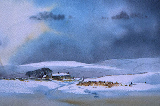 This watercolour shows a lonely farm on Tideswell Moor in Derbyshire, where you can find many similar compositions, at times without even needing to get out of your car! While it’s tempting to think of snow as being white, the snow as we see it varies considerably in tone, sometimes appearing almost black when in deep shadow and backlit by strong sunshine. If you wish to push a snowy hill or mountain back into the distance lay a weak wash of blue or blue-grey over it, as you can see on the right-hand distant hill where I used cobalt blue. By comparison the left-hand hill, which is simply the white of the paper, really does come forward. To accentuate the white roof I’ve set it against a mid-tone background: planning your tones like this is easy with some forethought before starting to paint.
