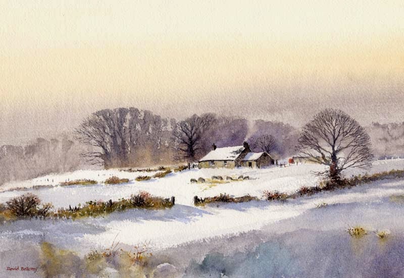
How often do you find yourself in a superb location for painting, but with poor, flat light and dull, lifeless colours? This happens to me rather too often, and while it pays to go out to seek painting subjects in fine weather, this is not always possible. As a result we find ourselves with a scene that needs livening up quite a bit, and this is best done by introducing some exciting light and atmosphere, and changing the colours to a degree. In this watercolour of a farm in snow I warmed up the sky with a touch of alizarin crimson, and while the mass of trees to the left of the farm were still wet I washed in some light red to warm that area up. Cast shadows, created with French ultramarine with a touch of cadmium red liven up what would otherwise be quite a dull foreground.
Every autumn I do a watercolour seminar, which is extremely popular, as it involves not just a landscape demonstration, but an illustrated talk and an opportunity to fire any questions at me. This year it takes place at the Pontypool Community Education Centre (The Settlement), in Pontypool, Monmouthshire on Saturday 1st November. The centre has tiered seating and excellent access roads, and the seminar begins at 10.30 am and finishes around 2.30pm. The demonstration is projected onto a screen, with techniques highlighted and shown in enlargement, enabling the audience to follow each procedure more clearly, and ask questions as it unfolds.
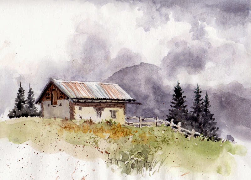
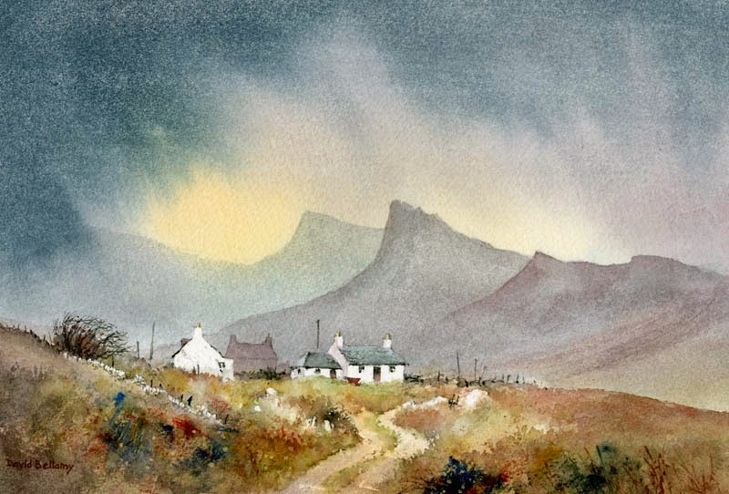
The illustrated talk covers many aspects of painting winter and autumn scenes, from initial sketching and how to work comfortably out of doors in the cooler months, what to wear outdoors, to painting back indoors with methods to make the most of low winter light to bring your painting to life; bringing warm and rich colours into a drab scene; making the most of snow in its various forms; describing those graceful bare trees; capturing the magic of autumn; tackling foregrounds, with examples of various types of foreground; and much more. Many watercolour techniques are shown in detail and discussed.
To find out more about the seminar visit http://www.davidbellamy.co.uk/watercolour-seminar-2014/ Make the most of winter and autumn painting by planning your approach now.