David Bellamy – Where do I stick the boat?

Many people find painting boats a challenge, and although they love working on harbour or coastal scenes where boats are featured, it is often the rendering of the boats that lets them down. Some boats, of course, are notoriously complicated and awkward even for the professionals, but here I’d like to offer some help and a few tips for those who find these fascinating subjects rather a struggle.

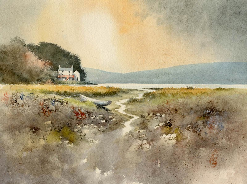
This watercolour is part of a small painting on Waterford 300lb rough paper, where I have included a few small dinghies that together with the figures form the focal point of the composition. Pushing boats into the middle distance like this makes them considerably simpler, and yet they can still be the centre of interest. By having them broadside on to the viewer you will eliminate those often excruciatingly difficult curves which may be present when you look at them from a side angle, but you can still give them a gentle rake where the top of the gunnel curves slightly upwards to the prow. If you are working on a reasonably large boat that is broadside on, closer to the foreground then use the shallower curve of French Curves to help you. With more experience work on more challenging boats.

Keeping the figures close to the boats emphasises the two elements as a focal point, but you can also use figures to hide those parts of the boat you may find awkward. Tarpaulins, netting, buoys, oars, lobster pots and all manner of seafaring detritus can also be used to break up parts of boats, as well as adding colour. Of course, you may be painting a truly picturesque harbour and find the main boat in the scene is a complicated mess and not at all attractive. Leave it out and substitute another, more handsome craft to your liking. It pays to sketch and photograph really good individual boats from all angles and at a variety of distances so that you can use these as substitutes in a composition. 

A few years ago I filmed a number of scenes painting on the coast aimed at a DVD to release with my Seas & Shorelines book, but I mislaid the footage and the book came out on its own. However, I found the coastal footage a while back and this has now been produced as a new Seas & Shorelines DVD, which can be bought on its own or as a special book & dvd offer and this is solely available from my website. It contains many tips on painting boats as well as other maritime subjects. There is also a clip of the DVD on You Tube.

This is not the best time of year for getting out to sketch in the landscape, but given the problem with Coronavirus you may well feel the effort is worthwhile. I spend a lot of time outdoors and on Saturday went up the Black Mountains to paint some snow scenes. Being out in nature is one of the best antidotes to our current situation, but make sure you wrap up warm. I visited Cotswold Outdoor a few days ago to get some new sketching gloves and they have two or three excellent versions which are thin, warm and ideal for sketching in cold conditions. There are naturally many tips for working outdoors in winter in my Landscapes Through the Seasons in Watercolour book. 

    Enjoy your painting!

David Bellamy – Enjoying the detail in a painting

How do you cope when you are presented with a complicated scene such as a harbour full of boats of all colours and sizes? Beat a hasty retreat and look for a simpler subject? I love painting and sketching boats, and there’s always a way round the problem: you can leave out craft that don’t appeal, reduce their number, enlarge one so that it hides two or three others, or perhaps cast a dark shadow over the ones further away.

    This is a watercolour I did of Oare Creek in Kent, a place crammed with lots of lovely craft, and although there seem to be a lot in the composition I did leave many more out. This is one of those works that doesn’t have just one centre of interest – there is a whole line of them! I do this sometimes as it makes quite a change, and some buyers do enjoy a mass of detail, and to get a sense of the place you do need to suggest that many boats line the creek, especially if working to commission.

    On occasion in scenes like this I lay shadow across many of the boats, simply suggesting them, and highlight the main ones – the focal point – with strong lighting. If you wish to subdue one or two off-centre then just paint them in silhouette as I have done with the boat on the extreme right background. The masts and gulls were rendered with white gouache when everything else had been completed. If need be I create dark areas deliberately so that white gulls can be placed there and stand out. This is at fairly low tide so much of the mud-banks are revealed. To avoid too much monotony I have made some lighter and on the right bank splashed in some cadmium red to add interest. The painting was done on Saunders Waterford hot pressed, 140lb weight.

    Now most of us are able to get outside do make the most of the summer days to find some new subjects. This is important not just from the point of view of finding new material to paint, but getting outdoors rejuvenates us and gets us away from the lethargic indoors syndrome that can deplete our enthusiasm for creating anything. There is nothing better than perching on a rock warmed by the sunshine, overlooking a stunning view while sipping a cappuccino as you sketch. I’ve been out there with my new Daniel Smith watercolour box of gorgeous half-pans lately, so it’s been a double pleasure!

David Bellamy – Painting Seas & Shorelines in Watercolour

Making life easy for ourselves isn’t really the done thing in painting – we do love striving to find the most complicated and difficult way of producing a painting. In my new book, David Bellamy’s Seas & Shorelines in Watercolour I have outlined a number of ways to simplify and ease our ways of working, from basic use of French curves and rulers to mono-printing and highlighting alternative ways to cope with painting those nasty rocks and cliffs, and much more.

In this painting of waders in an estuary I have used low-tack masking tape to create the horizon and also streaks of colour depicting different tones in the water on the mid-left of the composition. These latter might not be so obvious in this small image, but this method is so simple and can be used to create many features involving straight lines. The horizon line, by the way is not exactly halfway down the composition – I have cut out some of the sky to try to show up the lines better!

The book is crammed with paintings, sketches, diagrams showing a great many techniques, and has four step-by-step works. I have introduced many alternative methods of working with watercolours, bringing in additives to create various textural effects, introducing collage to create rock and cliff structures, pulling out colour with greater force, and producing effects with sponges, knives and other tools. A number of different methods have been demonstrated to illustrate how to achieve the white highlights, sparkles and splashes on boisterous and calm waters, and there’s a number of ways of coping with boats.

Signed copies of the book are available via my website  It’s a great companion to take away on a summer holiday or break by the sea, and though subjects are mainly around the British coastline there are many from abroad. It includes a chapter on painting on holiday and a variety of ways of working on the spot, including pen and wash, watercolour pencils, critical observation methods, making the most of figures and seabirds in your work, and beefing up your compositions with a completely different sky to that in your photograph or sketch, plus a host of other ways of achieving a more exciting result, whether you want a tranquil estuary scene, raging seas, a gentle beach or harbour composition or dramatic cliff scenery.

David Bellamy – Making powerful compositions

Getting the composition right is critical whatever medium you use. In landscape painting there are many rules, or guides that will help you achieve a powerful composition, although like most ‘rules’ in painting these can be broken at times in order to create more original results. It does pay, however, to follow these rules while you are learning, and then perhaps taking a more creative approach later when you gain experience.

In this watercolour of Angle in Pembrokeshire I have used Waterford 300lb paper with a marvellous rough surface to enhance the textural effects, particularly in the large foreground area. The large foreground pushes back the centre of interest – the cottage – and allows a large lead-in of the creek. A lead-in to the centre of interest like this helps establish it, and the boats, birds, sparkle on the water and strong orange colour in the sky all draw attention to the centre of interest. The cottage also stands out darkly against the sky. These are all devices you can use to highlight your focal point.

The far right-hand boat gives a sense of balance to the composition, so that not everything is concentrated around the centre of interest. It is a good idea to carry out one or two studio sketches to ascertain the optimum positioning and emphasis on the painting to be done. Having the centre of interest around one-third of the way down the paper, or up from the bottom, and one third of the way along from either side always gives a powerful effect, so try not to place it bang in the centre!

The actual painting is on display in the Breath of Nature exhibition at Boundary Art at 3 Sovereign Quay, Havannah Street, Cardiff CF10 5SF   Tel.02920 489869 until 1st May. The other paintings I have on display at Boundary Art are here 

If you want to learn how to add Drama and Atmosphere to your paintings come to my Watercolour Seminar in Pontypool in October

David Bellamy – Creating a large foreground

It’s some time since I found time to write a blog post – having to work on the studio, being away from home and a recalcitrant computer with an impossible broadband service has made it difficult. The sun is beating down outside and the spring flowers are rife, a marvellous time to be out sketching, so maybe when I finish this post I’ll get some fresh air.

Dylan's Boathouse smMy subject today is Dylan Thomas’s Boathouse  where he wrote his poetry. In this case I have designed the composition so that the foreground plays a major part, covering at least half the area of the painting. This has allowed me a rather long lead-in where I’ve elongated one of the ditch-like creeks and let it fade into the immediate foreground. With so much foreground space there is a danger that it could be severely over-worked, so I have made the detail intermittent, gradually losing it lower down as a vignette.

I began rendering the foreground by drawing in the shapes of stones in outline with a fine rigger brush, varying the colour with burnt umber, light red and ultramarine. I then washed a medium tone of French ultramarine and light red over the area, avoiding the stream and light stones, working very quickly with a number ten sable, not worrying if I covered some of the stone images, and losing the edges of others where they were still wet. While this was all wet I dropped in other colours, mainly yellow ochre, and then let the painting dry. Finally I drew in further stones with the rigger – these are the ones that stand out more prominently. I also added touches to some of the light stone shapes to make them stand out.

This painting is now on display with others at Art Matters in their White Lion Street Gallery in White Lion Street, Tenby in Pembrokeshire. Their telephone number is 01834 843375 if you wish to get in touch, and their site is www.artmatters.org.uk  Enjoy your painting and make sure you give those foregrounds plenty of consideration before you decide on the final composition. Don’t be afraid to make them a significant part of the painting, and not just an after-thought.