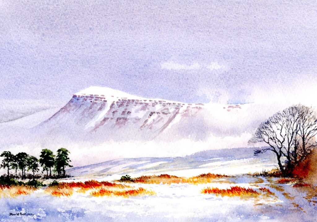
Rock and cliff features are some of my favourites, not just in the mountains, but when painting coastal scenes. You can obtain truly striking effects of light on rocks and crags in the contrasts of light and shadows areas, and also colours are intensified wet rocks are caught in certain light or when they become wet, allowing you to introduce imaginative and creative responses.
In this composition high up on the Sundance Mountains of the Canadian Rockies I turned afternoon light into early evening by flooding the peaks with a transparent glaze of French Ultramarine and Alizarin Crimson, and deepening the shadows. Much of the rock surfaces I have left completely blank to increase the suggestion of strong light, while the shadow parts were painted with a weak mixture of French Ultramarine and cadmium red, then yellow ochre was floated in while it was still wet. When this had dried I drew in some fracture lines with a no. 1 rigger using French Ultramarine and burnt umber, applying more pressure to the brush in places to vary the width of the fractures.
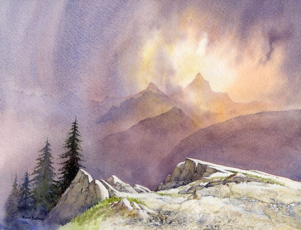
For the flattish foreground I glued tissue paper over the Saunders Waterford 200lb rough paper, which of course changes the response of a wash considerably. Tissue paper is quite useful for depicting rocks as it creates natural fractures when glued down, if you leave the crinkle ridges in place. I painted over it using the side of a large sable to further suggest textures, and for this I apply a very wet wash then follow it up by dropping other colour into it to cteate variations. This is one of the techniques from my book Watercolour and Beyond, which contains many techniques and devices I’ve not covered before.
I shall be carrying out a demonstration and workshop at https://internationalwatercolourmasters.com/events-new/david-bellamy-19-may-1-day-workshop/ the International Watercolour Masters event in Shropshire on 18th and 19th May and would love to see you there if you can make it.