Jenny Keal – Pastel Workshop in Marlborough

Sometimes it is a good idea to take a completely different approach to a painting. I normally start by painting the sky, background hills and trees and then painting the focal point, finishing with the foreground. There are practical reasons for this, as it is easy to smudge a focal point that you are pleased with when painting the area above it.
Farm Above Dinas Cross JK
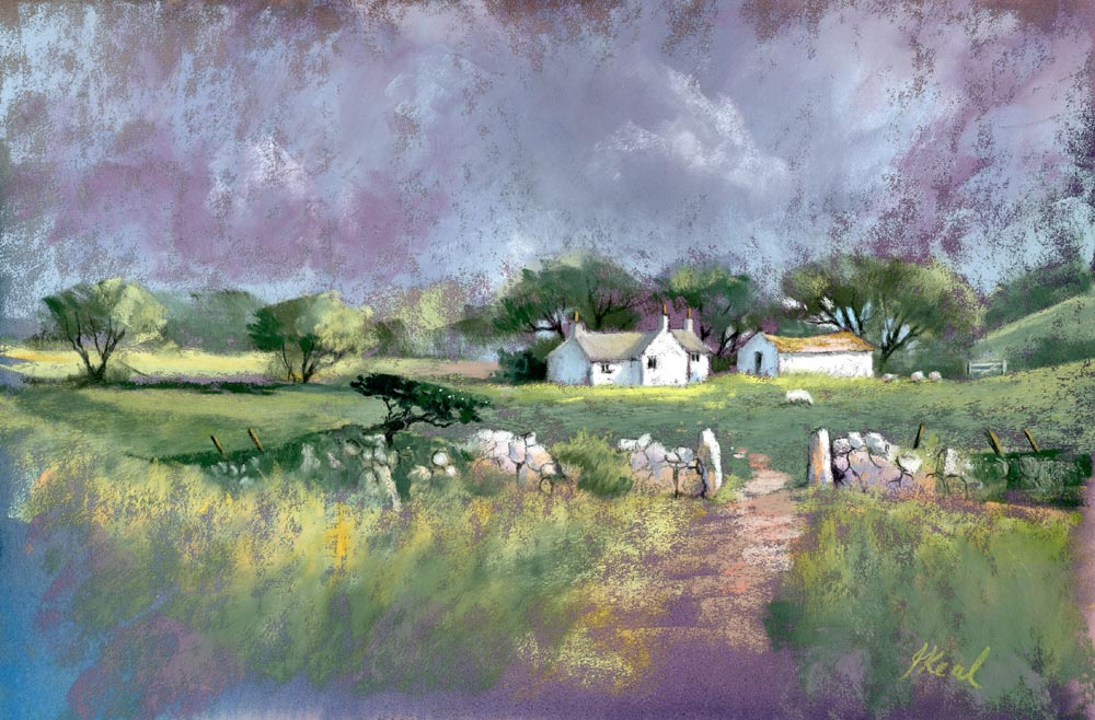
However, in the case of the painting illustrated here, a cottage in the Preseli hills, Pembrokshire, I began with the focal point, then painted the sky and trees ending with the foreground.  The surface I am using is Fisher 400 art paper which has been tinted with a purple ink wash. This gave me a dark background and allowed me to leave some of the surface unpainted giving a unity to the work.

By adopting this order of working I found myself working in a much looser way, for example adding the light between the branches of the trees instead of the other way around, and painting the trees around the buildings rather than painting the building over the trees.

So experiment with your approach to a painting and see what happens.

I will be running a Pastel Workshop in the White Horse Bookshop in Marlborough on 4th August, 2016. If you are interested in enrolling please contact Edwina Pearce on 01672 512071.at the White Horse Bookshop in Marlborough.

Stage 4 of my competition entry

I have made further progress on my painting for the Cox & Kings Morocco competition: The middle distance in a landscape painting is often a tricky area to tackle. It’s important to keep in mind the relative size of features compared to the foreground such as trees and bushes;   the colour temperature must be carefully controlled;  and we must resist the temptation to render too much detail to features that are distant.

morocco stage4

Stage 4 – middle distance

In the photograph there were very strong, sharply defined cloud shadows on the hills on the right and initially I painted these in as they were in the photograph but I quickly realised that they were drawing the eye too much and would compete with my focal point so I softened them considerably. The hills on the left were lighter in tone with less tonal contrast so there was no need to soften them too much.

The next stage will be the focal point, the building, and the foreground. See you in a few days.


Stage 2 & 3 of my competition entry

Yesterday I made more progress on my painting for the Cox & Kings Morocco competition: Stage 2 – Sky: When painting landscapes, I generally work from the top of a painting downwards. This serves two purposes. Firstly it helps prevent the heel of your hand smudging the work where it rests on the support and secondly it helps create a sense of recession. If you think of the landscape in terms of distance, the objects farthest away are usually lighter in tone, cooler in colour and less distinct. Translating this into the painting process means that you use paler, cooler colours in the distance and less detail. By working down the support you can remember that meme in your choice of colour and tone.

morocco stage2

Stage 2 – Sky

Stage 3 – The mountains: The sky was painted down over the drawn lines that defined the mountain tops. This is to ensure that there are no gaps between the sky and mountains and also to give the impression that the sky is, in effect, behind the mountains. Sticking to cooler colours and pale tones, the mountains are painted with sharp edges in places and softer edges in others so that there is not a hard line all the way across the painting. Soft edged cloud shadows helps define the ridges.

morocco stage3csm (1)

Stage 3 – the mountains

The next step will be coming soon.

The Secret of Speckles

I’ve been asked many times how I get the fine speckles of colour in my paintings so I am going to let you into the secret. I lay the painting flat on a table and using the edge of a palette knife I scrape flakes of pastel on the surface where I want to create the effect of small leaves, seed heads in a field or sea spray on rocks etc. I than press the flakes into the painting with the flat of the palette knife. If there are some stray flakes which you do not want, you simply don’t press them in and they will either fall off when you place the painting in a vertical position or you can blow them away.

Scraping

Step 2. Press the flakes into the surface of the painting with the flat of the palette knife where you want them to stick. Blow away any unwanted flecks.

Pressing in Speckles

Step 1. Lay the painting horizontal on a table and using the edge of a palette knife, scrape flakes of pastel from a pastel stick on to the surface of the painting where you want to create fine specks of colour.

__________________________
This technique is most effective if you use contrasting tones and colour.

It is almost impossible to achieve these fine marks with a dotting technique and the random effect is particularly pleasing.  However, I will issue one word of warning. This technique is addictive and it is easy to get carried away using it all over the place and then the effect is spoiled.This technique is described in my book Painting with Pastels and demonstrated on my DVD of the same name. Or you can buy both at a Special Offer Price of £20.

Painting Landscapes in Pastel

Autumn in the Clydach Gorge

Autumn in the Clydach Gorge by Jenny Keal

Although I work in watercolour, I do some painting in other mediums, one of which is pastel. I have neglected it for many years and keep promising myself to do some more, especially when I see what Jenny is producing these days. If you find watercolour difficult, or maybe you are in a rut at the moment, why not try pastels? They make a wonderful change, and you can always return to watercolour later. Many artists find pastel painting so much easier, but some don’t like the dust and mess on their fingers.

Jenny has excellent ways of managing pastel dust and the mess on your fingers, and she is only too willing to show you her methods. She has superb techniques for creating areas of tranquil water with reflections and sparkling highlights. On the right you see one of her paintings of the Clydach Gorge with reflections in deep water. Pastel, with its rich colours, is excellent for autumnal scenes, which can at times be tricky in watercolour, especially when you want to juxtapose light yellow or orange foliage against a darker background. The medium is also much more forgiving – you can alter features fairly easily compared to watercolour. Pastel is also great for fading away the more distant features, as you can see here.

One of my favourite subjects is rocks, and I’ve just seen Jenny’s latest works on rocks, and they certainly have the WOW! factor. Check out Jenny’s blog where she gives free tips, but if you’d really like to give pastels a try why not enroll for her course in Lynmouth from 20th to 23rd May, when she’ll be showing students how to paint the stunning coast and countryside of North Devon?