David Bellamy – Reserving whites in a watercolour

One of the greatest problems concerning the watercolourist is that of reserving whites in a painting. There are several ways of tackling this: the use of the negative painting technique, masking fluid or film, scratching with a knife or scalpel, or the use of Chinese white, white gouache or acrylic. Pulling out colour with a damp brush or tissue, or sponging out when the wash is dry, are further ways of achieving a considerable lightening of the tone, although these latter methods rarely are as glaringly white as the aforementioned ones. Down the centuries white body colour has been employed, the equivalent of our white gouache or Chinese white.

These days even the main watercolour societies feature paintings carried out with much use of white gouache or acrylic paint, so there is no stigma attached to using that method, and I shall illustrate it in a future blog. Scratching can be effective for minor features such as ropes or rigging in a harbour, limited sparkle on water, and similar items, but for larger or more intricate work masking fluid or the negative painting technique is a better method.

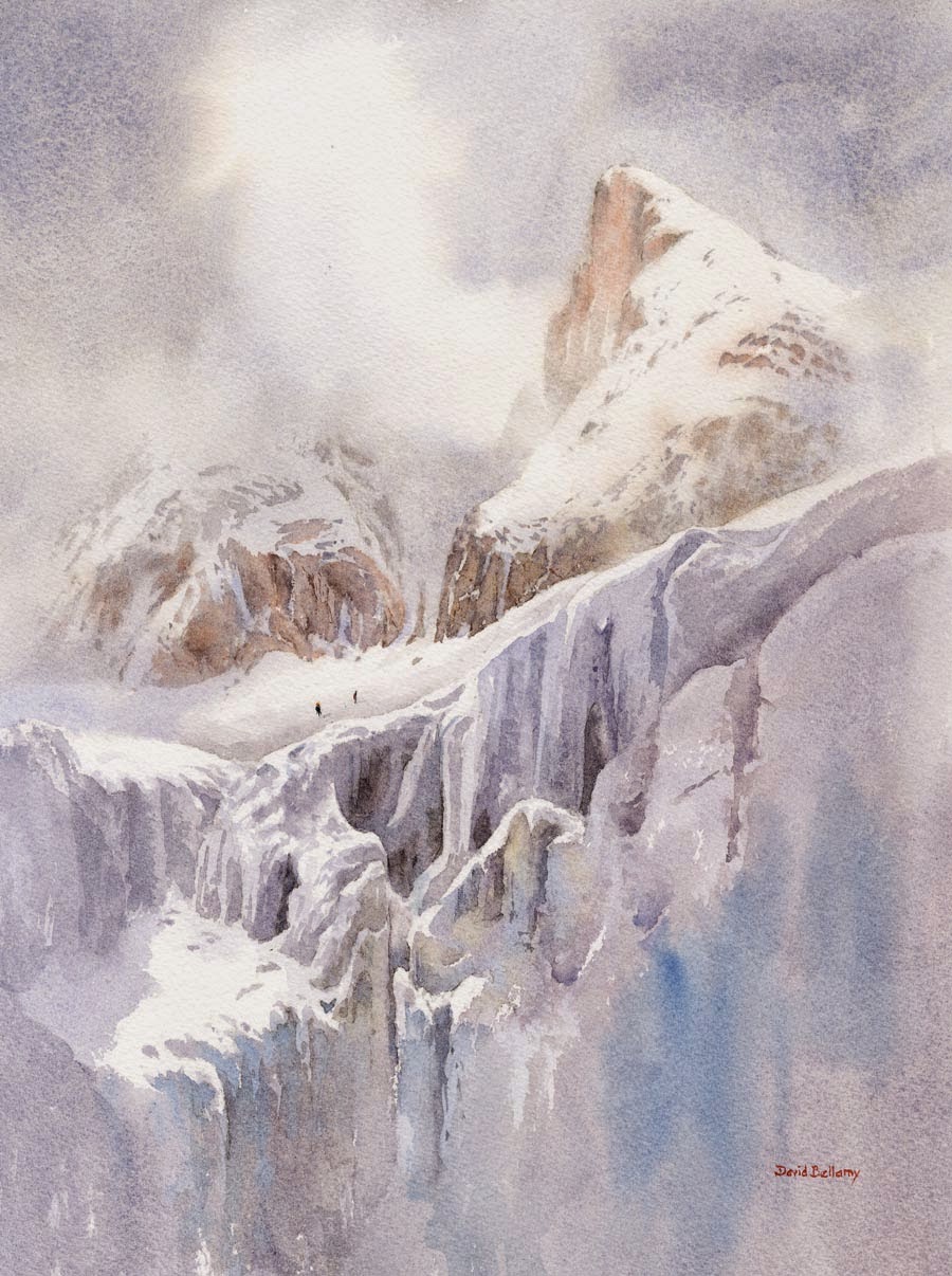
In the watercolour on the right I applied masking fluid over the actual icefall with all its complexities, in the positions where you see the absolute white. This, of course, is the naked paper after the masking fluid has been removed near the end of the painting. For the snow lying on the peak and crags, and also for the light cloud, I used the negative painting method, that is, I worked round the white shapes with the darker sky, the rocks and shadow areas. When it was all dry I applied further shadow washes using French ultramarine and cadmium red over some of the snow and rock areas that were in shadow. I could have employed masking fluid to some of these parts, but it results in hard edges and much of the edges there I wanted to appear soft, especially the light cloud. I find it best not to mix the two techniques in the same area as it can get confusing, thus causing errors, so I have deliberately kept the top and bottom halves of the composition apart in that sense.

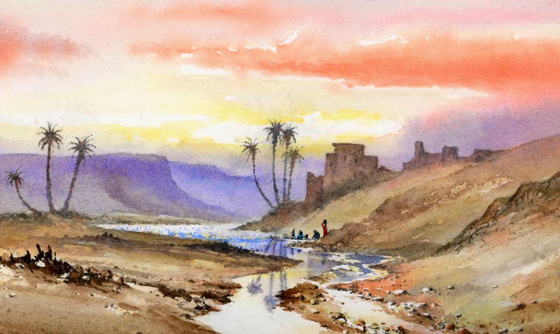
This is one of the paintings that will appear in my exhibition at the Windrush Gallery from 3rd to 10th May (it will be closed on 7th and 8th May), at Windrush, Gloucestershire, OX18 4TU  Telephone 01451 844425 The gallery open times are from 11 am to 5pm daily. The exhibition will cover a wide variety of scenery, including marine and pastoral paintings. I shall also be doing a watercolour demonstration Painting in the Cooler Months in Windrush village hall on Saturday 9th May at 2pm. If you wish to come along please book in advance:  j.neil299@btinternet.com or phone 01451 844425

David Bellamy – Creating a feeling of past times in your watercolour landscape

The vast range of styles, approaches and emotions generated in our paintings makes the art world such a wonderful place for us to explore. It never ceases to amaze me what an exciting world we have in the arts. I mention emotions in particular, for to respond with passion and feeling is vital in whatever genre we paint. Sure, we all do ‘bread and butter’ work, as it’s not easy maintaining that level of high emotion for our most important works.Road to the Brecon Beacons sm

Emotion in art is often triggered by a sense of nostalgia, and one small, yet effective way of introducing this into landscape paintings is to include symbols of yesteryear, whether you are painting old sailing boats, steam locomotives, or whatever your theme may be.

In this watercolour the old county road stretches away towards the Brecon Beacons, and on the right-hand side I have included the old sign-post that still stands there. This style of sign-post is slowly disappearing from the British countryside, and it’s amazing how including just a minor element like this can evoke a marvellous sense of the past. Watch out for these little gems if you like to put across this feeling of past times in your paintings. The signpost was created with masking fluid which will give you a strong, stark edge to the feature.

This is one of several of my paintings now on display at the Ardent Gallery in the centre of Brecon, tel. 01874 610710 Pop in and treat yourself to a coffee there while you look at the Christmas show.

David Bellamy – Making the most of the winter landscape

Like boy scouts, we should always be well prepared as artists, for those moments when the weather and atmosphere create stunning effects that we simply cannot ignore. This means not just carrying sketchbook and camera around with us when we’re in the great outdoors, but being ready to venture out at short notice when a little seasonal magic appears. At this time of year I’m always aware that snow may well fall at any time on the hills and mountains, and if this coincides with those flaming autumn colours we have stunning possibilities for superb landscape paintings, so keep an eye on them there hills!

In this watercolour of the Applecross Mountains the contrast in colour temperature between the foreground and the background is striking. You can, of course beef up the warm colours well into winter if you don’t want your compositions to appear to cold overall. In this painting, which you will find on a larger scale in my book Winter Landscapes in Watercolour, the mountain details have been rendered in cool blues, apart from where the low sunlight is catching the higher parts. In the sunlit features I dropped in a touch of light red while the dark crags were still wet, and this also helps to place more emphasis on certain parts of the scene.

During the change of seasons be ready for this effect and look out for it in your local landscapes. Be prepared to move around to set those lively warm colours against the cool mountains and snow. It will really bring your work to life.


There are still places left on my seminar in Pontypool on Saturday 1st November, on painting winter landscapes in watercolour, and it includes a full demonstration and an illustrated talk on creating exciting winter scenes, with a great many examples of different types of landscape. It is aimed at preparing you for painting the winter landscape both indoors and outdoors, and making the most of this fascinating season. Check it out on my website. In the meantime, enjoy your painting!

David Bellamy – Painting desert and tropical scenes in watercolour

I was asked recently about painting tropical scenes and how this differed from my usual British landscapes. Although I haven’t done any tropical work for a while, over the years I’ve painted quite a number of scenes in the tropics, especially in East Africa with its wide range of spectacular scenery. Desert scenery is one of my favourite genres, as the figures and colours can be quite exotic, and one tends not to find the painting water freezing up, as in more northerly climes. Unfortunately I don’t have any record of earlier jungle and tropical plant scenery paintings, so this is the closest I can find, until I manage to paint further tropical scenes, which probably won’t happen until next winter.

This watercolour shows a wadi in the Atlas Mountains of Morocco towards evening, with women washing clothes in the river. We were returning from an expedition when I spotted this marvellous composition, and did a quick pencil sketch of it, even though I felt pretty tired and was likely to be assailed by hundreds of kids demanding pencils.

I take much the same colours with me to the hotter climates, as I do in Europe, but tend to use more of the brighter colours. This watercolour was done on Saunders Waterford 140lb hot-pressed paper which is excellent for bringing out the vitality of the brighter colours, really making them sing. I used vermilion in the sky, with gamboge in the brighter parts. As with most landscape work it helps to suggest space and distance with cooler colours in the more distant passages, and this can also throw the emphasis on to those areas of brighter colours, whether lush vegetation or other features. Here I used French ultramarine for the background. You can create really striking colour effects by juxtaposing complementary colours, for example bright red flowers or plants set in vivid green foliage. I hope these tips will help those of you who like more exotic scenery………..until I can get back into the jungle.

Suggesting detail in watercolour landscapes

Last month Watercolour Journey left a comment about my paintings “suggesting a lot of detail without actually cluttering up the painting,” and I wanted to follow this interesting point with an example to help you. Not just to prove that I read your comments, for they are invaluable in providing both feedback and ideas for further posts, even if my response time is rather long, but I was in Switzerland at the time enjoying the fantastic mountain scenery.

This is a small part of a watercolour of a scene in the Cairngorms mountains in Scotland and the point I wish to focus on is the mountainside in the background which I have tried to suggest as rough detail. Unlike the loch and trees, this is not one of the most picturesque aspects of the scene, so I wanted to play it down and not clutter up the area immediately behind the trees, yet still give a sense of place.

At the top of the mountain the detail stands out more strongly where I have deliberately painted in rock and crag shapes, then dragged dry-brush colour down behind the trees. This is an excellent method for suggesting detail without actually painting any in, and it still allows the trees to stand out strongly. Note that the direction of the brush-strokes is designed to enhance the direction of fall of the mountain-slopes. Before I painted in all this suggestion of distant detail I did lay a weak blue wash over the background and let it dry, and you can see it through the broken colour.

To see more of this painting of Loch Pityoulish see my book Painting Mountains & Moorlands in Watercolour and you can order a signed copy from my website.