David Bellamy – Reserving whites in your watercolours

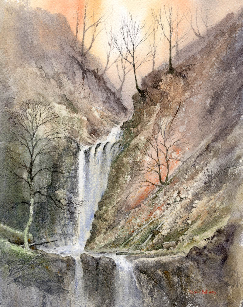
Many folk ask why I didn’t use masking fluid in a demonstration painting where I needed to reserve white areas, and this is a constant source of concern to artists. Often  the decision depends on how you feel about the use of the fluid, and in my case I normally only use it when there are intricate details in white, or a light tone.

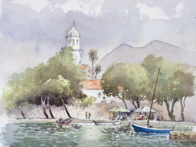
In this detail of a watercolour of the old harbour at Fishguard I made quite extensive use of masking fluid on the roofs and chimneys, the clothesline, steps and white highlights on the water. This allowed me to brush the sky wash vigorously across the paper and over the tops of the roofs, and later to apply the dark washes over the harbour wall and steps and the background to the clothesline without having to fiddle. The same applied to the sparkling water where I used cobalt blue.

I sometimes work round these features to create the negative shapes, but this can make the background appear overworked or splotchy, and take away the freshness. However, developing your skills at negative painting is invaluable, and is an excellent alternative to masking fluid. You will notice in this painting that there are tiny white features such as gulls, masts and ropes hanging from the harbour wall. These were rendered with white gouache, as I prefer this where the feature is so thin that masking fluid can appear clumsy. Gouache is also really effective for tidying up bits that haven’t quite worked.

I hope you all have a great festive season, and maybe Santa has left you an arty treat in your stocking to help get you going again with your painting. I shall try and snatch a few moments in the great outdoors with my paintbrushes. May you have much success with your painting in 2017

David Bellamy – Adding a sense of mystery to a waterfall painting

Waterfalls are popular subjects in a painting, and I’ve had a great many exciting moments sketching them, climbing them and abseiling down them, including ones underground where they really give you that “Hey-ho, here we go, but what’s at the bottom?” sort of feeling. Having the Brecon Beacons close by is an added bonus as there are more waterfalls per square inch there than anywhere else in the country.

    It is fairly easy to find waterfalls as they are usually marked on walkers’ maps, and if they have a name then you can Google them to get access information and a pretty good idea of what you can expect as descriptions are often accompanied by photographs. In this watercolour I used the excellent Saunders Waterford 300lb rough paper and increased the roughness even further in places where more rock textures were to appear by glueing thin Oriental papers in place.

My aim was to create a sense of mystery in the background using the wet-into-wet technique to blend the furthest rock and tree shapes into the misty background, then when this was dry painting harder shapes to suggest distance. The upper falls emerges from out of this atmospheric backdrop and for the falling water I leave the paper untouched so that it stands out in strong contrast to the darker sides, and especially the hard-edged rocks jutting out.

I shall be demonstrating waterfalls in watercolour at the Sandpiper Studio at Ledsham on the Wirral at the end of the month. As the first demonstration was so popular and filled up quickly, we have added another on Friday 28th October from 2pm to 4.30pm, and there are still a few places left on this one. Further details and bookings can be obtained from Julie McLean on 07788 412480  or Email her on iinfo@thesandpiperstudio.co.uk The two demonstrations will be of different waterfalls, and if you have lots of questions then bring them along! I will also be using the Daniel Smith watercolour range with their exciting colours. No abseiling is involved.

David Bellamy – Hand-bagged in Dubrovnik while painting

The sun beat down as I sat in a pleasant, shady spot beside Cavtat harbour demonstrating a watercolour, when Tarzan and Jane hove into view, both bronzed as they stood before us brazcavtat-harbourenly flexing their pectorals. Both were clad solely in thongs, otherwise naked and obligingly creating a combined landscape and life class all rolled into one. They moved round us, causing titters among the group, and at times my brush went distinctly wayward as I heaved with laughter at this incredible display of narcissistic clownery. Jane sat down in front of us, smiling like a Cheshire cat at the group, and presumably hoping someone would paint her.

This sort of distraction can un-nerve the alfresco artist, but the group chuckled valiantly and took it in their stride, producing some excellent work. Later in the week I demonstrated again in Dubrovnik, which unfortunately was so choked with cruise-ship tourists that there was hardly room to swing a sable, and as I painted I did get hand-bagged several times.

    So, it was with relief we sailed to the island of Sipan where I found a shady spot to demonstrate watercolour pencils. An old bicycle formed an excellent centre of interest – it was leaning against a wheelbarrow, which was leaning against the tree, so in the interests of simplicity I left out the barrow and about a million other equally exciting things lying around, to illustrate the need for keeping things simple. I faded out the buildings adjoining the old barn. The pencils were applied first in the various colours and then this was washed over with water, blending in the colours and then drawing into the wetness with a dark watercolour pencil where I wanted to emphasise details. If you feel your watercolours get a little out of control then try the watercolour pencils. This work was done on Bockingford 140-lb hot-pressed paper, an excellent surface for these pencils.

Our annual Watercolour Seminar is just about upon us, and this year we are back in The Settlement in Pontypool, a superb venue. It takes place on Saturday 1st October and there are still places left if you feel like coming along. The theme will be injecting mood and drama into a landscape and I will be using the exciting range of watercolours from Daniel Smith, demonstrating how to take advantage of these amazing colours and give your paintings some extra zip. As well as a demonstration I will be giving an illustrated talk on the same theme, covering a wide range of landscape subjects. Details of the seminar are on my website. We look forward to seeing you there.

David Bellamy – Using tonal effects to suggest mood and space

Injecting mood into a landscape painting not only makes the overall effect much more exciting, but can create a strong sense of space and distance in the work. Although this scene of Faversham Creek in Kent already had a feeling of great space I wanted to exaggerate the atmosphere even more in the finished painting.
I chose a blue-grey tinted paper for this watercolour and deliberately kept the distant wooded hillsides very faint in order to create a striking contrast with the foreground features. The strong tones on and around the buildings help to push the faint hills well into the background. If everything is given the same degree of tonal strength then it will be hard to distinguish various features from each other, even with contrasting colours. Masts, gulls and some white boats were rendered in white gouache, and I have only included the main part of the composition so that the distant hills can be seen better.

I shall be giving another of my annual seminars at the Settlement, Pontypool on Saturday 1st October, and it will be covering how to create mood and drama in a painting, beginning with a watercolour demonstration, and this will be followed by an illustrated talk on the subject, including a great many examples of different landscapes and coastal scenes. You can find details on my website http://www.davidbellamy.co.uk/seminar-pontypool-october-2016/  I shall be demonstrating the exciting Daniel Smith watercolours and Saunders Waterford paper, and there will be plenty of time for you to ask any questions, so I hope to see you there.

David Bellamy – Losing mountains in clouds with your watercolours

The last six weeks have been a breathless dash and blogging I’m afraid has consequently suffered. The Patchings Art Festival in early June was marvellous as usual and it was good to see some of you there. It is always so well organised and seems to get better every year thanks to Chas Wood and his enthusiastic team.

More recently I’ve been reveling in the Italian Dolomites, a great favourite with such drama, colour and atmosphere for the landscape artist. Although there were lots of blue skies, thankfully the clouds made their presence felt most strongly at times, enabling me to get away from the picture postcard effect, though occasionally they did rather overdo it a bit and totally obscure just about everything except my feet, at high altitude.

The illustration on the right shows one of my low-level watercolour sketches done on cartridge paper. Cloud is obscuring much of the peak and there are a number of ways of tackling this. Here I simply left the white areas as untouched paper, highlighting the white clouds by painting around them with a light grey, or as in some places a darker grey to suggest the darker mountain behind. I softened the edges of the clouds with a damp brush as I progressed, to suggest the light airiness of cloud, but sometimes a hard edge is left inadvertently. When this happens I let the paper dry then brush over the hard edge with just water on a small flat brush – a quarter-inch or 5mm one is fine. When this softens the edge I dab it with clean tissue and a soft edge has emerged.

Other ways to achieve the effect of mountains, ridges and crags disappearing into cloud are described in my book Skies, Light & Atmosphere, published by Search Press. If you don’t have the book you can order a signed copy from my website and we will include a FREE dot card of Daniel Smith watercolours (David Bellamy palette) for a limited time only. I wish you many happy cloudy moments with your paintbrush.