David Bellamy – Getting in the mood for painting

 It’s really heart-breaking to see some of the problems besetting the world at the moment, which put into perspective my frustrations at not being able to travel. In many ways we are seeing the best and the worst of humanity, and we wonder how it will all end. While art is giving so many people a great relief from all this misery, I know some artists are finding it difficult to concentrate on painting at the moment.

If you are finding it hard to get going then consider doing a few minutes of quiet meditation before you begin to think about what you would like to paint. I am not an expert on meditation but I do sometimes retire to a quiet spot – usually the studio – where I visualise myself back in some of the lovely locations I’ve explored and sketched, doing this for 5 or 10 minutes, helping to get myself in the mood. You may like to try it with some gentle music, or even some more lively stuff if you wish. When I do this I often start dancing and swinging the brush around more vigorously and my audience starts to get nervous at this spectacle – when I go out to the studio in the morning I am greeted raucously by them, the adulating noise often being terrific as I open the door. This is especially loud if I am carrying a bag, as the sheep think I’ve got food for them!

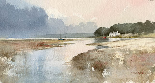
I’ve put together another scene for you to paint from if you wish, and I will show you my version in about ten to 14 days’ time. This scene is Llyn Mymbyr in Snowdonia, with the Plas y Brenin Mountain Centre just left of centre. You can leave the building out if you wish, just show the trees at that point. My painting will be from slightly to the right, and will include a crag descending into the right-hand side of the lake as shown in the second photograph.

Unfortunately my photographs are not filed with any precision, so I often struggle to find suitable matches, unless I’ve only recently done the painting. It takes quite some time to organise one of these mini projects. Working from more than one photograph or sketch is common and helps us introduce additional features like these crags, so this is a good exercise. Try to introduce more light and colour into the work, as the scene as it stands is rather dull, and feel free to change the tonal values where you feel this would enhance your composition.

If you don’t feel up to producing a full painting at the moment then try little sketches or small vignettes, perhaps simple experimenting with one or two techniques. Stay safe!

David Bellamy – Painting a backlit scene in watercolour

  Some of the simplest watercolours can have the most impact, and one of my favourites in this category is a watercolour sketch done of the Middim Khola river in Nepal, carried out at speed.

Most of this was done with a mixture of French ultramarine and cadmium red, with burnt umber replacing the red for the closer, stronger tones, and closer in the foreground and right-hand trees I have also dropped in some yellow ochre. The strong backlighting eliminated most detail and created a powerful sense of a series of tones that automatically suggested a vast space. Here and there I have deliberately lost the edges of ridges and the shorelines of the river, and emphasised others. Evenings are a good time to capture this sort of effect with backlighting, which also creates a sparkling effect of water. If you are working directly from the scene try painting a monochrome as it is quicker and you can capture the effects before they disappear!

This sketch was carried out during a painting expedition when I took a group of painters trekking in the Himalayas. That morning we had descended from some considerable height and one of our more elderly artists was missing as we sat on the banks of the river for lunch. I wasn’t too worried as she had a Sherpa allocated to look after her full-time, but we waited in expectation of her arrival. She wore a large distinctive white hat and when I gazed up at the mountain we’d descended I suddenly caught sight of what I assumed was her hat coming out of the trees like a bat out of hell. I couldn’t believe it, as she would never have been able to move at such speed, so I grabbed my binoculars and focused them on the hat.

Sure enough, it was our missing artist, hurtling down the mountainside at astonishing speed. She was actually sitting piggy-back style on the back of the diminutive little Sherpa and he was running down the mountain! These little fellows are incredible, and he was quite a bit smaller than our artist friend. They then disappeared into more trees and about fifteen minutes later came sauntering side-by-side out of the bushes on the far side of the river. There were many tales on that trip and it was quite tough for many, but they all relished the experience of a lifetime.

Stay safe and keep painting!

David Bellamy – Liberate your painting with scraps of paper

I often find that when I’m testing a wash or new colour on a scrap of watercolour paper that I produce some marvellous results, yet when I try to repeat the exercise in a proper painting it often falls far short of what I hope will happen. So why not try to capitalise on this perversity by now and then painting on a piece of scrap paper that you might otherwise throw away?    This little watercolour was painted on a discarded piece of 300lb Saunders Waterford rough paper 9 inches by 4.5 inches, and I loved every moment painting it. With such a small, insignificant size you tend to lose any inhibitions, and it’s certainly a liberating feeling, as you feel you have nothing to lose even if you make themost astounding mess!

    One of the main features I love is the soft wet-in-wet reflections in the water below the cottage. These were achieved by wetting the area of the water below the building and out as far as the central boats, leaving it for a few minutes to start drying, and then applying the dark green-grey reflections of the massed trees into the wet area, leaving the part directly below the cottage as white paper. At this stage it’s vital to watch how the dark reflections creep outwards as though they deliberately want to annoy you. With a damp – a really ‘thirsty’ brush (a number 6 round brush is usually fine for this) – pull out any of the dark colour that edges its way beyond where the reflections should appear. You may need to do this more than once.

    This painting appears in my Seas & Shorelines in Watercolour book, recently published by Search Press, which not only covers a really wide variety of coastal scenery and features, but is also crammed with sky treatments of all kinds that you should find useful for adopting in your own work. Signed copies are available via my website  ….and don’t forget to make full use of those bits of scrap paper lying around!

David Bellamy – Greys in watercolour landscapes

For the landscape painter grey is an extremely useful colour, often to set the mood, or equally importantly to provide a passage of quiet dullness that can be vital to make those exciting vibrant and perhaps bright colours stand out. In this scene of a stream in the New Forest, painted on Waterford NOT 140lb paper, I have used the superb Daniel Smith Lunar Blue to create the background, an exciting blue-grey colour that has interesting characteristics that may not at first sight be apparent. At it’s full strength as you can see on either side of the main tree-trunk where it defines the tops of the grasses, it reveals a powerful granulation, yet on the right-hand side where I have simply laid a weak wash of the same colour, there is no granulation. The stronger tone used, the more prominent become the granulations.

Daniel Smith have introduced a number of useful new greys into their collection recently and I’ve been trying out some of them. Alvaro’s Caliente grey is a lovely, warm grey which is quite dark at full strength, and is excellent for creating moody landscape backgrounds. The cooler Alvaro’s Fresco grey can inject a feeling of drama into a composition, for example if you may like to portray a cold sea or stormy sky, or simply cool shadows. The third grey I tried was Joseph Z’s neutral grey, a versatile colour that will be a welcome addition to the landscapist’s palette, again for creating moody scenes. All these greys can of course be modified by mixing, but one great advantage of these Daniel Smith greys is that the artist will already have a selection of interesting and varied greys without having to do any prior mixing, and in each case above the colours can produce a wide variety of  tonal values.

 I shall be demonstrating next Thursday, Friday and Saturday at the marvellous Patchings Art Festival, in the St Cuthberts Mill marquee, using the superb Saunders Waterford and Bockingford papers. Our stand will be beside the marquee so do come and chat and learn more about these excellent products and see other examples after the demonstrations. I will also be signing copies of my new book, David Bellamy’s Seas & Shorelines in Watercolour, just published by Search Press and is the No.1 Landscape painting best-seller on Amazon. You can obtain signed copies from my website  I hope to see you at Patchings

David Bellamy – Enhance your watercolour landscapes with simple cloud effects

I’ve just returned from running a sketch & walk course in the Lake District with a lovely group of students, where the biggest problem was a lack of water! This is something which is rarely encountered in Lakeland, and it did confound attempts to sketch certain waterfalls rather devoid of water. Still we had a great time and at least we eventually found some in Coniston Coppermines Valley.

The watercolour on the right is the view we painted, though I actually did this three years ago during autumn when there was more water in the beck, and the hillsides were alive with warm colours. This also happens to be on the cover of the summer issue of Leisure Painter magazine, featured in an article on creating wisps of cloud and streamers, which can so enhance your work. It was painted on Saunders Waterford rough 140 lb paper, and to achieve the soft misty edges I scrubbed with a damp half-inch flat brush. Losing ridges and parts of a hill or mountain can add so much mood and mystery to a landscape, and the article covers various ways in which you can achieve these effects.

These softening-off techniques are a common feature in my books, especially the Winter Landscapes in Watercolour and Skies, Light & Atmosphere in Watercolour. Some artists feel that a standard broad-washed blue or grey sky can fit any landscapes, but I put great effort into my skies to introduce exciting and interesting cloud and atmospheric effects that suit a particular landscape, so there are a great many examples of these in both books.

In Lakeland my biggest problem with the students was keeping up with the three octogenarian ladies, one of whom was leaping up and down precipitous slopes like an over-active monkey. What a great pleasure it is to see people respond so well to the beauties of nature.