David Bellamy – Concentrating the light in your paintings

Whatever medium you paint with, light is the all-important key. You can bathe your composition entirely in strong sunlight if you wish, but by restricting the brightest parts to one or two localised areas you will achieve more impact.
In this picture I have cut out a 
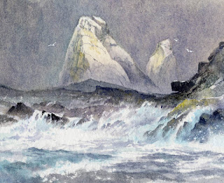
large part of the painting just to illustrate the advantages of the sort of effect you can achieve by concentrating the light into a small part of the composition. The turbulent sea gave sketching on the boat a refreshing spontaneity, although it was not long before it was not just the sea that was starting to turn a bit green……

Although I finished my book on the Scandinavian Arctic a while ago, I’ve been trying to catch up on so many things, so there’s been little time for blogging, especially with such a tremendous autumn that has tempted me out time after time. David Bellamy’s Arctic Light will be published in May 2017 by Search Press.

With winter with us once more try to get out to sketch those lovely winter trees whenever you can. Choose your days, wrap up well and if you have all your sketching gear ready to hand you can work quickly before you get too cold. I usually take a thermal travel mug with me as the drink will stay warm for ages, and is a great boost to morale when the sun disappears behind a cloud. My book Winter Landscapes in Watercolour is packed with tips on painting winter scenes, working outdoors in cool weather, and making the most of those warm colours, low lighting and evocative winter trees. You can find a copy on my website together with the film of the same name, which has some stunning winter scenery and was produced by APV Films.

On Wednesday 30th the Christmas exhibition begins at Lincoln Joyce Fine Art and the above painting (in full!) will be on display with several others. You will find the gallery at 40 Church Road, Great Bookham, Surrey KT23 3PW  Tel. 01372 458481

David Bellamy – Losing mountains in clouds with your watercolours

The last six weeks have been a breathless dash and blogging I’m afraid has consequently suffered. The Patchings Art Festival in early June was marvellous as usual and it was good to see some of you there. It is always so well organised and seems to get better every year thanks to Chas Wood and his enthusiastic team.

More recently I’ve been reveling in the Italian Dolomites, a great favourite with such drama, colour and atmosphere for the landscape artist. Although there were lots of blue skies, thankfully the clouds made their presence felt most strongly at times, enabling me to get away from the picture postcard effect, though occasionally they did rather overdo it a bit and totally obscure just about everything except my feet, at high altitude.

The illustration on the right shows one of my low-level watercolour sketches done on cartridge paper. Cloud is obscuring much of the peak and there are a number of ways of tackling this. Here I simply left the white areas as untouched paper, highlighting the white clouds by painting around them with a light grey, or as in some places a darker grey to suggest the darker mountain behind. I softened the edges of the clouds with a damp brush as I progressed, to suggest the light airiness of cloud, but sometimes a hard edge is left inadvertently. When this happens I let the paper dry then brush over the hard edge with just water on a small flat brush – a quarter-inch or 5mm one is fine. When this softens the edge I dab it with clean tissue and a soft edge has emerged.

Other ways to achieve the effect of mountains, ridges and crags disappearing into cloud are described in my book Skies, Light & Atmosphere, published by Search Press. If you don’t have the book you can order a signed copy from my website and we will include a FREE dot card of Daniel Smith watercolours (David Bellamy palette) for a limited time only. I wish you many happy cloudy moments with your paintbrush.

David Bellamy – Observing the Landscape

Learning to draw and observe properly are essential skills for the landscape artist in watercolour, and although most artists can see objects clearly, so many have appalling problems when trying to observe and record a scene. This is one of the fundamental skills I try to teach students on my painting courses, but it does take quite some application and determination to continue practising the skills once the course has ended.

This is a photograph of Skelwith Bridge, taken during my recent painting course in the Lake District. Whilst the lighting is a little flat, it is still pretty clear that the distant features viewed under the arch are a little darker in tone than the left-hand side of the bridge, though they are lighter than the underside of the arch to the right. Comparison of tones in this way is a vital method of working out these tonal relationships. Always think not just about the shapes before you, but the main tonal relationships as well. This will bring forward your art in leaps and bounds, and I would urge you to practice this with deliberate emphasis for at least the next month or so.

My rough sketch of the bridge on the right was done in about 12 to 15 minutes and this is the sort of drawing that will help you with your tones. Breaking away from a pure linear response to a subject is absolutely essential in your development as an artist.

I shall be demonstrating at the Patchings Art Festival  on Thursday 9th, Friday 10th and Saturday 11th June, in the St Cuthberts Mill Marquee, painting on the fabulous Saunders Waterford and Bockingford papers. Do come and chat. It’s always a great show with superb demonstrators, marvellous crafts, paintings and art materials. I will be painting with Daniel Smith watercolours and will have available the dot-card palette of the colours I mostly use in their range, so come along and pick one up.

David Bellamy – Quick sketching in watercolour

Don’t you wish sometimes that life could be really dull, drab and boring? It can get a little too exciting for much of the time, leaving you breathless and with no time to sit back and recall all the fun you’ve had. Being out on the hills tends to energise me and is far more pleasant than sitting in the studio, especially when you have to listen to the racket of builders across the road with their loud radios and screaming stone-cutters. And I usually take a cappuccino and Danish pastry out with me anyway – it’s amazing how it helps the washes flow across the paper!

When I went out recently on the Brecon Beacons, I took with me some small sample sheets of the new Saunders Waterford High-White hot-pressed paper from St Cuthberts Mill. It really is delightfully smooth and as one would expect with St Cuthberts, it takes the washes well. As you can see in the rough sketch, the snow really does stand out on this paper. Note how the terracing of the rock outcrops appears in broken horizontal lines, with a few gullies sweeping down here and there. It’s important to spend a few moments observing these aspects as they give a marvellous sense of place in your work. This paper also works well for wash and line work, and should be in the art shops fairly soon. I can’t wait to work on some big sheets.

I shall be demonstrating at  Patchings Art Festival next month in the St Cuthberts Mill marquee, on the 9th, 10th and 11th June, so I hope you can come along and enjoy the event. It’s always a great pleasure to be there, with so many artists and crafts-people, and of course, all the materials to check out. And make sure you try out some of the Waterford HP paper!

David Bellamy – Nature’s Little Jokes

My recent silence is a result of being up in Snowdonia, at last finding some snow this winter to sketch and roll around in. At times ferocious winds made sketching something of a challenge, but I returned with several good compositions to work on. One subject I spotted while driving along first thing, and luckily there was somewhere to park. The scene that caught my eye was dominated by Esgair Felen – not perhaps an outstanding subject under normal conditions, but under deep snow and with the early morning light catching it, I just had to go for it.

I usually prefer to photograph a superb subject before sketching it, but as I arrived in position the sunlight faded. Still, I took some shots then hurried back to the car. Halfway back along the 150 or so metres the sun came out again, tempting me back. But I wasn’t playing that game. Without moving, I focused the camera on the mountain despite the fact that I could only see the top two-thirds or so, and fired away, catching the glorious light on the critical part at the top. Then I realised that I’d caught a new composition – the foreground in the shots was made up of crags and rocks, making the scene look far more remote than in actuality. OK, I didn’t have the lake in the scene, but I had a second exciting composition to play with.

The watercolour sketch includes the lake and I finished it off with Derwent Inktense pencils, which are excellent for giving a watercolour sketch a bit more power. Even for my sketches, however rough, I like to paint with the beautiful watercolour sables produced by Rosemary & Co. as they come to such a lovely point and make it a pleasure to sketch in this way. You can now buy my favourite ones from our web shop

By playing its little joke on me – albeit the pretty common one of making the subject disappear before my eyes, or losing its appeal – it had actually given me two compositions instead of one, so in future I must watch for this phenomenon more closely, as perhaps I’m missing out on many secondary scenes…….