David Bellamy – Rip-Roaring Tales from the drawing board

  One of the after-dinner features of many of my painting courses has been Bellamy’s Bedtime Stories which developed after requests from students, and I’ve been asked if I can include some of these into the blogs. Robert, one of my students who is sadly no longer with us, had a delightful mischievous streak and asked me to literally tear into his painting at the final critique. He’d painted it especially for the purpose and he was a good painter. With the group gathered I began with Robert’s work, explaining what a marvellous rendition of the subject he’d made, but I didn’t like the right-hand side, so to everyone’s horror I tore a 3-inch vertical strip off the paper and declared that that was much better. However, I then pointed out that it was slightly unbalanced and that we needed to remove the top part of the sky, and so tore another strip off. By now many in the group were eyeing their own paintings piled up on the table and wondering whether they should rescue them.

    I continued with a denigration of the over-worked foreground (which was actually well done!), and with a severe frown announced that much of that would have to go as well. By now the painting was less than half its original size. I found a particularly “revolting” passage and tore that off, continuing in that way until the whole thing was reduced to the size of a large postage stamp, at which point I declared it was a truly outstanding work of art. Many of the students were in the know and the non-painting partners found it rather entertaining. I no longer do such severe appraisals, but while Robert was with us anything could happen. We do miss him greatly.

    How did you get on with the scene of Carn Llidi? I promised in an earlier blog I would show you my version which you can see below. I decided to work mainly in greys with spots of colour here and there, darkening the sky to highlight the peak. The buildings were pushed nearer to the peak and stand out against the strong darks immediately behind. The telegraph pole was achieved with white gouache which I have also used to scrub in to add interest in places. The foreground is almost abstract with stony shapes and splashes of reds and ochres. The painting was done on Saunders Waterford rough paper which I find superb for creating textural effects. The original photograph shows how much I have altered the scene. Of course there are an infinite number of ways to respond to a subject – there is no one ‘right’ way, but my aim here was to stimulate a different way of looking at a scene and also to encourage you to look at your sketches and photographs with a view to trying all sorts of approaches, perhaps even trying five or six completely different ways to paint a scene.

Keep painting and stay safe…….

David Bellamy – Liberate your painting with scraps of paper

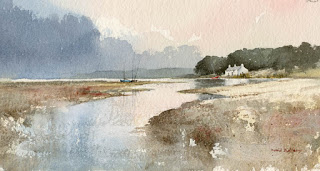
I often find that when I’m testing a wash or new colour on a scrap of watercolour paper that I produce some marvellous results, yet when I try to repeat the exercise in a proper painting it often falls far short of what I hope will happen. So why not try to capitalise on this perversity by now and then painting on a piece of scrap paper that you might otherwise throw away?    This little watercolour was painted on a discarded piece of 300lb Saunders Waterford rough paper 9 inches by 4.5 inches, and I loved every moment painting it. With such a small, insignificant size you tend to lose any inhibitions, and it’s certainly a liberating feeling, as you feel you have nothing to lose even if you make themost astounding mess!

    One of the main features I love is the soft wet-in-wet reflections in the water below the cottage. These were achieved by wetting the area of the water below the building and out as far as the central boats, leaving it for a few minutes to start drying, and then applying the dark green-grey reflections of the massed trees into the wet area, leaving the part directly below the cottage as white paper. At this stage it’s vital to watch how the dark reflections creep outwards as though they deliberately want to annoy you. With a damp – a really ‘thirsty’ brush (a number 6 round brush is usually fine for this) – pull out any of the dark colour that edges its way beyond where the reflections should appear. You may need to do this more than once.

    This painting appears in my Seas & Shorelines in Watercolour book, recently published by Search Press, which not only covers a really wide variety of coastal scenery and features, but is also crammed with sky treatments of all kinds that you should find useful for adopting in your own work. Signed copies are available via my website  ….and don’t forget to make full use of those bits of scrap paper lying around!

David Bellamy – Greys in watercolour landscapes

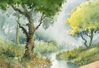
For the landscape painter grey is an extremely useful colour, often to set the mood, or equally importantly to provide a passage of quiet dullness that can be vital to make those exciting vibrant and perhaps bright colours stand out. In this scene of a stream in the New Forest, painted on Waterford NOT 140lb paper, I have used the superb Daniel Smith Lunar Blue to create the background, an exciting blue-grey colour that has interesting characteristics that may not at first sight be apparent. At it’s full strength as you can see on either side of the main tree-trunk where it defines the tops of the grasses, it reveals a powerful granulation, yet on the right-hand side where I have simply laid a weak wash of the same colour, there is no granulation. The stronger tone used, the more prominent become the granulations.

Daniel Smith have introduced a number of useful new greys into their collection recently and I’ve been trying out some of them. Alvaro’s Caliente grey is a lovely, warm grey which is quite dark at full strength, and is excellent for creating moody landscape backgrounds. The cooler Alvaro’s Fresco grey can inject a feeling of drama into a composition, for example if you may like to portray a cold sea or stormy sky, or simply cool shadows. The third grey I tried was Joseph Z’s neutral grey, a versatile colour that will be a welcome addition to the landscapist’s palette, again for creating moody scenes. All these greys can of course be modified by mixing, but one great advantage of these Daniel Smith greys is that the artist will already have a selection of interesting and varied greys without having to do any prior mixing, and in each case above the colours can produce a wide variety of  tonal values.

 I shall be demonstrating next Thursday, Friday and Saturday at the marvellous Patchings Art Festival, in the St Cuthberts Mill marquee, using the superb Saunders Waterford and Bockingford papers. Our stand will be beside the marquee so do come and chat and learn more about these excellent products and see other examples after the demonstrations. I will also be signing copies of my new book, David Bellamy’s Seas & Shorelines in Watercolour, just published by Search Press and is the No.1 Landscape painting best-seller on Amazon. You can obtain signed copies from my website  I hope to see you at Patchings