
Waterfalls are popular subjects in a painting, and I’ve had a great many exciting moments sketching them, climbing them and abseiling down them, including ones underground where they really give you that “Hey-ho, here we go, but what’s at the bottom?” sort of feeling. Having the Brecon Beacons close by is an added bonus as there are more waterfalls per square inch there than anywhere else in the country.
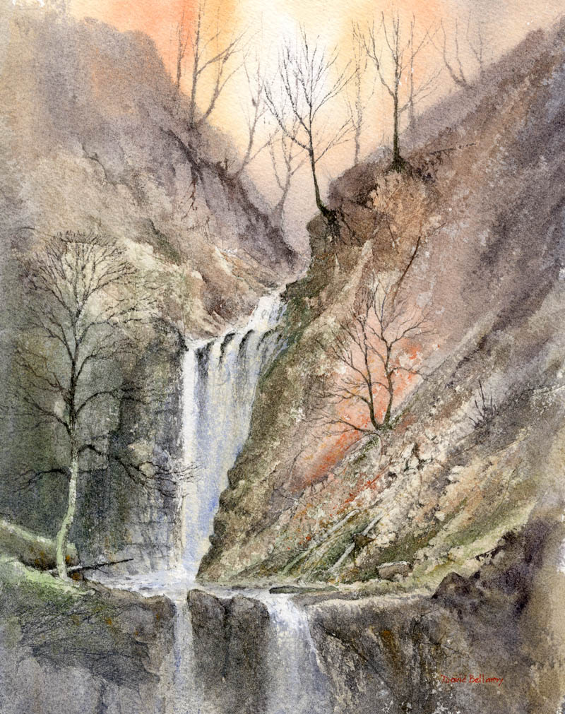 It is fairly easy to find waterfalls as they are usually marked on walkers’ maps, and if they have a name then you can Google them to get access information and a pretty good idea of what you can expect as descriptions are often accompanied by photographs. In this watercolour I used the excellent Saunders Waterford 300lb rough paper and increased the roughness even further in places where more rock textures were to appear by glueing thin Oriental papers in place.
My aim was to create a sense of mystery in the background using the wet-into-wet technique to blend the furthest rock and tree shapes into the misty background, then when this was dry painting harder shapes to suggest distance. The upper falls emerges from out of this atmospheric backdrop and for the falling water I leave the paper untouched so that it stands out in strong contrast to the darker sides, and especially the hard-edged rocks jutting out.
I shall be demonstrating waterfalls in watercolour at the Sandpiper Studio at Ledsham on the Wirral at the end of the month. As the first demonstration was so popular and filled up quickly, we have added another on Friday 28th October from 2pm to 4.30pm, and there are still a few places left on this one. Further details and bookings can be obtained from Julie McLean on 07788 412480 or Email her on iinfo@thesandpiperstudio.co.uk The two demonstrations will be of different waterfalls, and if you have lots of questions then bring them along! I will also be using the Daniel Smith watercolour range with their exciting colours. No abseiling is involved.


