
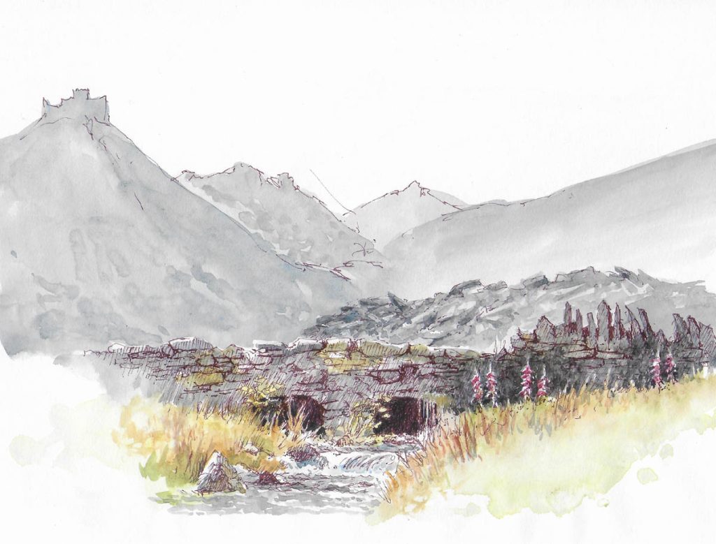
Often, even in a stunning landscape subject, I feel the need to add something of myself into the composition to enhance it as a painting. Whilst this may involve introducing an extra tree, perhaps a more handsome specimen than is present, or enlarging a feature to give it more presence, or many other such alterations, here I will concentrate on adding a little variety to the existing features in a scene to breathe fresh life into it.

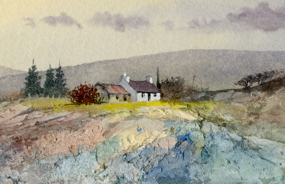
In this scene set in Mid-Wales the only feature I have added is the puddle below the right-hand gate which helps as a lead-in to the farmhouse. The main point I would like to put across, however, is the addition of colours into the outbuilding roof, and its exaggerated wonkiness at the top and bottom. I used cadmium red and cobalt blue on the corrugated iron roof, leaving some white untouched paper for highlights and a mixture of the two colours on the darker left-hand end. Energetic dry-brush strokes of the brush work well in this situation, and any slight mess at the bottom can be overpainted with a dark mixture of burnt umber and French ultramarine as in this structure.
Sometimes a chimney can benefit from being a different tonal value than the gable end of a building, and as you see here I have made it dark, then losing the dark tone as it merges into the wall below. It is better to let this gradually change in this way, rather than paint a strong and hard definition between chimney and main structure as you see in many buildings. These are just minor points but they can have a striking effect on your finished work.
I have been invited to demonstrate at the International Watercolour Masters exhibition in Lilleshall Hall in Shropshire on 13th May 2026. You can find details at: https://internationalwatercolourmasters.com/portfolio_page/david-bellamy-uk/?v=7885444af42e
I am looking forward to the event and hope to see you there. I’ll be happy to answer questions, and do bring along any of my books you would like signed – this is something many people bring up when they come along and have left the book behind! Enjoy your painting during the rest of this amazing summer…..or maybe you are longing for a bit of good old British autumn drizzle for a change?

