It feels very un-Christmassy here in rain-drenched Pembrokeshire at the moment while I’m recovering from a fairly mild dose of ‘flu, and I’ll need to be in top form next week when my two over-active grand-daughters arrive. Jenny will be safely ensconced in Hampshire with her ‘little’ ones while I face the full force of furious chaos.
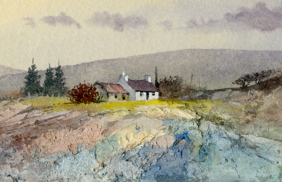
A fall of snow would help of course, with the distraction of building a snowman while I sneak in a quick watercolour sketch if I’m lucky. Plotting it is fairly easy as I can take the girls up handy toboggan slopes at the same time and where the mountains are in full view. The attached watercolour of the Black Mountains gives an idea of what can be done reasonably quickly. In cases like this where speed is vital then watercolour pencils are truly effective.
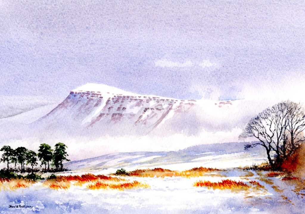
Note how the track on the right-hand side has been defined in the snow with intermittent stabs of the brush to suggest a winding effect. For this I used transparent red oxide, and also floated it into the dark mass under the trees while this was still wet. The background at this point has been kept simple with just a stroke or two of a wash brush, and the mountain ridge at the top has been lost in cloud in places. These are all really simple techniques which use the watercolour medium to advantage. This has been painted in the studio on Saunders Waterford 140lb NOT paper, but in a sketch these effects can be achieved in two or three minutes with watercolour pencils, working freely without any need to create a complete landscape composition.
Enjoy your Christmas and have a great time. I wish you every happiness for Christmas and 2026 and evry success with your painting.