David Bellamy – Subjects to Paint in Self-Isolation

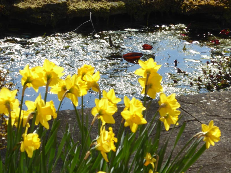
Spring is always a great pleasure in Mid-Wales: buds are springing out, daffodils caught in the spring sunshine invoke a joyous feeling as they are set against the sparkling water of the garden pond, while the birdsong is especially uplifting at the moment. The frogs have come and gone after their annual orgy in the pond, their massed croaking drifting into the house in waves of communal ecstasy. The sparrows are forever darting about, but with the mating season in full swing they are pretty aggressive: at times the undergrowth is waving about madly with their exertions! All this I see from my studio window, as well as the new-born lambs gambolling around in the field next door.

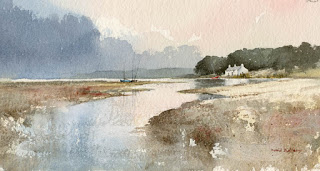
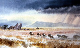
    All this seems utterly surreal given our present predicament with this nasty virus, but as artists we are lucky to have an occupation or hobby that transports us to other worlds, if only for a brief period. Your response to my last blog post was so rewarding and I’m glad so many of you found it helpful. I’ve just completed a deadline for my book on Landscapes Through the Seasons, so while I am still working on another book, I now have more time to push out blogs that will hopefully give you some ideas during this difficult period when we have to self-isolate. Although I am mainly a landscape artist I will try to cover a number of genres to provide as much variety as I can, including imaginary subjects and maybe even fantasy – we all need a little fantasy now and then. I know many of you are flower painters, for example, so why not start there?

    Flowers and still life are obvious subjects to fall back on when we are house-bound. My work on flowers is almost exclusively on wild flowers as part of a landscape, but I did touch on cut flowers in my book Complete Guide to Watercolour Painting. If you are painting a vase of flowers pick out one or two blooms that stand out and play the others down slightly by losing edges and running colours into one another. Suggesting background shapes with a plain, shadowy wash can accentuate a sense of depth in the composition, and introducing some spatter effect as I’ve done round some of the edges in this watercolour, gives a sense of spontaneity and life. You don’t always need a background but if you do include one then play it down so that the flowers take pride of place. A simple suggestion of perhaps the edge of a table can also set it up well. Saunders Waterford high white is an excellent paper for flowers as its white is so brilliant, and Bockingford is a good alternative.

    Those without a garden may find it difficult at the moment, unless you have a window-box. Now, of course is the time to set seeds so if you are bereft of window-boxes or flower baskets try to get one, even if you have to rely on a rusty old bucket – sometimes these decrepit old things can have far more character than the latest gleamingly spotless container. Plant a few seeds and before very long you will have new subjects to work on, but don’t ask me what to plant – unlike my late namesake Professor David Bellamy or my brother Malcolm, I’m not a horticultural expert! Also consider getting miniature trees and exotic plants.

    More tips and ideas soon, and maybe I should shortly do one especially for the lads, perhaps on how to paint the Cold War era Soviet T-64 main battle tank in action, although I doubt that many of you will have one of those in your garden…….  Keep safe and keep painting!

David Bellamy – Liberate your painting with scraps of paper

I often find that when I’m testing a wash or new colour on a scrap of watercolour paper that I produce some marvellous results, yet when I try to repeat the exercise in a proper painting it often falls far short of what I hope will happen. So why not try to capitalise on this perversity by now and then painting on a piece of scrap paper that you might otherwise throw away?    This little watercolour was painted on a discarded piece of 300lb Saunders Waterford rough paper 9 inches by 4.5 inches, and I loved every moment painting it. With such a small, insignificant size you tend to lose any inhibitions, and it’s certainly a liberating feeling, as you feel you have nothing to lose even if you make themost astounding mess!

    One of the main features I love is the soft wet-in-wet reflections in the water below the cottage. These were achieved by wetting the area of the water below the building and out as far as the central boats, leaving it for a few minutes to start drying, and then applying the dark green-grey reflections of the massed trees into the wet area, leaving the part directly below the cottage as white paper. At this stage it’s vital to watch how the dark reflections creep outwards as though they deliberately want to annoy you. With a damp – a really ‘thirsty’ brush (a number 6 round brush is usually fine for this) – pull out any of the dark colour that edges its way beyond where the reflections should appear. You may need to do this more than once.

    This painting appears in my Seas & Shorelines in Watercolour book, recently published by Search Press, which not only covers a really wide variety of coastal scenery and features, but is also crammed with sky treatments of all kinds that you should find useful for adopting in your own work. Signed copies are available via my website  ….and don’t forget to make full use of those bits of scrap paper lying around!

David Bellamy – Painting Wild Serengeti

I will be giving a talk and demonstration at The Galtres Centre, in the Market Place at Easingwold on Friday 26th April, and you are welcome to come and have a chat. The theme will be “Wild Serengeti” and I will be covering encounters and sketching with African wildlife. The event starts at 7.30 pm and for those using satnav the postcode is YO61 3AD. For tickets and information please ring the Galtres Centre on 01347 822472

The scene shows wildebeeste startled by a lion during the annual pilgrimage across the Serengeti, when the line of wildebeeste runs from one end of the horizon to the other. The lion watched them with indifference, probably having eaten so many he couldn’t face any more for a while! I enjoy working on a narrative like this, where there is more than just the visual image. To make the main animals stand out I deliberately simplified the ground directly behind them. Fast movement is depicted not just by blurring the legs slightly and placing them in running positions, but also by the angle and attitude of the body. This is at its clearest in the two beasts 3rd and 4th from the left, where they are moving away from the viewer and their bodies are slightly leaning over to the left as they turn away.
 The painting was done on Saunders Waterford 140lb rough paper.

Some folk may wonder why I don’t use Facebook, even though there is an account in my name (which I don’t use). I find it almost impossible as I live quite an action-packed life with little time to spare – in fact I don’t paint so often these days because 21st-century life just is too demanding of one’s time. Technology is supposed to make life easier for us, but I find it just adds an extra burden, being so incredibly slow and error-prone. It’s much greater fun to be out in the wilds or at least brandishing the old-fashioned paintbrush somewhere nice and remote.

David Bellamy – Seeking out a rural lane to paint

I have a great affection for rural lanes, especially old rutted cart-tracks. While they are superb for leading you into a composition they are also excellent subjects in their own right. When I plan a sketching trip I often seek out winding lanes on the walking map, and where they lead to an interesting-looking subject such as a mountain or hill, then there is a strong chance of a good subject.

This particular lane heads towards the Brecon Beacons and I tramped it on a sunny winter day. I particularly liked the way the low sunlight cast shadows across the lane, and was keen to include this aspect, as well as giving the feature a few extra ruts for good measure. Ruts, puddles, clumps of grass and weeds and stones can be exaggerated or even added if they are not present, to give the composition more character. Keep a file of drawings, sketches and photographs of these countryside features so that you can add them in when needed. Undulating hedgerows with gaps here and there enhance the rustic nature of the place as do mature trees and bushes, and if you’re feeling really bold why not include a rustic shepherd wending his weary way home?

The painting was done on a sheet of quarter-imperial Saunders Waterford rough paper, a beautiful surface to work on, and the rough surface enhanced the track, especially where I used drybrush strokes.

It’s been all-action since my last blog, from the marvellous annual festival at Patchings Art Festival in Nottingham’s Robin Hood country where I demonstrated the Saunders Waterford papers for St Cuthberts Mill, and had the pleasure of meeting a lot of you. I’ve also just returned from an immensely rewarding trip to Germany, so that has a lot of potential for some great artwork.

I do hope, like me, you’ve enjoyed this amazing summer and made full use of it with your paintbrush!

David Bellamy – Creating an illustrated journal

One of my great enjoyments is keeping an illustrated journal, although because of a lack of time it tends to be rather intermittent – it’s just so stress-free to paint or sketch for yourself and add notes about your experiences, and this is especially rewarding on a holiday or journey. I am therefore pleased to announce that I have teamed up with Leisure Painter Magazine over the next six months to offer a monthly competition to encourage folk to get out and try their hand at producing a journal. Jakar International have kindly agreed to supply the monthly prizes, so do please have a look at the current (April) issue of Leisure Painter.
     The illustration shown right is taken from my sketchbook-journal done on a visit to Holland, and shows the typical notes I often add beside the picture. I don’t really class this as a sketch, as I feel it is more of a diagram drawn solely to illustrate the fascinating architectural styles in Old Amsterdam. I had no intention of creating a finished painting from this: it was done for my enjoyment, although many other sketches in the A4 book were intended as sources for future paintings. Working this way, with no pressure to produce a brilliant piece of artwork can be liberating as well as helping your work to improve.

The houses varied from colourful to a more drab colour, so it’s a good idea to pick out those colours that appeal most to you, rather than paint every house exactly as you see it before you. Note that I have run most of the house colours into one another, rather than paint each one with individual exactitude. I have left out a great many windows, but feel I should have omitted even more, or at least reduced the strength of detail is some.

I shall look forward to seeing how you all fare in these competitions, and I must point out that this is not limited to those who travel far and wide – you are very welcome to join in even if you are house-bound, and there are many ideas for you in my current article in Leisure Painter. Make sure you don’t miss out on the fun!